Maltings Academy

Enhancing Educational Environments through Bespoke Wall Graphics at Maltings Academy

Project Brief:

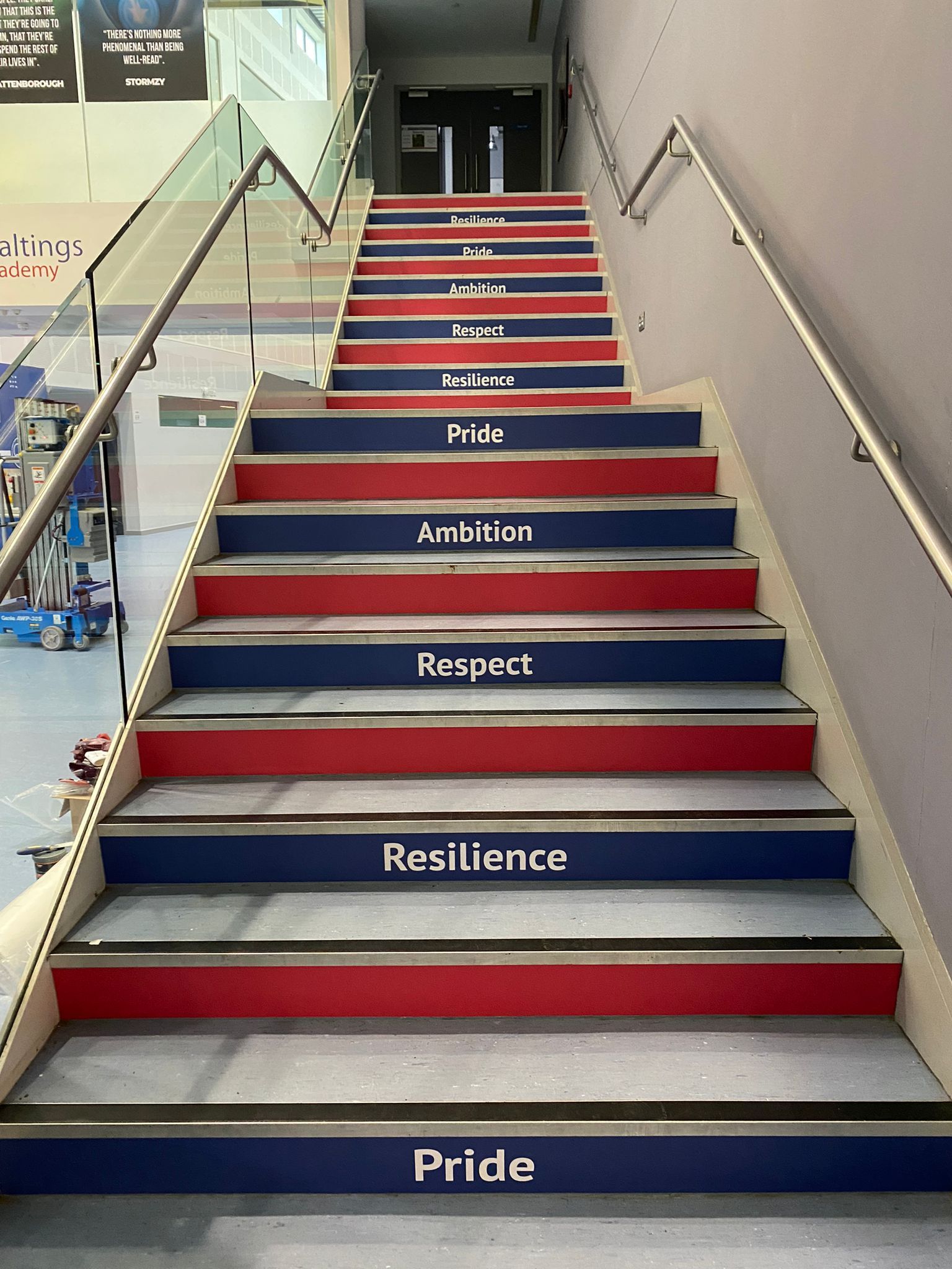
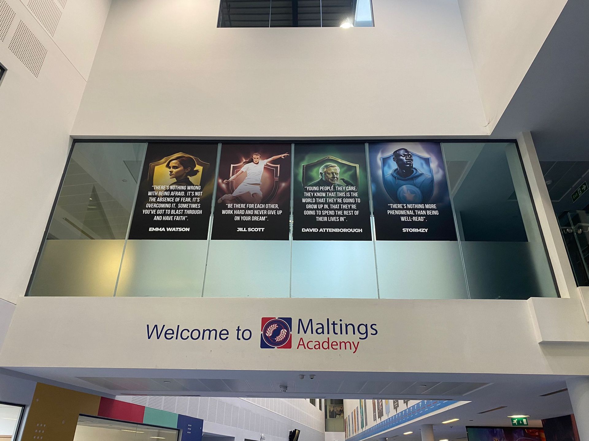
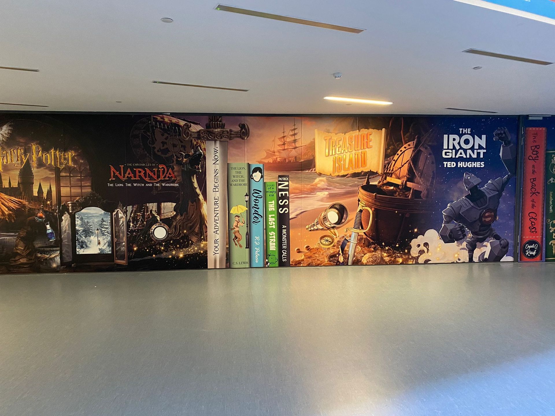
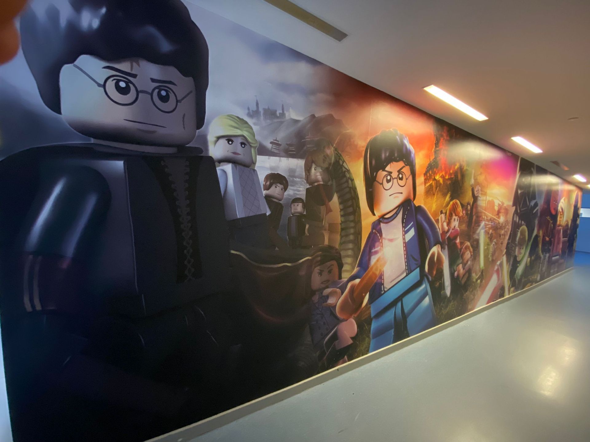
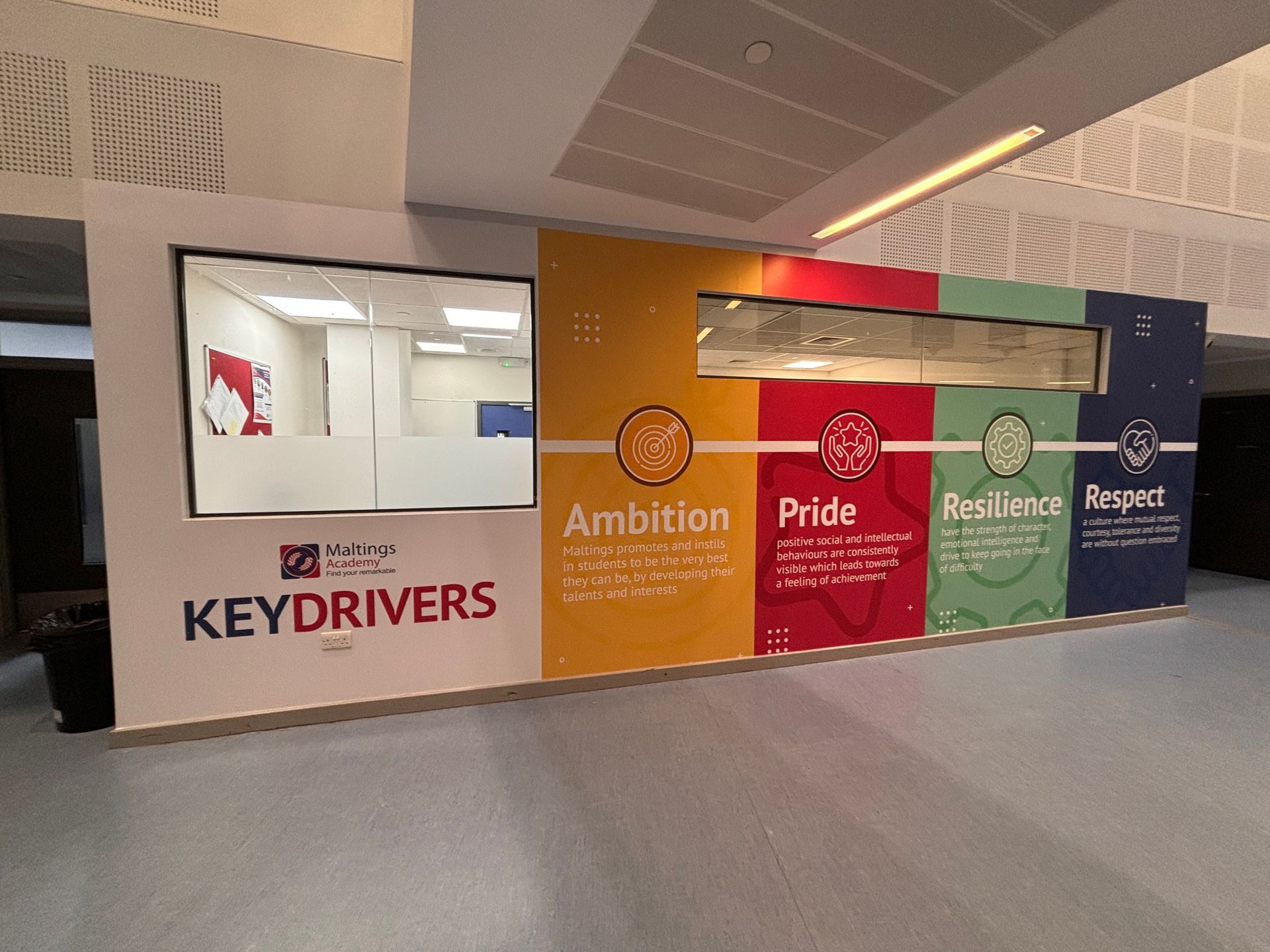
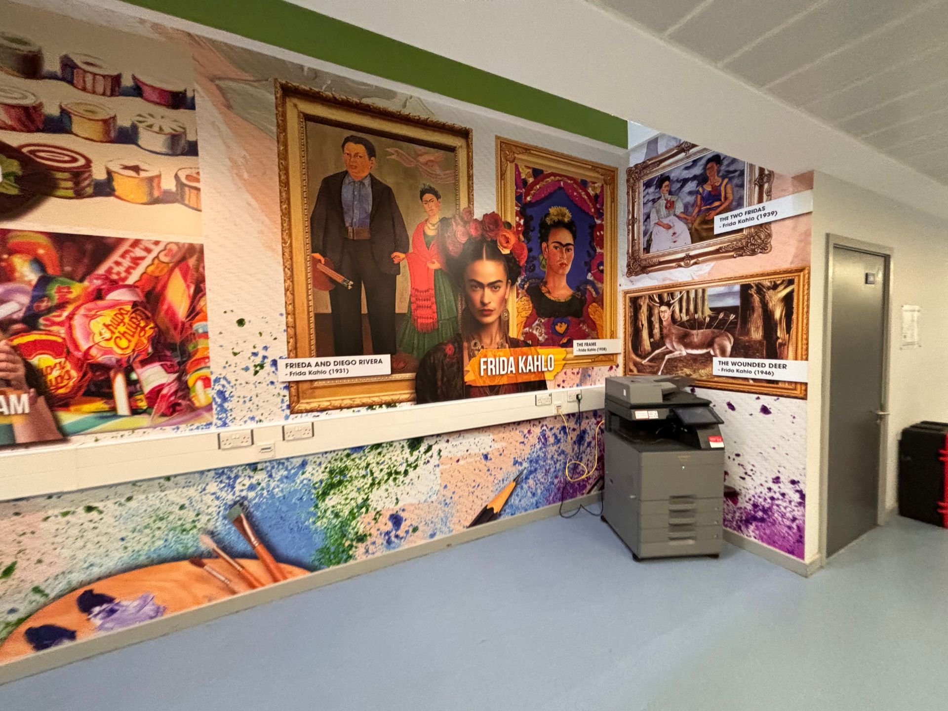
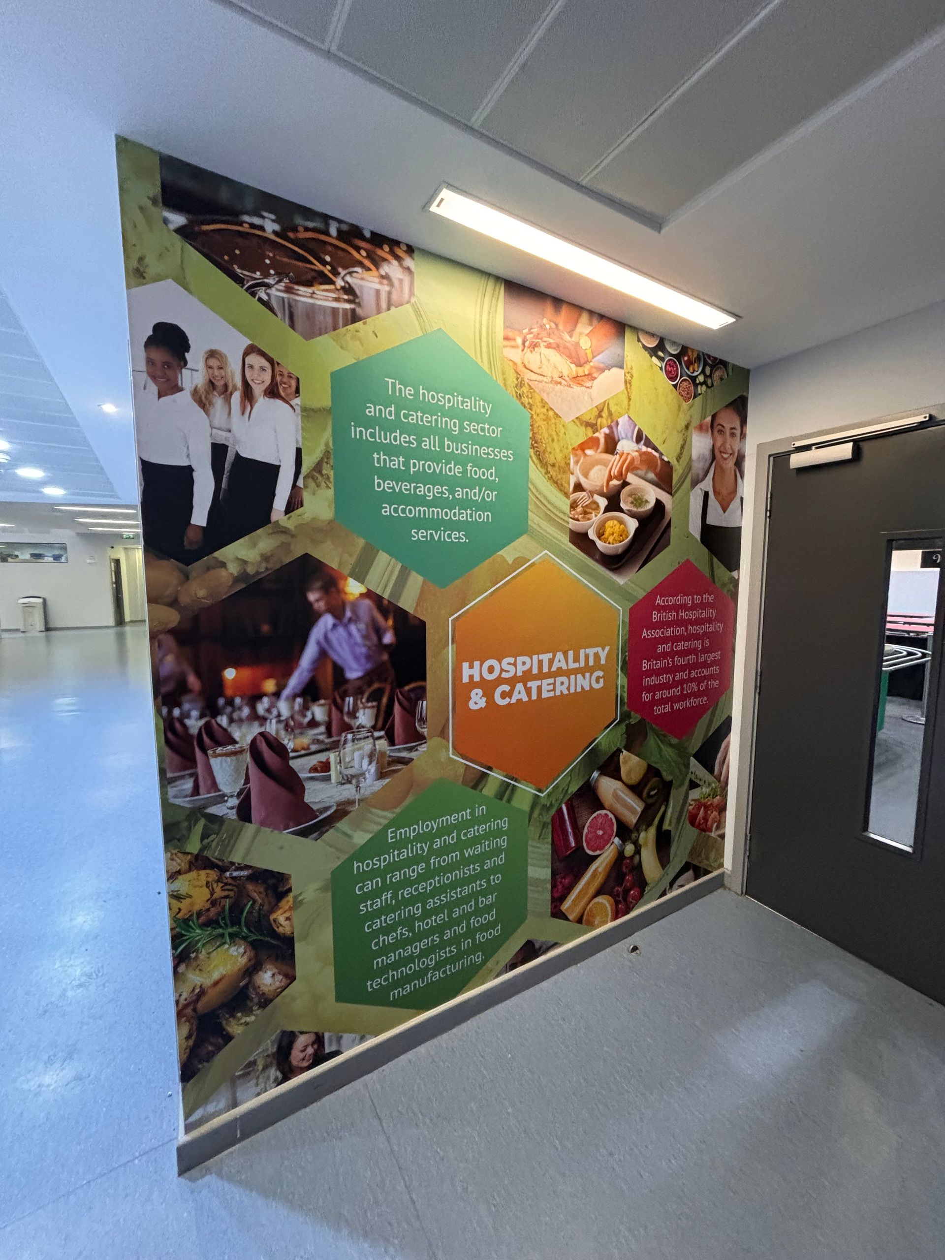
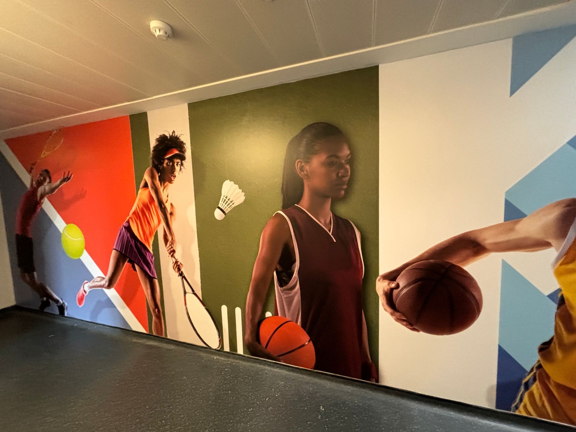
Design and install bespoke wall graphics for multiple subject zones to enhance the educational experience and environment. Areas of focus included values, art, design technology, mindset, sports, among others.


Objectives

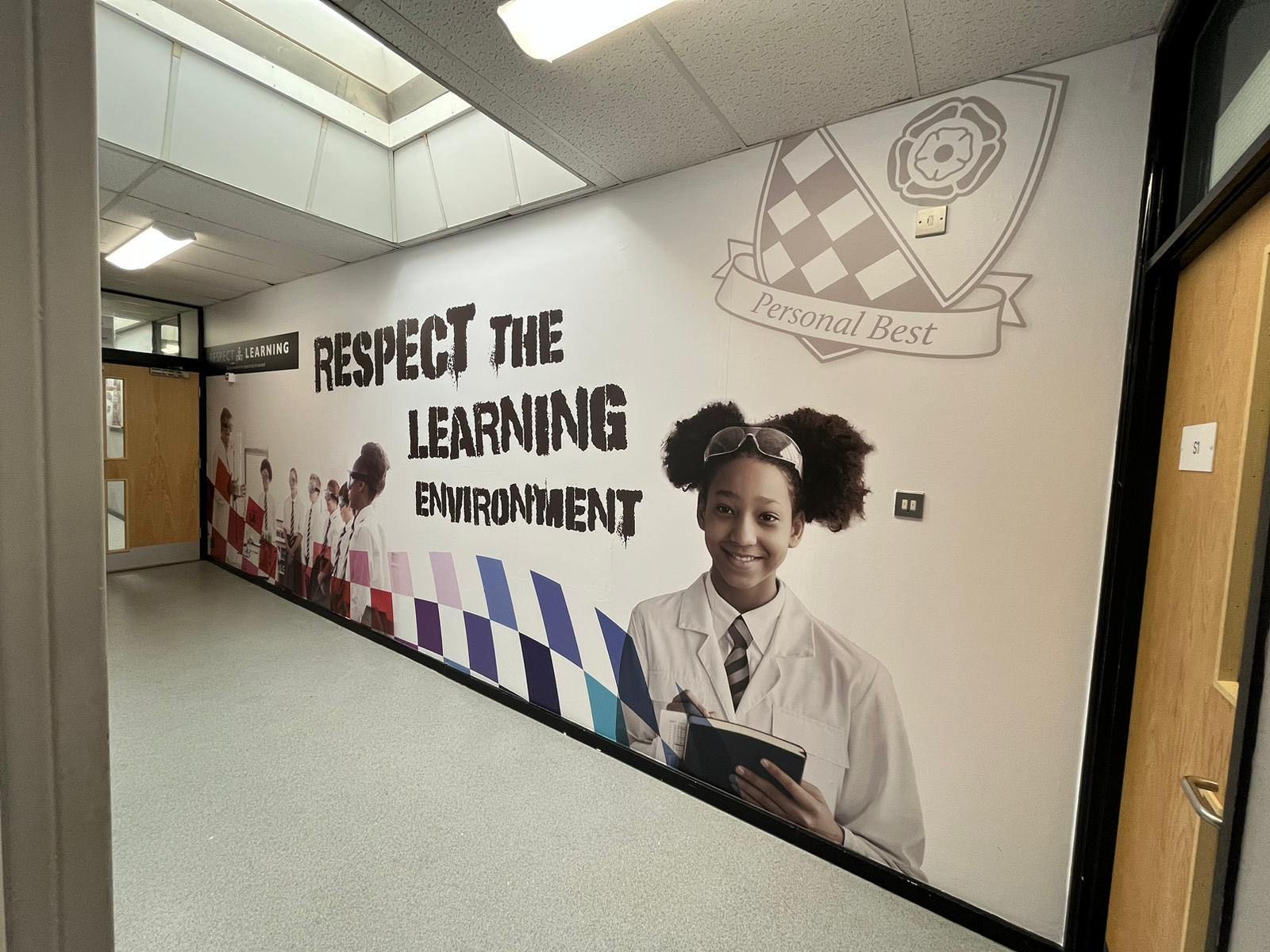
The primary objective was to transform the school’s learning spaces into vibrant, engaging areas stimulating students' interest and reinforcing the academy's educational values. The graphics were designed not just to beautify the space but to serve as functional educational tools that complement the learning objectives of each subject.

Design Process

  1. Research and Engagement: The project began with a meeting with school officials to understand Maltings Academy's specific needs and values. This phase helped tailor the design brief to align with the school's ethos and educational goals.
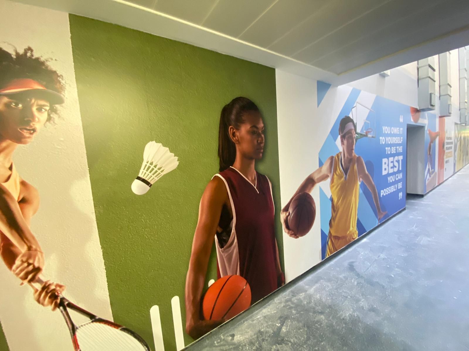
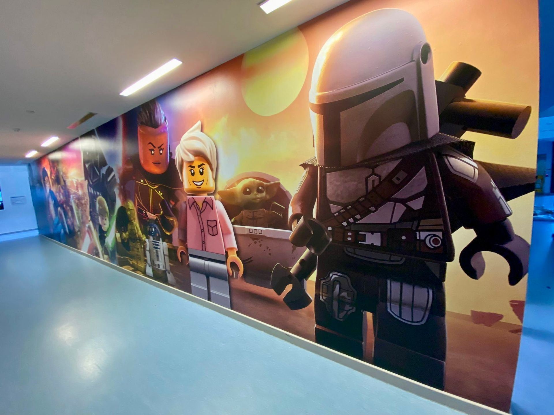
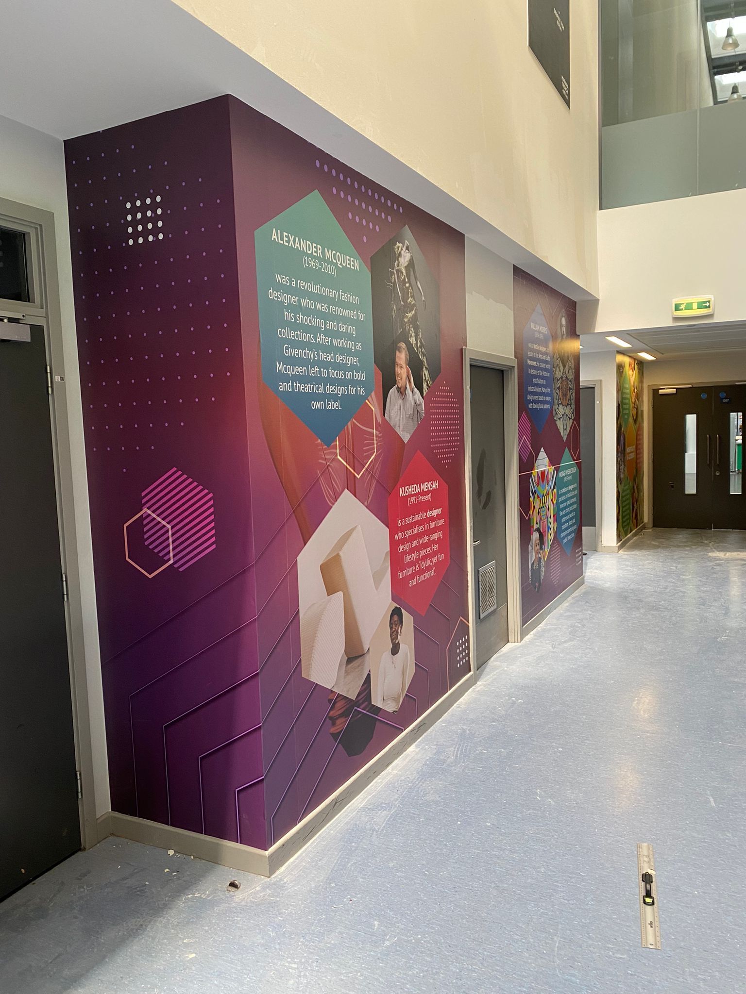
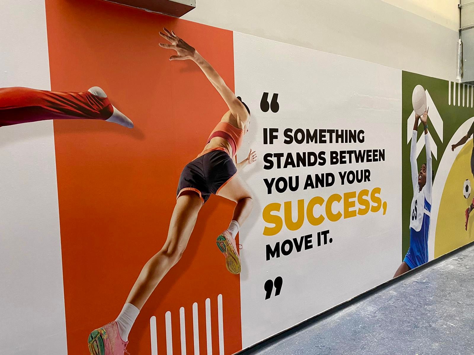
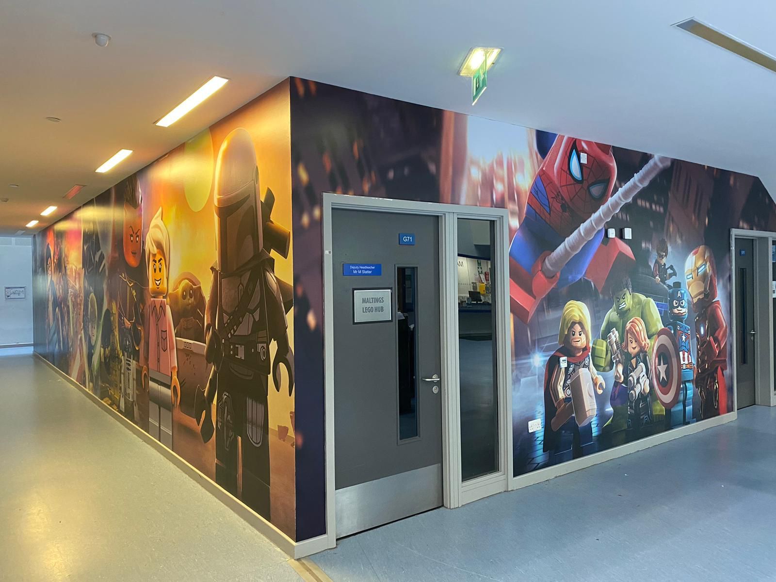
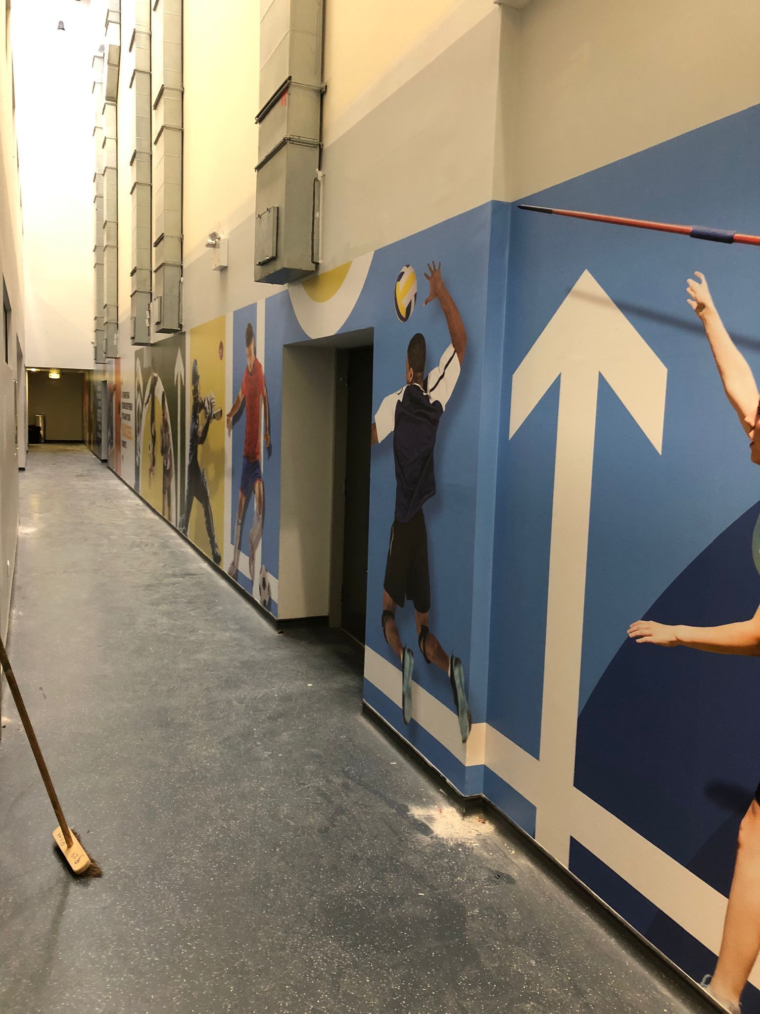
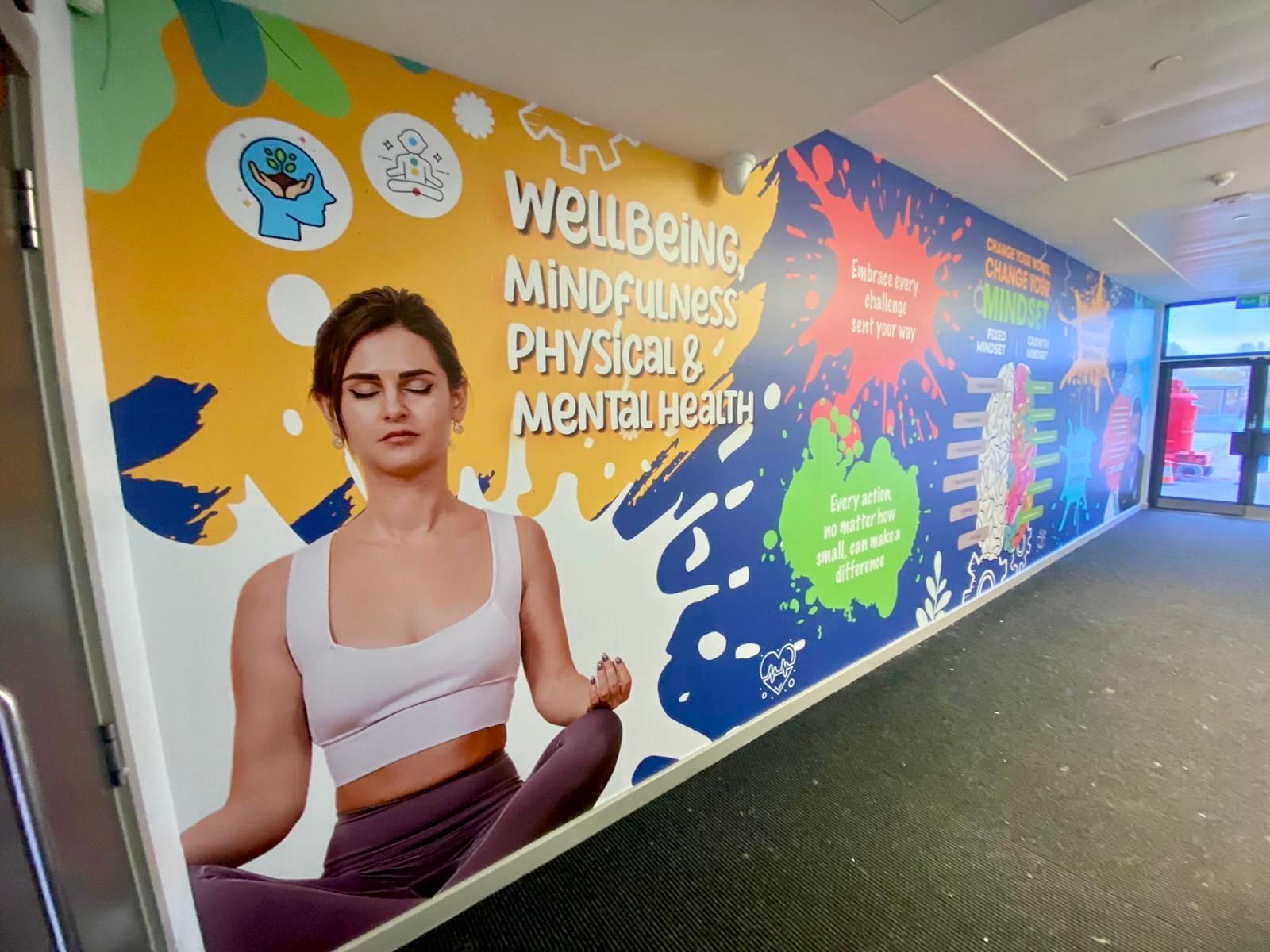
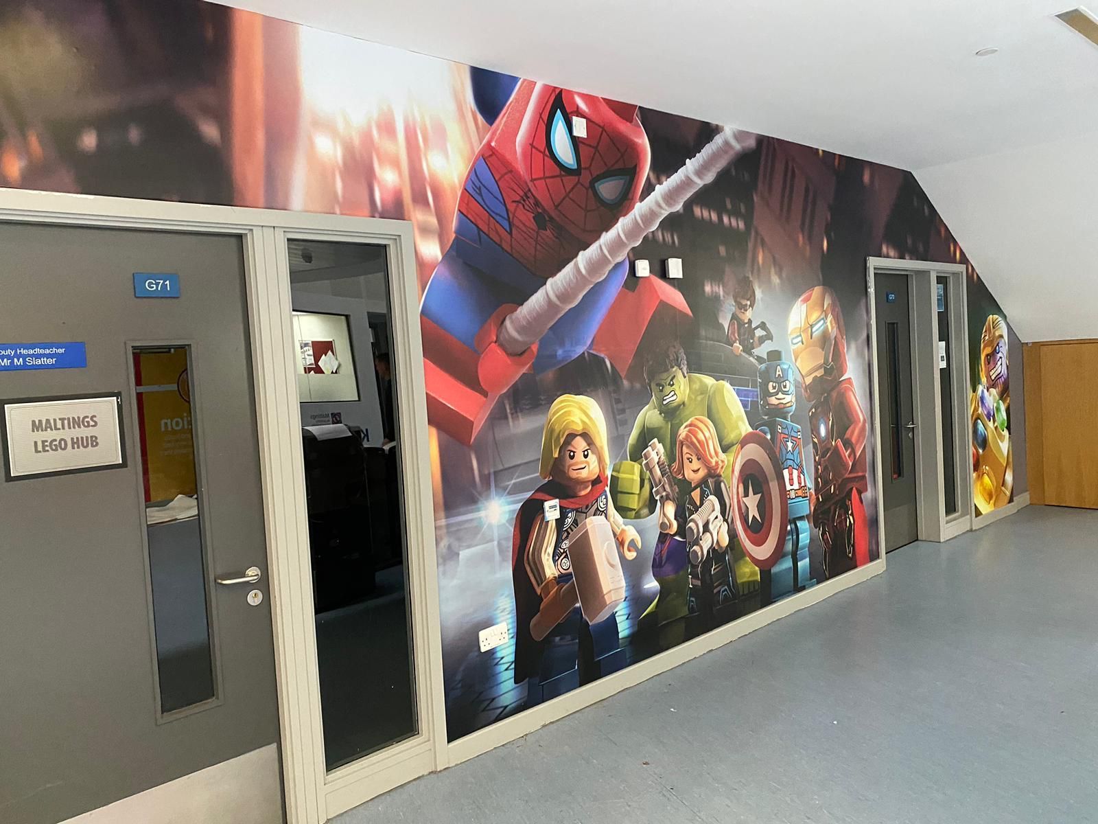
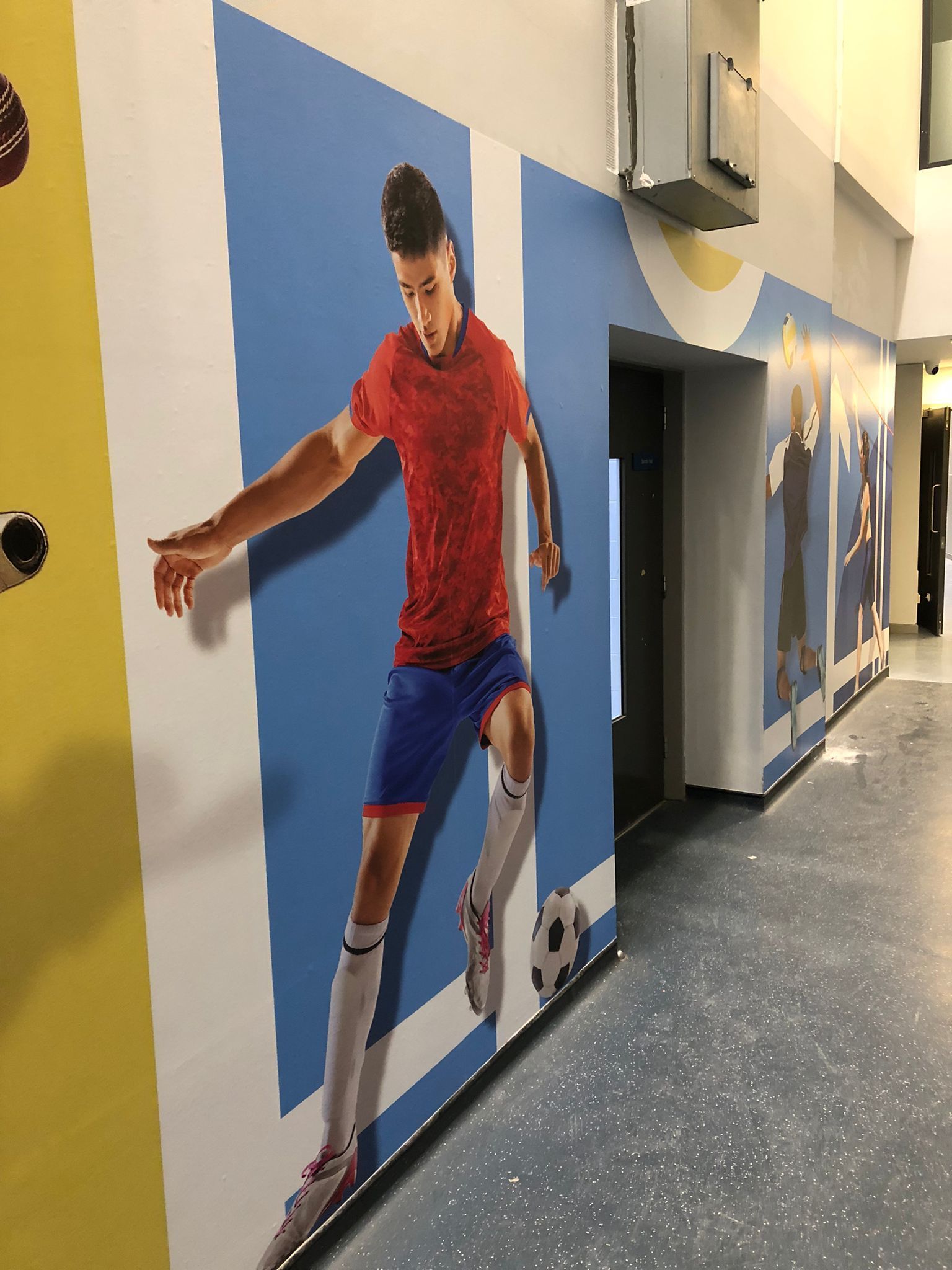
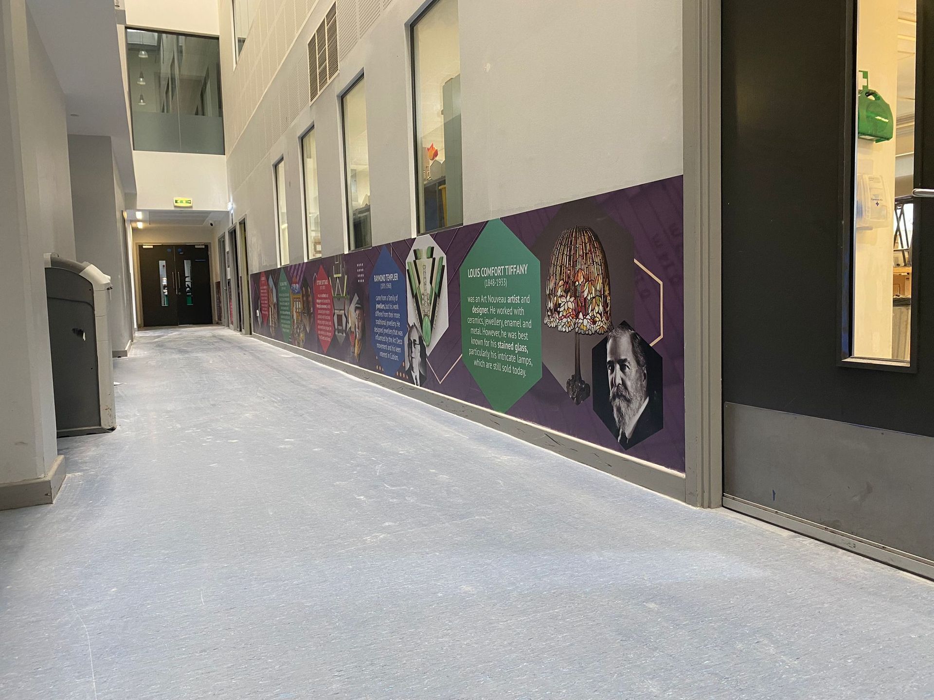
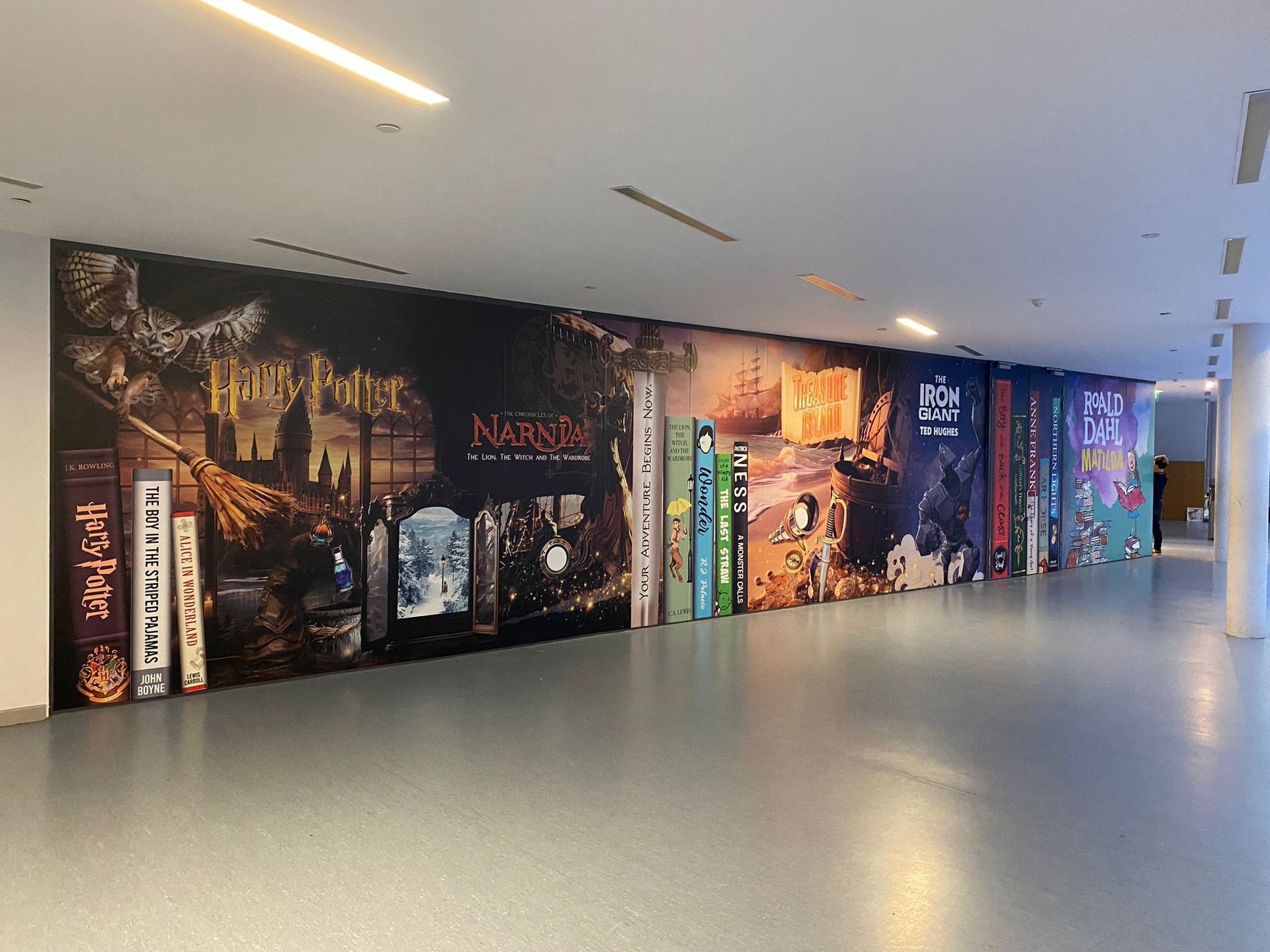
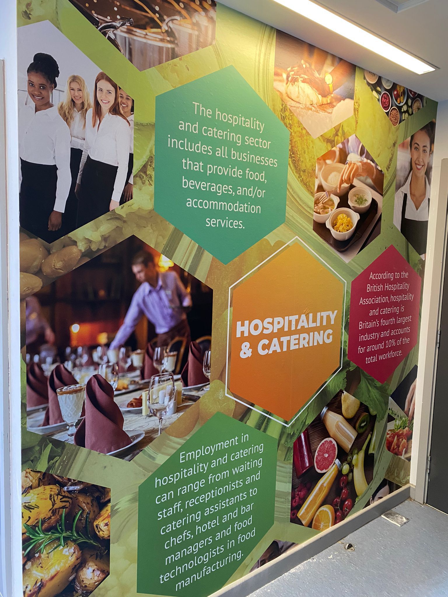
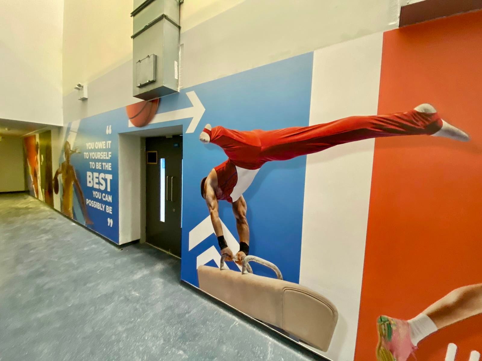
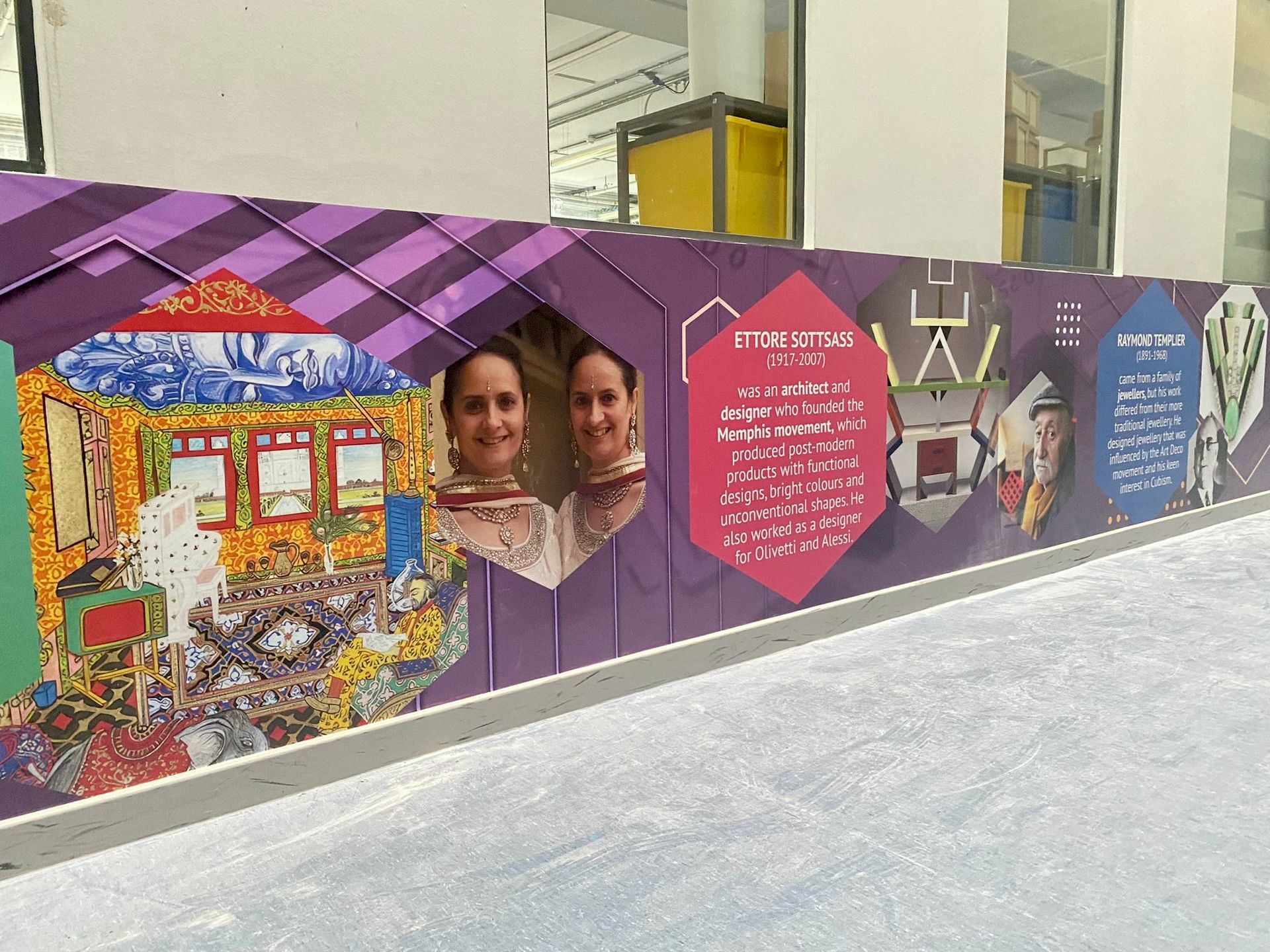
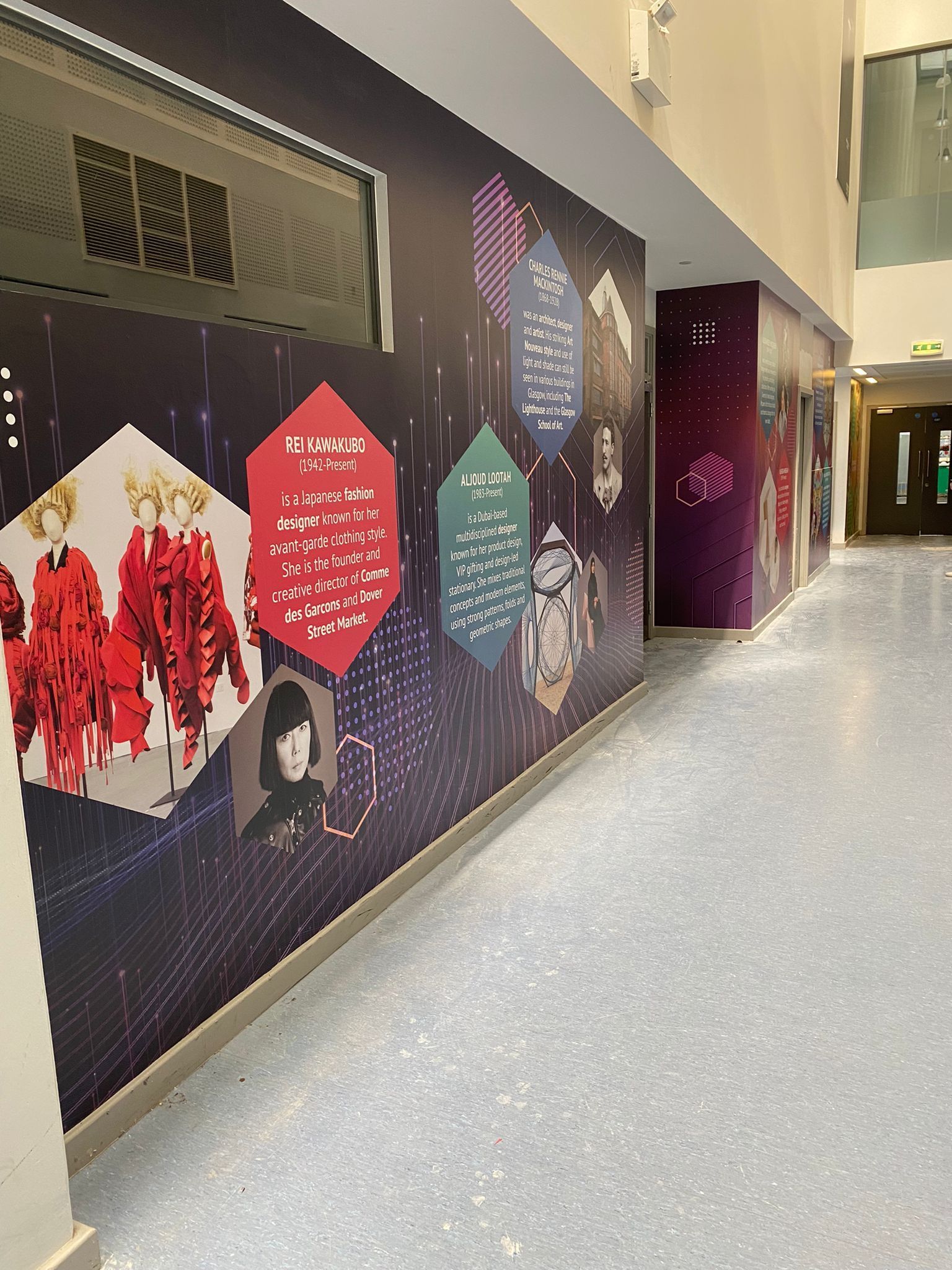
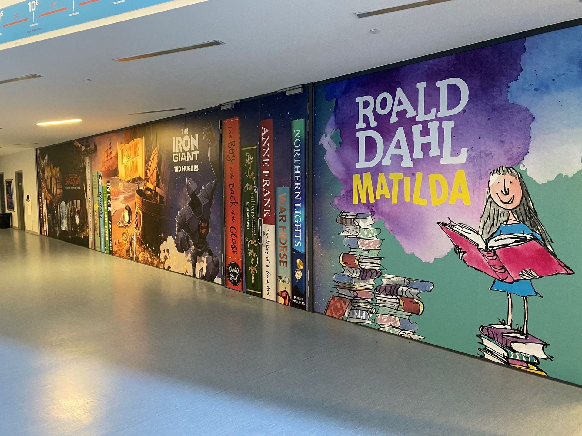
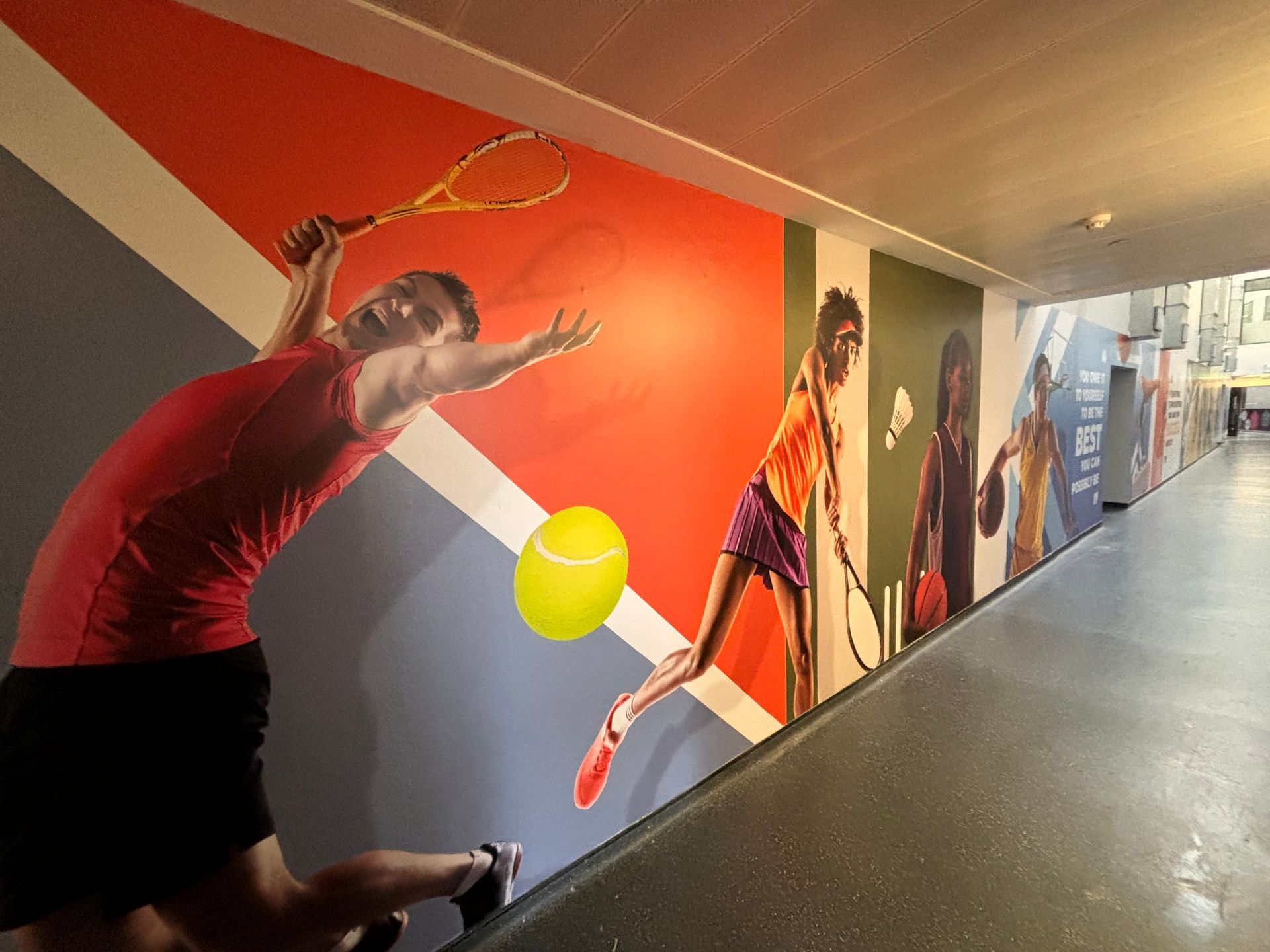
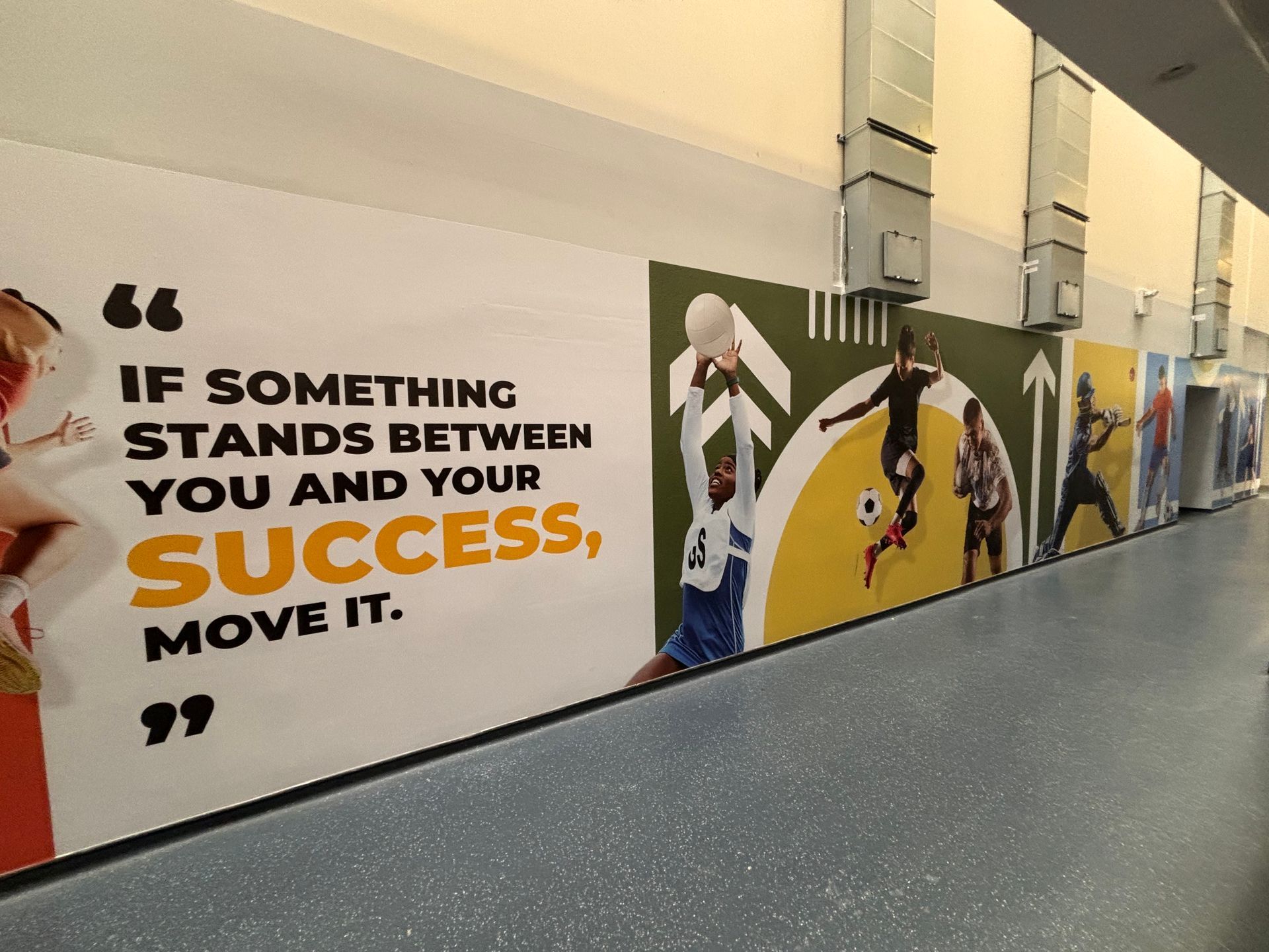
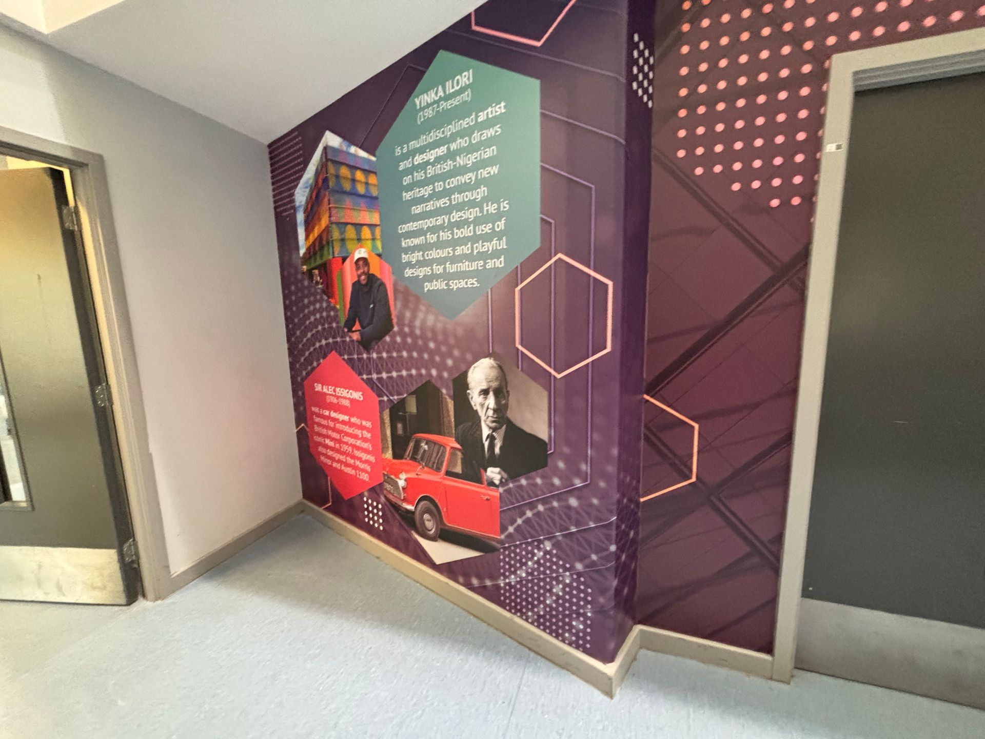
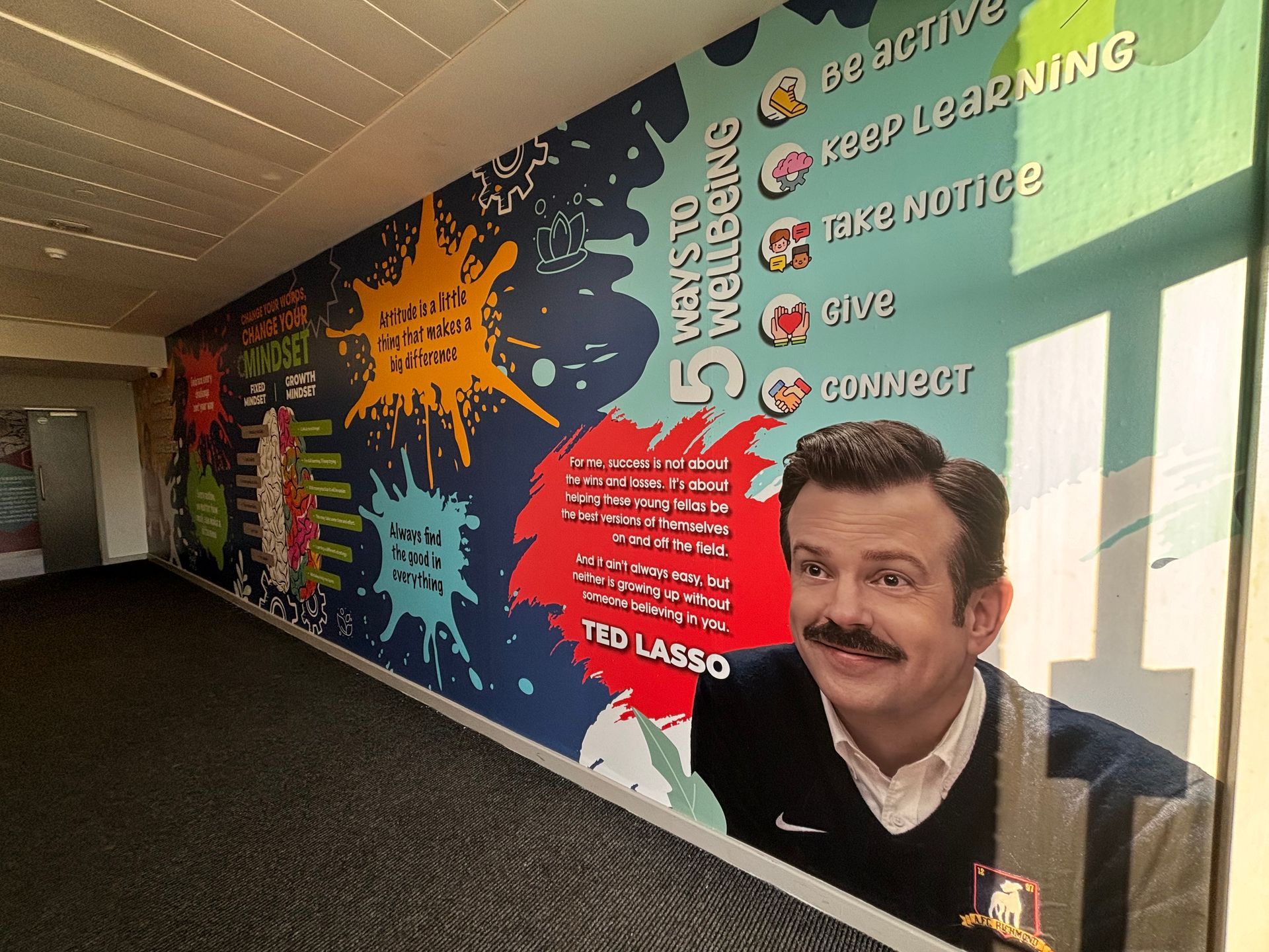
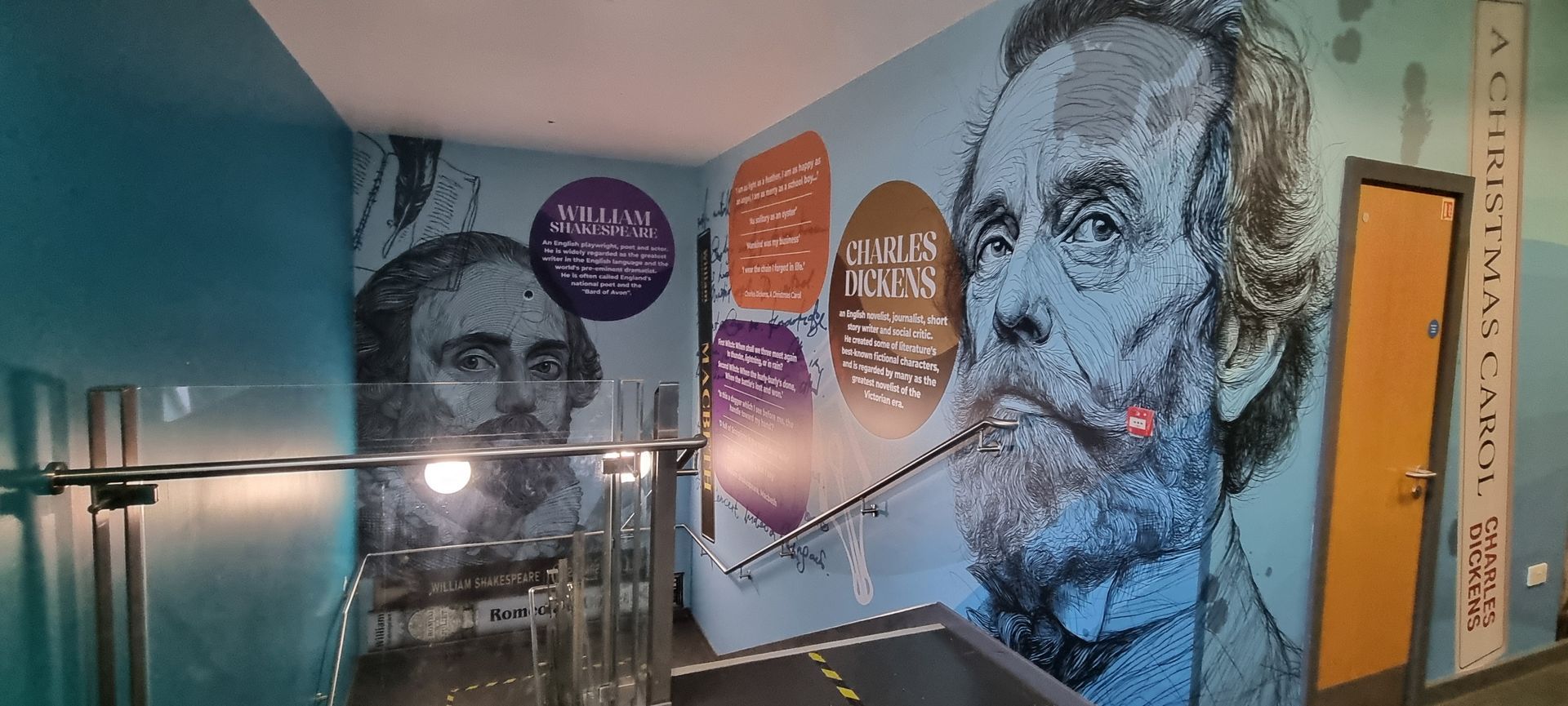
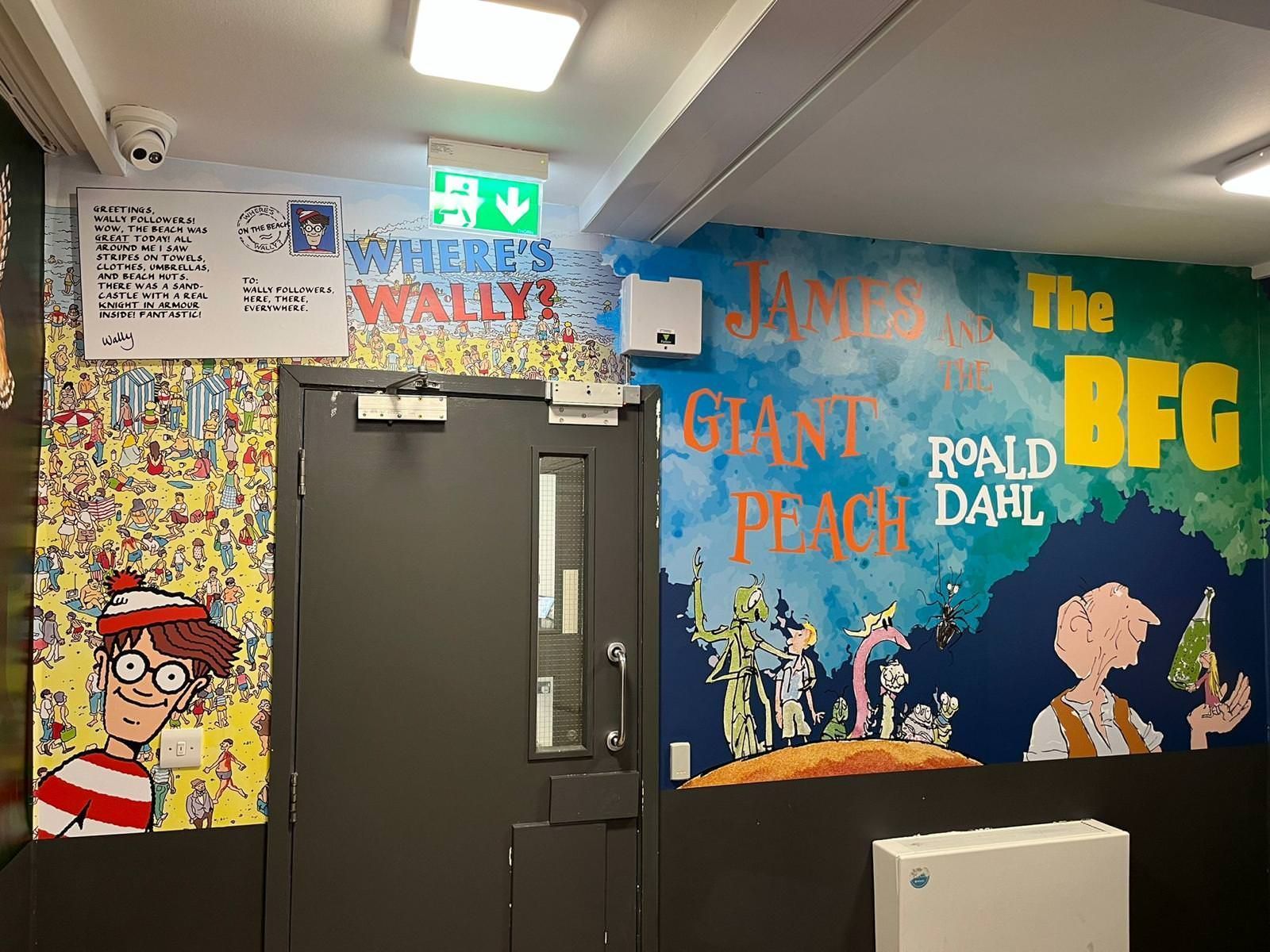
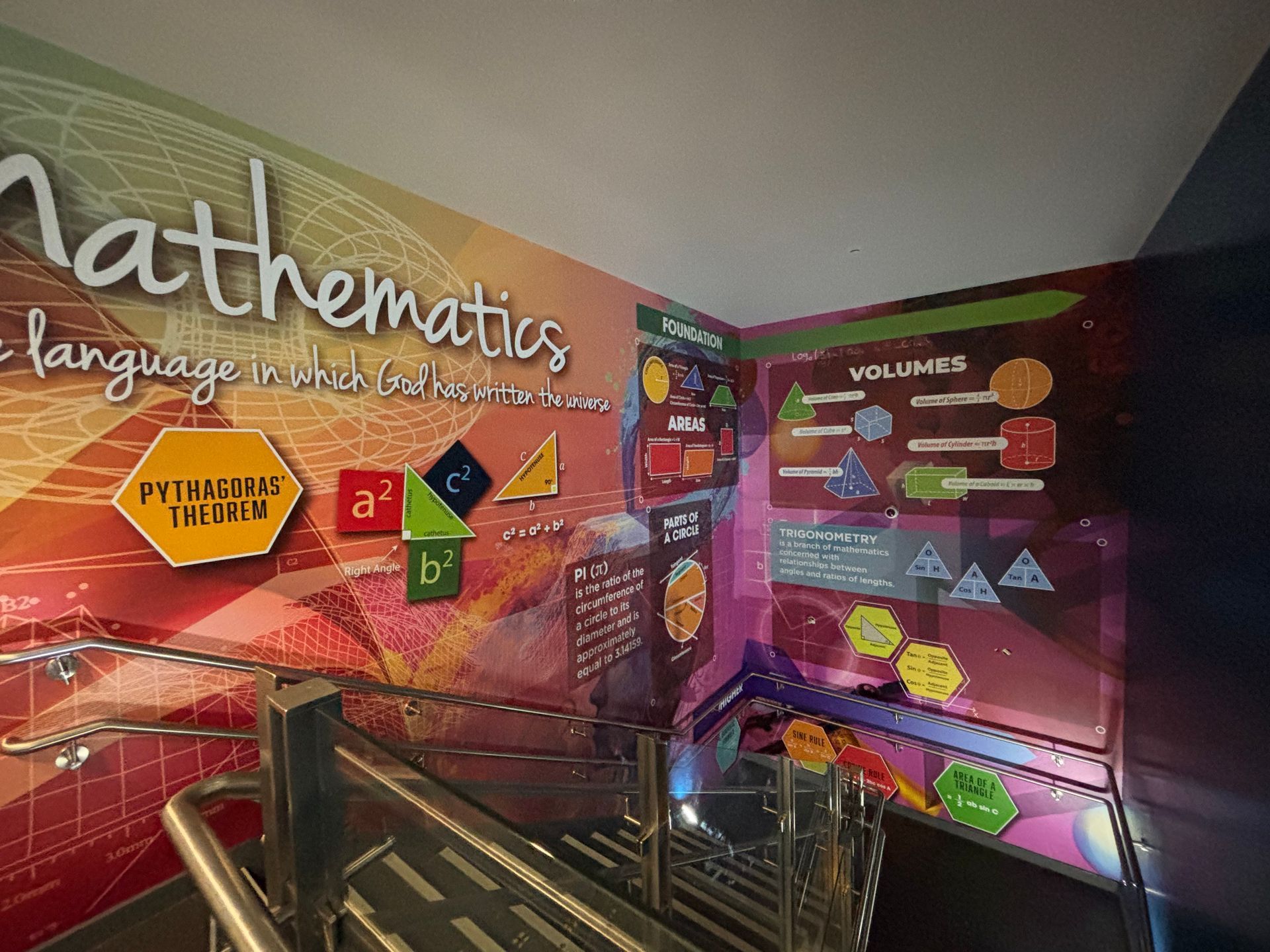
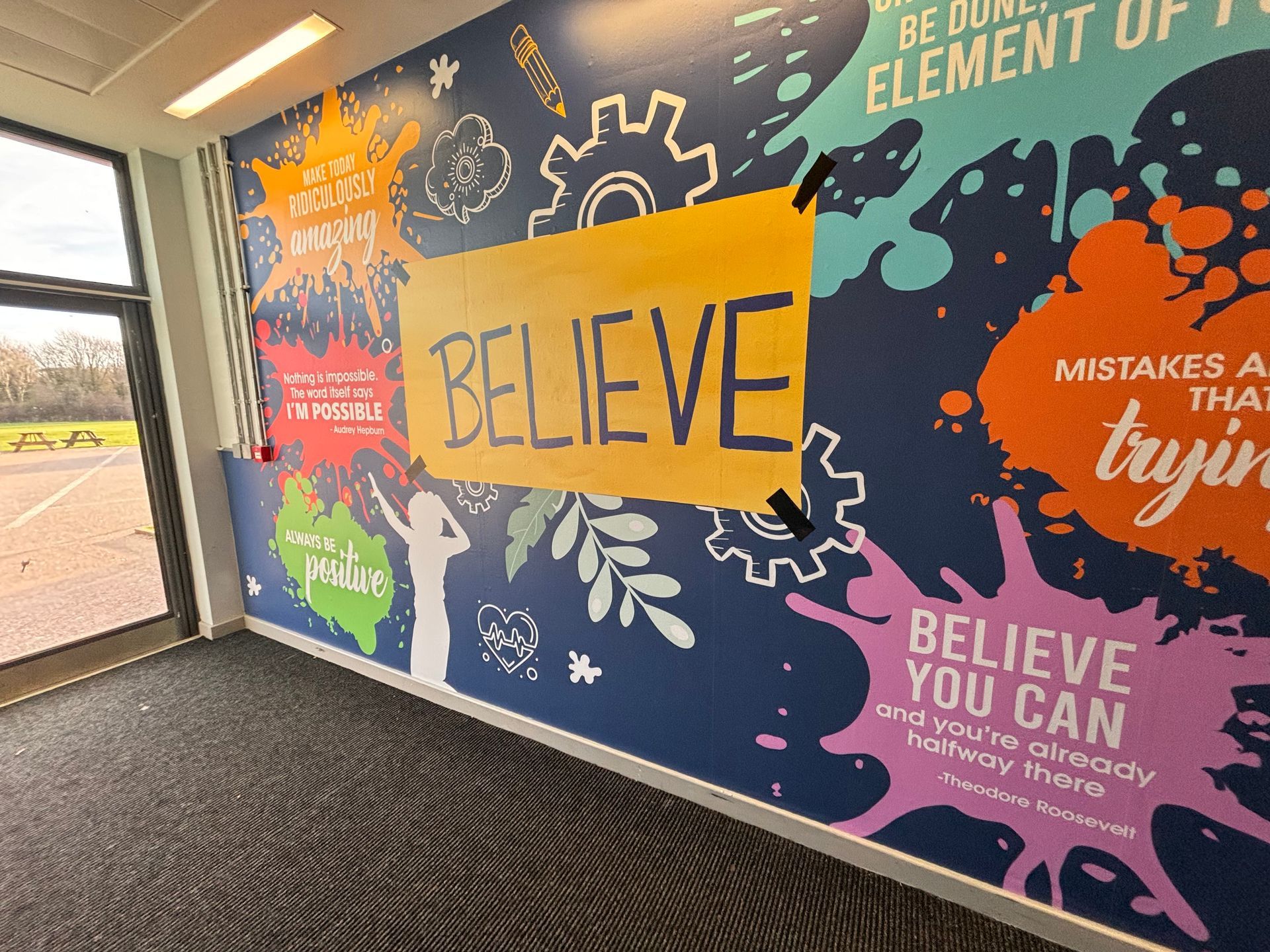
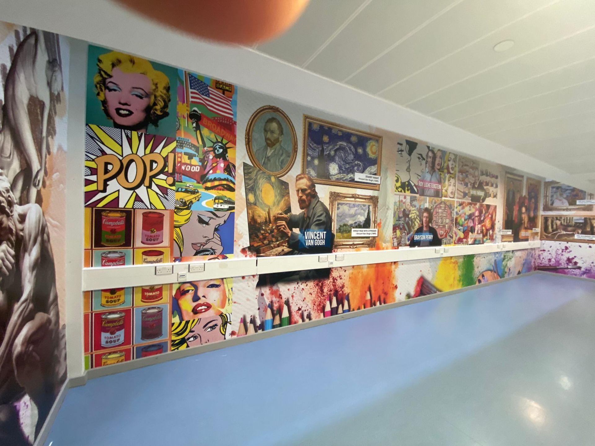
  2. Concept Development: Unique themes were conceptualised for each subject zone based on the curriculum and the age group of the students using the space. For example, the sports zone featured dynamic and motivational themes to energise students, while the art zone used creative and abstract designs to inspire creativity.
  3. Feedback and Iteration: Preliminary designs were reviewed with the school staff to ensure they met educational and aesthetic requirements. Feedback was incorporated iteratively, demonstrating a flexible approach to fully meeting client satisfaction.

Implementation

  • Materials Selection: Materials were chosen to align with our environmental initiatives, ensuring durability and safety without compromising environmental values.
  • Installation Process: The installation was carried out over half term to minimise disruption to the school’s daily activities.


Impact

  • Educational Enhancement: Post-installation feedback indicated a significant positive impact on student engagement and interest. Educators reported increased enthusiasm and participation in zones where the graphics were installed, with students expressing a greater connection with the subject matter.
  • Visual and Aesthetic Improvement: The transformation of educational spaces into more appealing and stimulating environments was evident. The visual appeal of the graphics contributed to a more vibrant school atmosphere.
  • Environmental Contribution: In line with our commitment to environmental stewardship, one tree was planted for each graphic installed, contributing to local reforestation efforts.


Challenges and Resolutions

The project encountered challenges such as aligning designs closely with educational goals and installing large graphics with minimal disturbance. These were overcome through adaptive project management and close communication with school officials, ensuring all installations were executed smoothly without impacting the school schedule.


Future Directions

Building on the success at Maltings Academy, plans are underway to expand our offerings to other educational institutions looking to enhance their learning environments similarly. This project's positive outcomes serve as a robust model for future collaborations.


Conclusion

The project at Maltings Academy stands as a testament to the power of tailored educational enhancements through art. It showcases our ability to merge artistic creativity with functional educational needs, all while supporting environmental sustainability and fostering engaging learning environments.


This case study format provides a comprehensive view of the project from inception to completion and impact, designed to showcase your business's capabilities and successes to potential clients in the educational sector.


Find out more about wall graphics


Click Here
By angel April 17, 2026
You’ve seen it before. A beautiful, vibrant wall display that looked incredible on the day it was installed. Fast forward six months, and the edges are starting to curl. A year later, it’s peeling away at the corners, or the vibrant blues and reds have started to look a little tired and faded. In a busy school environment, "good enough" usually isn't. When you are looking to transform your school corridors, reception areas, or classrooms, it is easy to focus entirely on the design. After all, the design is what tells your story. It’s what inspires your pupils and impresses your visitors. But the material those designs are printed on? That is what determines whether your investment lasts for a decade or ends up in the bin before the next OFSTED inspection. At Cubed Creative , we’ve spent 21 years working inside schools. We know that a corridor isn't just a walkway; it’s a high-traffic zone where hundreds of blazers, backpacks, and wandering hands pass by every single hour. Choosing the right school wall graphics materials is the difference between a long-term asset and a short-term headache. The Science of the "Shrink": Monomeric vs. Polymeric Vinyl If you’ve been gathering quotes for school wall graphics , you might have noticed a significant range in pricing. Often, the "cheaper" quotes are using what we call Monomeric vinyl. To keep it simple: vinyl is made of plasticisers. In monomeric vinyl, these molecules are short and "unbound." Over time, especially when subjected to the fluctuating temperatures of a school building, these molecules migrate. The result? The vinyl literally shrinks. When vinyl shrinks on a wall, it pulls away from the edges. It leaves a sticky, unsightly residue that attracts dust and dirt. It looks poor, and more importantly, it becomes a target for inquisitive fingers to pick at. This is why we champion polymeric vinyl school graphics  Polymeric vinyl is engineered with longer molecular chains. It is far more stable. It doesn't shrink, it doesn't curl, and it stays exactly where we put it. It’s the gold standard for long-lasting school wall displays . When we talk about durability, we aren't just talking about the print staying bright; we’re talking about the material staying bonded to the wall.
By Gary Boad April 6, 2026
The morning rush. You know the one. It is a whirlwind of lost shoes, half-eaten toast, and the ticking clock. Then comes the final hurdle: the school gate.
By angel March 20, 2026
We’ve all been there. It’s 4:00 PM on a Tuesday, you’re armed with a staple gun that’s seen better days, and you’re staring at a vast expanse of blue sugar paper that refuses to stay flat. You want your classroom to be an inspiring hub of learning, but by the time the final border is pinned, it looks more like a chaotic explosion in a stationery shop. At Cubed Creative, we’ve spent the last 21 years helping schools transform their environments. We’ve seen the good, the bad, and the "why is that poster from 1994 still there?" The truth is, your walls are more than just partitions between rooms. They are silent teachers. When used correctly, school wall graphics can boost engagement and reinforce key concepts. When used poorly, they become a distracting mess that hinders focus. Here are the seven most common mistakes schools make with classroom wall displays, and, more importantly, how you can fix them. 1. The "Everything but the Kitchen Sink" Approach There is a common misconception that a "good" classroom is a covered classroom. We feel the urge to fill every square inch of brickwork with posters, bunting, and student work.  The Mistake: Visual overload. Research suggests that heavily decorated classrooms can actually decrease student performance. When every wall is screaming for attention, the brain struggles to filter out the noise. This leads to cognitive overload, particularly for pupils with SEND or sensory processing sensitivities. The Fix: Aim for the 20% rule. Keep at least 20% of your wall space clear. This "white space" gives the eyes a place to rest and allows the important displays to actually stand out. Think quality, not quantity.
By angel March 2, 2026
An Open Evening is not just an event on the calendar. It is a defining moment. Before the results are discussed. Before the curriculum is explained. Before questions are asked. Families are already forming an opinion. And your environment is leading that conversation. The Challenge: You Only Get One First Impression When parents walk through your doors, they are looking for reassurance. Is this school calm? Is it ambitious? Does it feel purposeful? Will my child belong here? A blank wall is a mystery. An inconsistent board confuses. A wall that has not changed for months or years is an indicator that communication with the wall is not important. But clear, intentional design builds confidence immediately. Your space either reinforces your message — or distracts from it.
By Gary Boad February 21, 2026
Step into any hallway at school. Something sits there before any text shows up at all. Quiet. A spark of drive. Heat in your steps. Yet at times, everything feels too heavy to carry A flash of colour stirs something deep, almost right away. Inside classrooms, that instinctual reaction holds weight - greater than many allow themselves to see. What keeps people okay isn't only rules or school counsellors. It shows up in each part of the daily world that kids navigate.
By angel February 13, 2026
A school hallway might hold paintings, award posters, and a time chart. Imagine stepping inside a quiet hallway. What happens if young learners find themselves wandering past moments from long ago? Every day, history timeline walls quietly spark interest. They transform ordinary rooms into moments where people pause, talk, and wonder. Curiosity grows without fanfare. Culture comes alive through simple displays. Conversations start where none were expected.
By angel February 7, 2026
Before a single word is spoken, a school has already started talking. From the moment someone steps through the doors, the environment sends signals. Calm or cluttered. Confident or uncertain. Purposeful or forgotten. These first impressions shape how visitors feel — and how much trust they place in the school.
By angel January 31, 2026
Giving pupils a visible voice in their school What kids think shows up on those walls - transparent, seen, shared. Their thoughts take shape in ways others can notice. This place proves voices count, without saying it outright. Not tucked away. Right there on the walls.
More Posts

Back to home