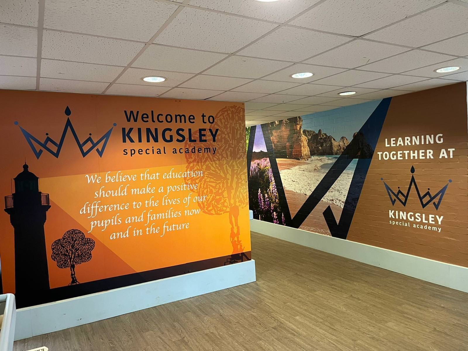
Designing for Wellbeing: What Pupils See Affects How They Feel

Hours fade fast when school never ends. Classrooms hold them tight, then hallways pull them forward, lines forming where doors once stood, faces repeating like seasons that won't turn. Feelings start to mould themselves into every corner, brick by quiet brick. Around them, little things shape how kids feel day by day. Moments like these add up without making a noise. Their inner world shifts because of colours on the walls, soft lighting, or quiet corners. Noticing this helps understand what goes unseen.
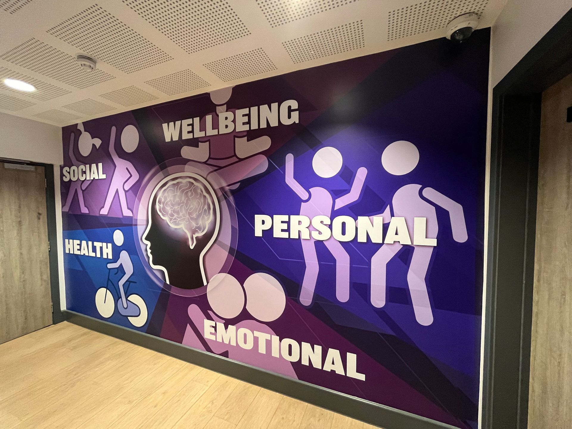
Beyond lessons or assemblies, wellbeing shows up in how classrooms feel. Quiet corners support concentration because students sense they belong. When areas get messy or complicated to navigate, anxiety often follows close behind. A single detail might shape how a space feels more than anyone expects. Not everyone sees it coming.


Emotion shifts with the world around us

  • Out of sight does not mean out of mind - kids absorb sights whether they notice them or not. What they see ties into words and pictures, showing how a room can hint at use and expectation. A quiet space that makes sense tends to steady feelings, give room for thought, and sometimes boost confidence about future steps.
  • What you see shapes how sure you feel. Knowing where to head, what comes next, or what a room stands for brings calm. This matters more when kids are small or struggling in loud, active spaces. Order helps quiet the nerves. When this happens, what's around might help calm things down rather than make them worse.


How thoughtful design supports wellbeing

  • Walls don't need to shout facts. What matters is picking moments that fit how students feel at different times. One thing that shifts mood? The shades on the walls. Warm, gentle light works quietly on thoughts, bringing stillness into areas where chaos might otherwise build.
  • What we say holds weight, too—simple words, often brief, when kids get them, way stronger than drawn-out talks. Tone shifts toward help, not tell. Quiet encouragement slips in easier than lectures ever did. If sentences sound warm and straightforward, kids often lean in without thinking, quietly absorbing what they say.
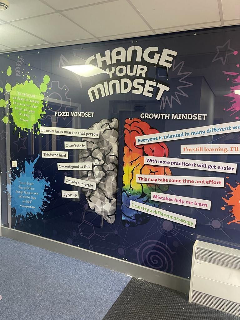
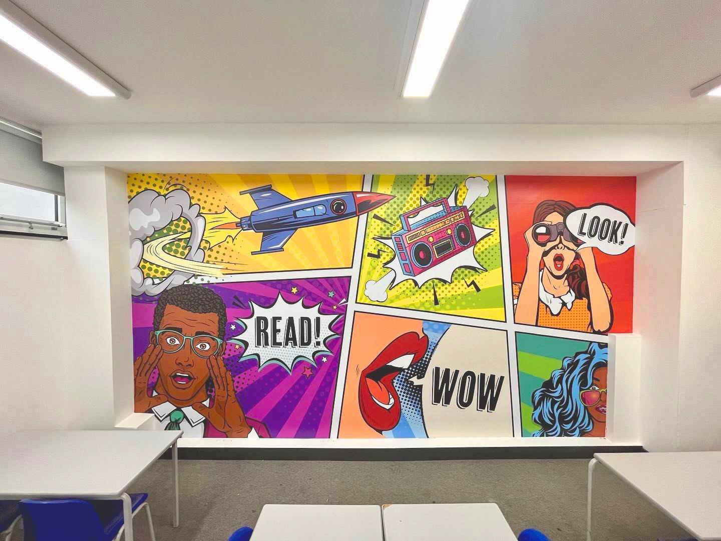
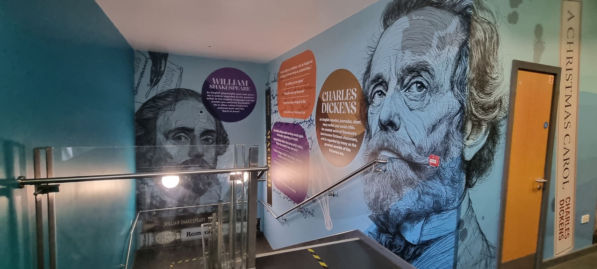
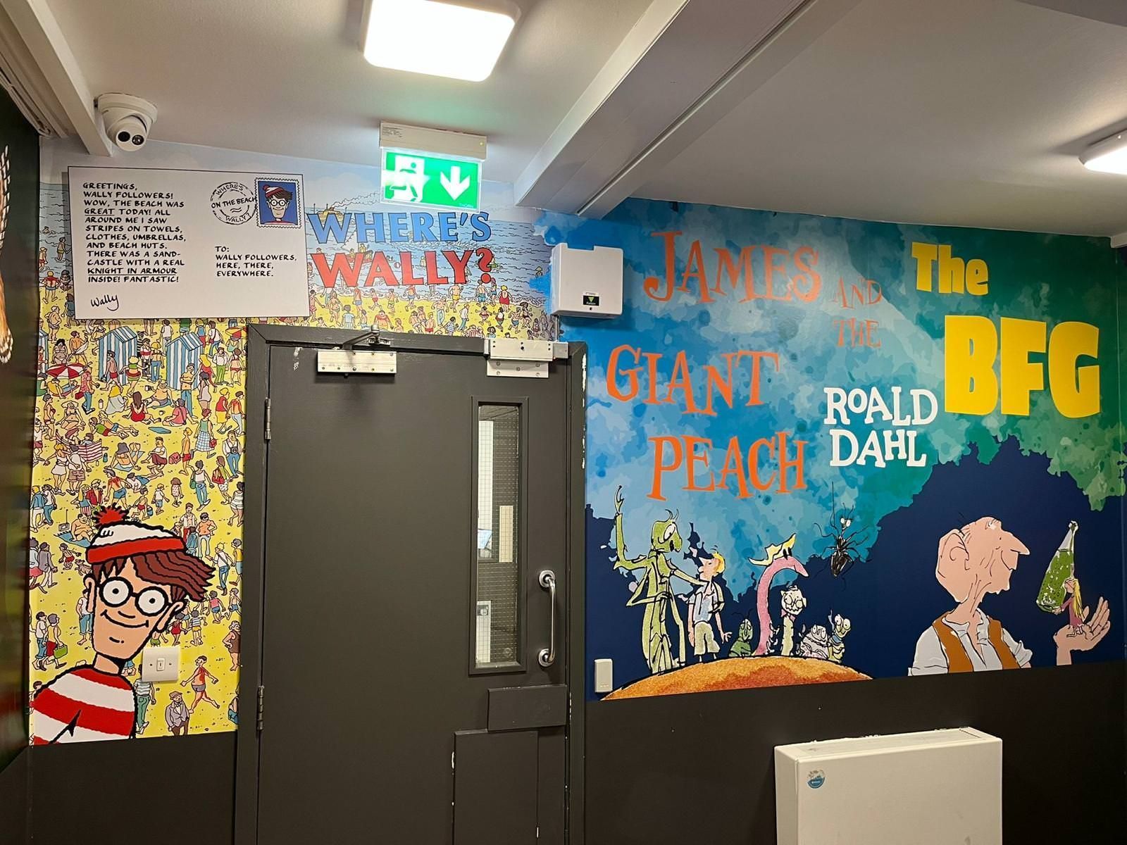
Pictures matter here, too. Show scenes where learners recognise themselves and feel they belong. What appears on screen must support the room's intent rather than pull focus away; where kids sit matters just as much. A soft nudge near the peaceful corner, or a cheerful message by the entrance where they queue, holds them steady - never loud, always present.


What this looks like in real schools

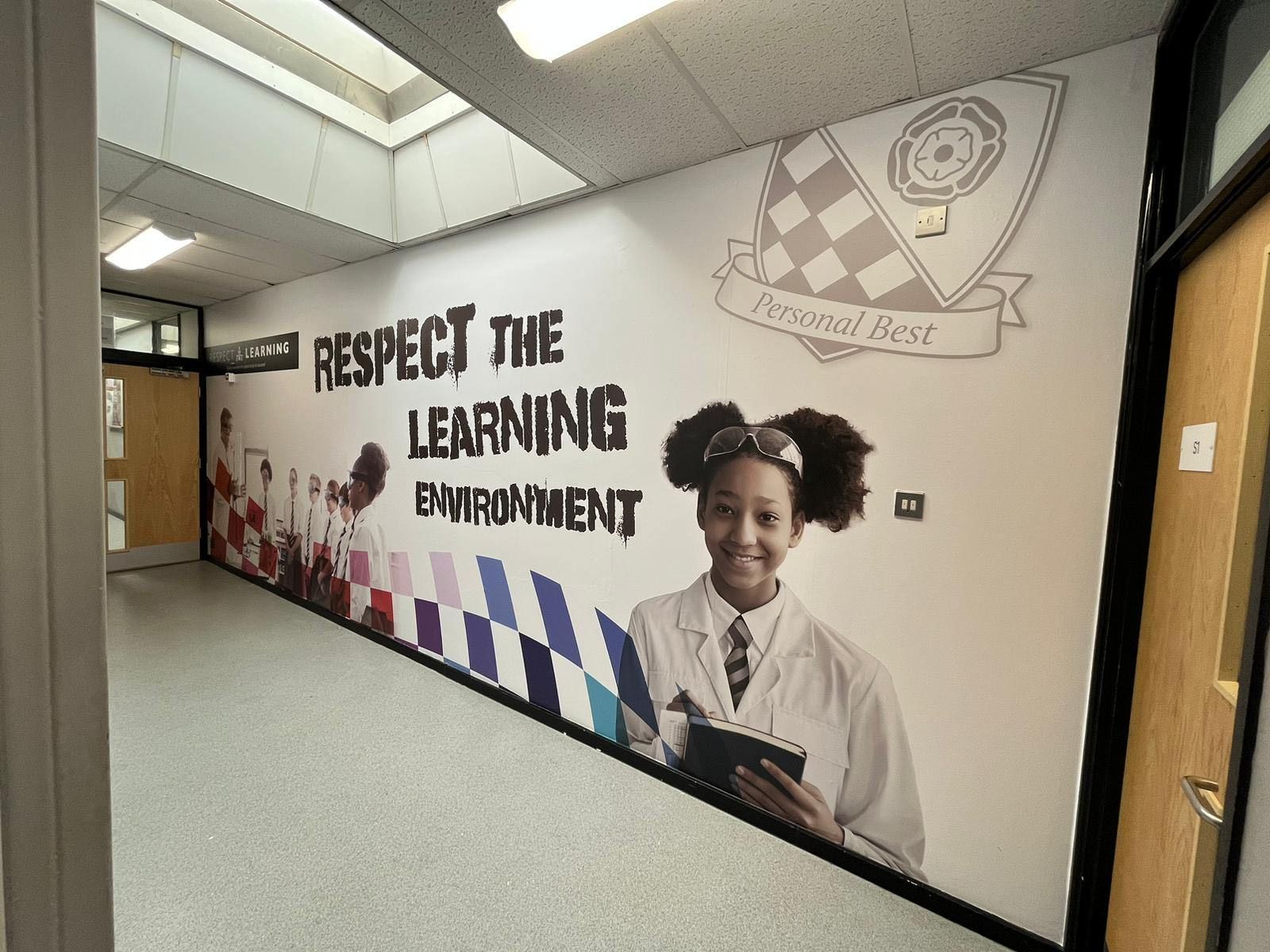
  • Down hallways, places buzz with motion. Often they seem fast, loud, and even tense. A well-placed visual cue might ease that tension - guiding movement quietly through space. Colours placed evenly do more than please the eyes; they steady thoughts. Words emphasising care and thoughtfulness shift the atmosphere without sound.
  • Inside nurture rooms or wellbeing spaces, choices about layout do quiet work. Safety shows up in shapes of soft pictures, gentle words, one after another. Calm grows where images breathe rather than rush, supporting how kids feel held. What matters most sticks around if it lives inside the classroom, not just stuck on a wall. Seeing school values each morning makes them real for students, shaping choices without them even noticing.


Lasting effects

  • Slowly, how something is built starts guiding what people do and think. When kids are around, familiar spaces help them settle - this eases schoolwork and daily moods. Teachers look at neat hallways or shared areas and quietly nod; it matches the effort they show each day.
  • People see it right away. Step inside, and that still, orderly school space carries a sense of calm. You feel it the moment you enter. Such places shape how students act, think, and grow - even if nobody shouts rules. Their effect lingers, soft but steady. Quiet efforts can matter just as much when it comes to wellbeing. Its most decisive moments usually happen without drawing attention.


Every day carries weight, even small ones.

  • What kids notice each day might matter more than big plans. Could their environment quietly shape how they feel? It could be simply asking whether the atmosphere makes sense to them. Messages might seem evident to staff yet confusing to students. Quiet moments in hallways or classrooms - are those really present? Can the walls somehow mirror what the school holds dear - its core beliefs, even?
  • A quiet thought shapes spaces where children find comfort and belonging, then turn their attention to learning. At Cubed Creative, school signs begin with students first. With each creation comes a tree added somewhere in the world - no fanfare, just a gift rooted in long-term care 🌳. Little tweaks in layout might shift how students experience school each morning. That shift? Often larger than expected.


Everyday moments carry the weight of wellbeing (Conclusion)

  • Small daily moments shape how people feel day by day. These things happen while kids move between classes, half-unaware, just existing. Pupil happiness grows when rooms seem quiet, smooth, open - not tight or messy. Safety comes first, then calmness settles, and only later comes real attention to lessons.
  • A sense of belonging grows without fanfare through thoughtful design choices. Values show up in how things are laid out, steering actions quietly but firmly. Pupils begin to see where they fit - not from speeches, but from repeated visual cues around them. Staff find comfort in familiar layouts, as does anyone stepping onto campus. Slowly, these details stitch together an atmosphere that lasts.


A quiet move ahead

  • Peer connections often shape daily moods more than teachers realise. Think about the last time you walked into your classroom - what caught your eye first? Were it posters that felt out of place, or images that somehow mirror the atmosphere you aim to create? Walls hold messages, whether painted deliberately or left untouched over the years. Moments of stress might rise when clutter piles up near windows, where light could ease tension instead. Confidence grows quietly when names on notices are spelt correctly every single morning. Belonging takes root simply because one classroom voice felt heard during group discussions earlier that week.
  • What happens inside Cubed Creative often starts with talks at local schools. Wall designs take shape through ideas about how children feel, act, and grow. Each design goes through steps that prioritise young minds. When a new installation goes live, a tree gets added somewhere - one for each place it appears. The forest grows quietly alongside your walls.
  • We could discuss how careful planning can help boost overall comfort in your school setting.
By Gary Boad July 15, 2026
Why Cubed Creative Is the Ultimate Choice for School Wall Graphics
By angel July 2, 2026
Let’s be honest. When you walk into a top-tier private school, you feel it immediately. It’s in the air. The walls don’t just hold up the ceiling; they tell a story. They breathe excellence. But here is the secret most school leaders don’t realise: You don’t need a private school endowment to get that feeling. At Cubed Creative, we’ve spent 21 years working inside the UK education sector. We’ve seen the "before" and "after" of hundreds of state schools. We know that with a bit of strategy, the right materials, and a focus on high-impact areas, you can make a 1970s brick corridor look like a modern academy of the future. This isn't about spending more. It’s about spending smarter. Here is your insider guide to making your school look expensive on a state-school budget. 1. The "First Five Seconds" Rule  You only get one chance to make a first impression. In the design world, we call this the "threshold experience." When a prospective parent, an Ofsted inspector, or a new pupil walks through your front doors, what do they see? If it’s a cluttered noticeboard with curled-up sugar paper and Blu-Tack marks, the "expensive" vibe is already dead. Focus your budget on the Reception and Entrance. Instead of ten small posters, go for one massive, floor-to-ceiling wall graphic . A single, high-quality focal point creates an immediate sense of scale and professionalism. It suggests that the school is organised, well-funded, and proud of its identity.
By angel June 5, 2026
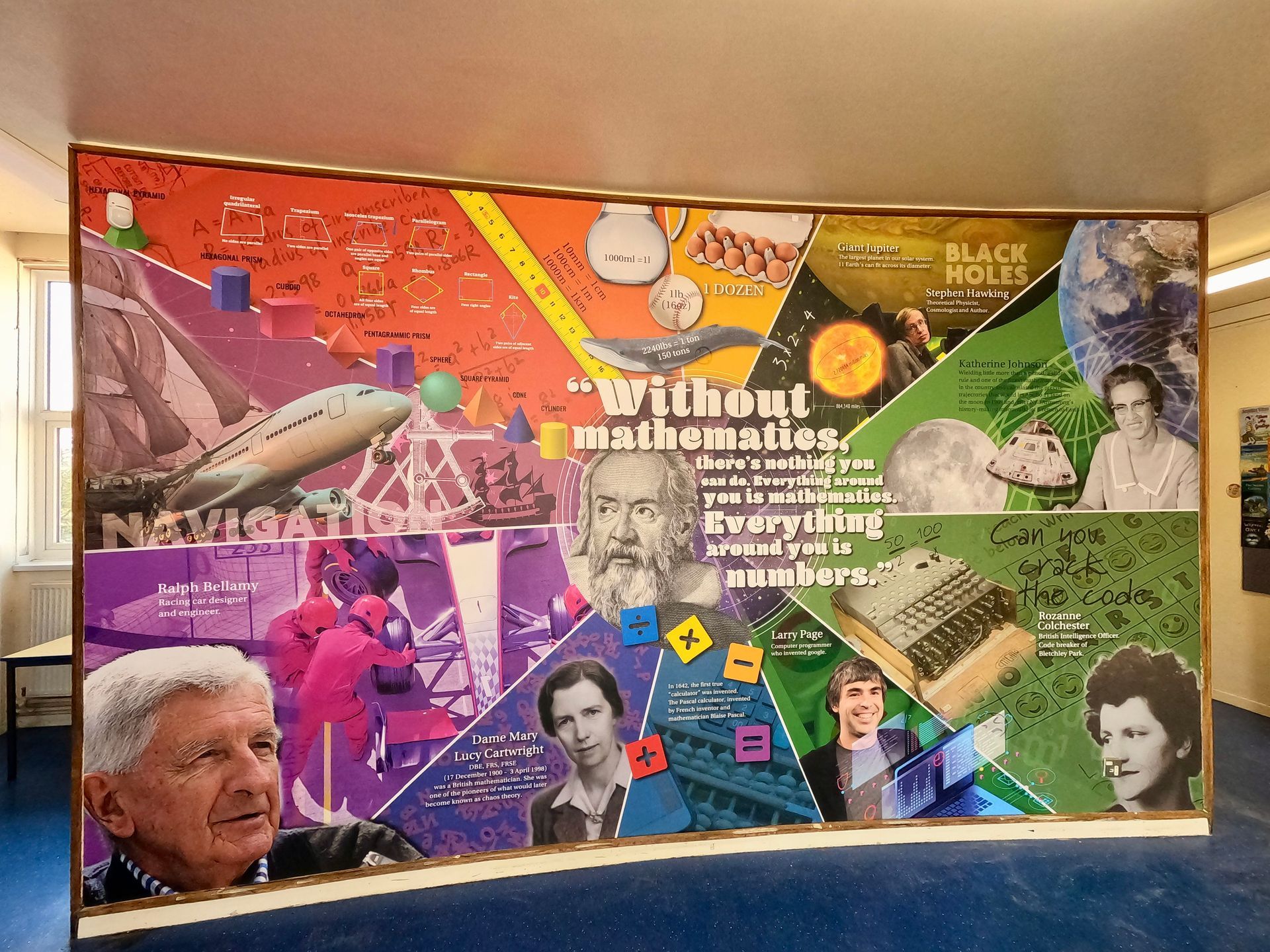
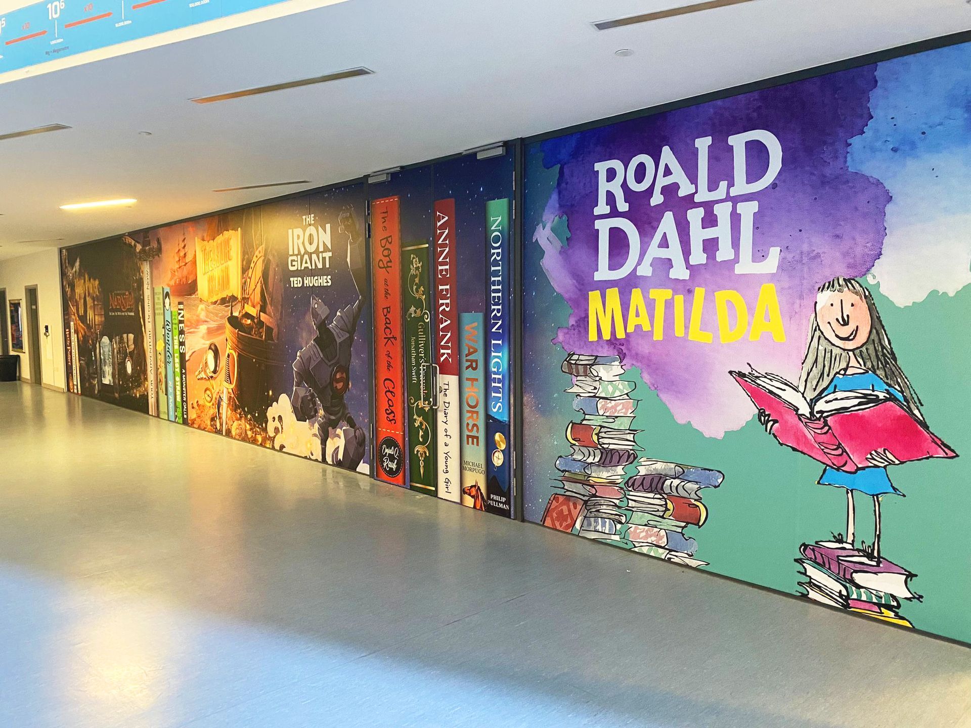
Summer is approaching. For school business managers and headteachers, this usually means one thing: the maintenance list. At the top of that list is almost always the corridors. They are the arteries of your school. Thousands of footsteps, bags dragging against walls, and the inevitable "scuff marks" that appear within weeks of a fresh coat of paint. You face a choice. Do you book the painters for another round of the "paint cycle," or do you look for a solution that actually lasts? At Cubed Creative, we’ve spent 21 years working inside schools. We’ve seen the difference between a corridor that is simply "clean" and one that is truly "inspiring." When you compare professional school wall graphics to fresh paint, the winner isn't just about aesthetics: it’s about your budget, your pupils, and your peace of mind. The Problem with the "Paint Cycle" We all know the routine. You spend a significant portion of your maintenance budget on a fresh coat of emulsion or eggshell during the summer holidays. By October half-term, the first scuffs appear. By Easter, the walls look tired again. This is the paint cycle . It’s a recurring expense that never actually solves the problem of a dull environment. While paint is the "standard" choice, it lacks the durability needed for high-traffic school environments. It doesn't offer protection against the daily wear and tear of a busy secondary school or the energetic movements in a primary hallway. More importantly, paint is silent. It doesn't teach, it doesn't guide, and it doesn't inspire. Why Wall Graphics Are the Long-Term Winner When we talk about wall art for schools , we aren't just talking about "stickers." We are talking about high-grade, laminated vinyl wraps designed specifically for heavy-duty use. 1. Durability that Defies the Corridor Our school wall graphics are finished with a protective laminate. This makes them incredibly tough. They are scuff-resistant and, perhaps most importantly for school staff, wipe-clean. Sticky fingerprints? Scuff marks from a backpack? They wipe right off. Unlike paint, which absorbs dirt and eventually chips, our graphics maintain their "just installed" look for years. When you look at the lifecycle cost, investing in graphics once every 5–7 years is far more cost-effective than repainting every year. 2. Turning "Dead Space" into Learning Space  A painted wall is a missed opportunity. Corridors are the perfect place for passive learning . Imagine your pupils walking to their next lesson surrounded by a giant timeline of British history, or a literacy-themed corridor featuring the spines of classic novels. You aren't just decorating; you are teaching. By using bespoke wall art , you can reinforce the curriculum outside the classroom. From Science and STEM displays to school values and maps, the educational value is immense.
By angel May 29, 2026
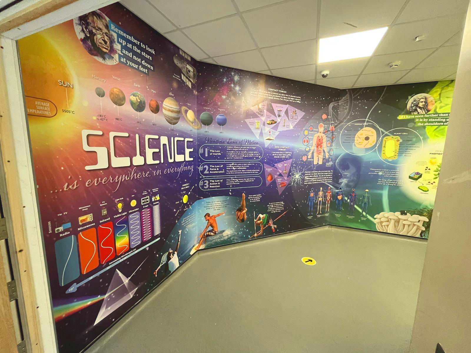
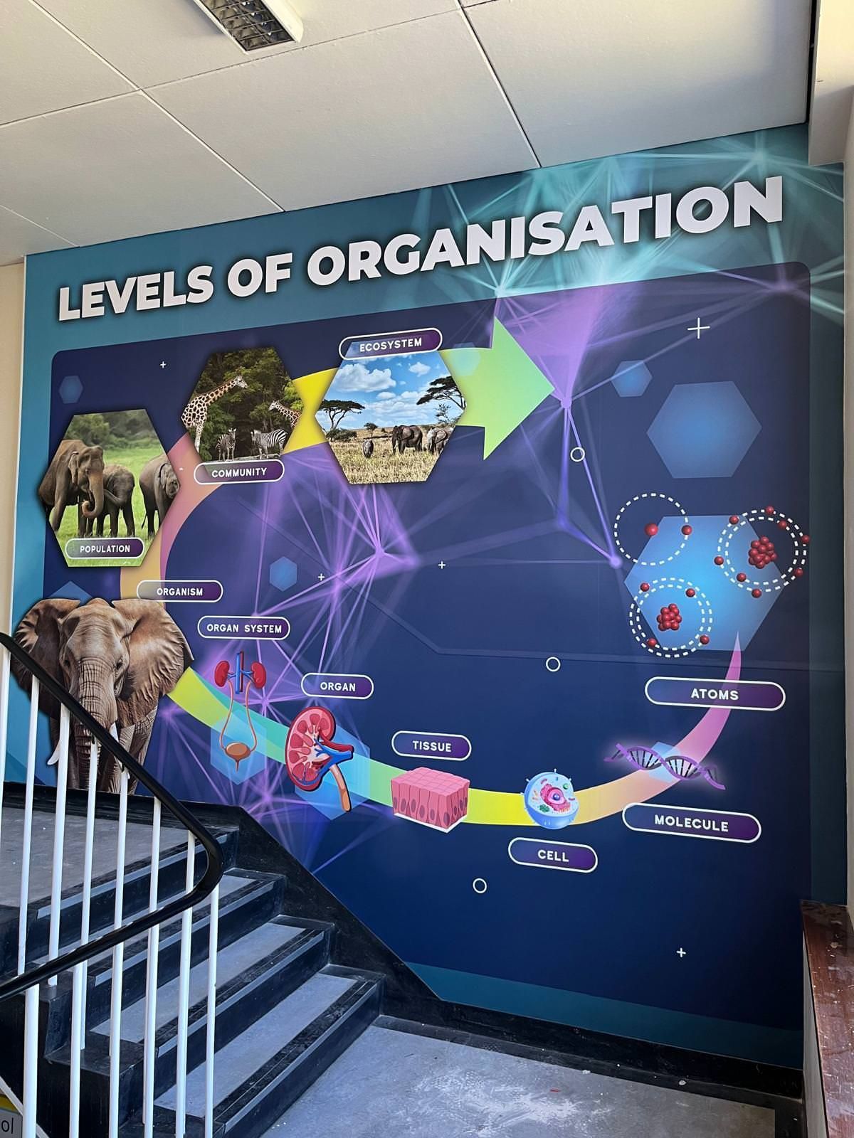
Walk through your school corridors during lesson time. It’s quiet. The doors are closed, and the heavy lifting of teaching is happening inside the classrooms. Or so it seems. But what about the walls around you? Those vast, often empty expanses of brick and plaster aren't just structural. They are constantly communicating. They are teaching, even when no one is speaking. In educational psychology, this is known as the ‘Silent Teacher.’ It is the idea that the physical environment: the colours, the displays, the signage, and the layout: shapes student behaviour and learning outcomes without a single word being uttered. At Cubed Creative , we’ve spent 21 years helping schools understand that their walls are their most underutilised educational asset. When you look at school wall graphics , you shouldn't just see decoration. You should see a pedagogical tool. The Psychology of the Learning Environment Your pupils spend roughly 15,000 hours in school across their academic journey. Most of that time is spent navigating the physical environment. The ‘Silent Teacher’ concept suggests that students are sponges for their surroundings. If a corridor is drab, grey, and cluttered with peeling posters, the message is one of low expectations and neglect. If that same corridor is vibrant, organized, and filled with bespoke wall art , it signals that the space: and the people in it: are valued. Reducing Cognitive Load There is a delicate balance to strike. Research into school behaviour and corridor design shows that while visual stimulation is vital, "visual noise" can be distracting. The key is intentionality. Purposeful visuals: Anchor charts, timelines, and key vocabulary support memory. Calming palettes: Blues and greens can help regulate energy levels during busy transition periods. Clarity: Clear, professional signage reduces anxiety by helping pupils feel oriented. Every graphic should "earn its place" on the wall. It must either inspire, inform, or guide. 
By angel May 15, 2026
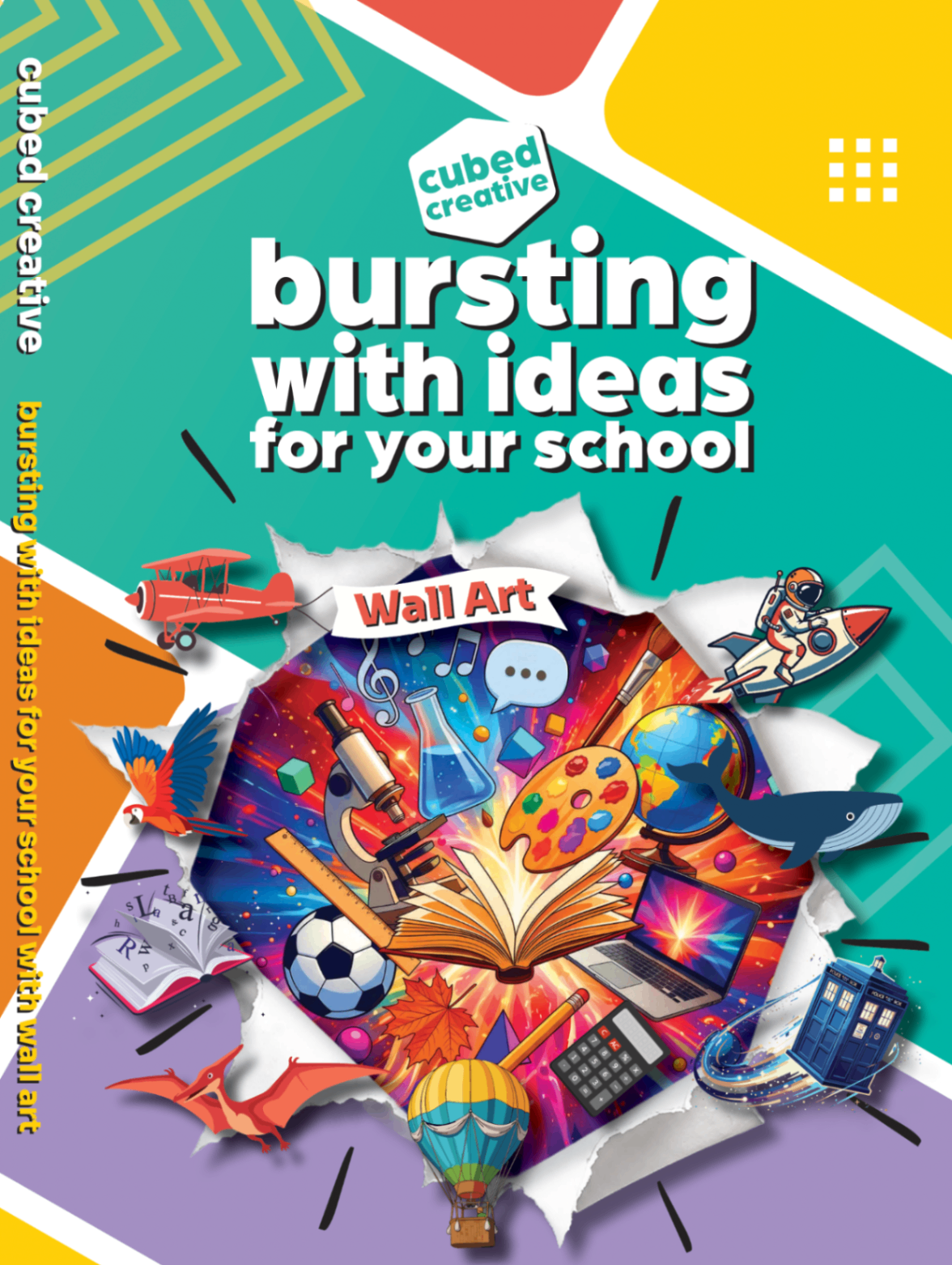
As we move through the middle of the school year, your thoughts are likely already drifting toward the summer holidays. Not just for the much-needed break, but for the opportunity it brings. When the corridors fall silent and the classrooms sit empty, your building finally has the chance to breathe. This is the window for the "September Reset" , that magical moment when students return to find their environment transformed, sparking a renewed sense of pride and curiosity. At Cubed Creative, we’ve spent the last few months working on something special to help you plan that transformation. We are thrilled to announce the launch of our brand new 2026 School Wall Art Brochure . It’s more than just a catalogue of past work; it’s the ultimate guide for a "September Reset" . It’s a toolkit for school leaders who want to move beyond tired noticeboards and plain magnolia walls. It’s packed with fresh inspiration, curriculum-linked designs, and the practical details you need to make a project happen during the summer break. Why Now? The Power of the September Reset The environment your pupils walk into on that first Tuesday in September sets the tone for the entire academic year. It’s a physical manifestation of your school’s expectations, its warmth, and its ambition. A "September Reset" isn’t just about making things look "pretty." It’s a strategic move to: Reinforce school values from the moment a child enters the gates. Reduce anxiety by creating calming, supportive spaces for wellbeing. Boost learning by turning "dead space" into passive learning zones. Improve behaviour through high-quality environments that show students they are valued. By planning your Summer wall art now, you ensure that all the heavy lifting: the design, the printing, and the installation: happens while the school is empty. You get the "wow factor" without any disruption to the school day. 21 Years of Creative Excellence When you’re looking for a partner to transform your school, experience matters. We’ve been working in the education sector for 21 years. Over those two decades, we’ve seen trends come and go, but our core mission has remained the same: to create environments that inspire. We understand the unique pressures of the UK education system. We know that budgets are tight, timelines are non-negotiable, and the materials used need to be "school-proof." Our 21 years of expertise mean we don’t just "put stickers on walls": we understand how to design for impact and install for longevity. What’s Inside the 2026 Brochure? The new brochure is designed to help you navigate the different ways wall art can support your School Improvement Plan. Here’s a sneak peek at the key areas we cover:
By angel April 17, 2026
You’ve seen it before. A beautiful, vibrant wall display that looked incredible on the day it was installed. Fast forward six months, and the edges are starting to curl. A year later, it’s peeling away at the corners, or the vibrant blues and reds have started to look a little tired and faded. In a busy school environment, "good enough" usually isn't. When you are looking to transform your school corridors, reception areas, or classrooms, it is easy to focus entirely on the design. After all, the design is what tells your story. It’s what inspires your pupils and impresses your visitors. But the material those designs are printed on? That is what determines whether your investment lasts for a decade or ends up in the bin before the next OFSTED inspection. At Cubed Creative , we’ve spent 21 years working inside schools. We know that a corridor isn't just a walkway; it’s a high-traffic zone where hundreds of blazers, backpacks, and wandering hands pass by every single hour. Choosing the right school wall graphics materials is the difference between a long-term asset and a short-term headache. The Science of the "Shrink": Monomeric vs. Polymeric Vinyl If you’ve been gathering quotes for school wall graphics , you might have noticed a significant range in pricing. Often, the "cheaper" quotes are using what we call Monomeric vinyl. To keep it simple: vinyl is made of plasticisers. In monomeric vinyl, these molecules are short and "unbound." Over time, especially when subjected to the fluctuating temperatures of a school building, these molecules migrate. The result? The vinyl literally shrinks. When vinyl shrinks on a wall, it pulls away from the edges. It leaves a sticky, unsightly residue that attracts dust and dirt. It looks poor, and more importantly, it becomes a target for inquisitive fingers to pick at. This is why we champion polymeric vinyl school graphics  Polymeric vinyl is engineered with longer molecular chains. It is far more stable. It doesn't shrink, it doesn't curl, and it stays exactly where we put it. It’s the gold standard for long-lasting school wall displays . When we talk about durability, we aren't just talking about the print staying bright; we’re talking about the material staying bonded to the wall.
By Gary Boad April 6, 2026
The morning rush. You know the one. It is a whirlwind of lost shoes, half-eaten toast, and the ticking clock. Then comes the final hurdle: the school gate.
By angel March 20, 2026
We’ve all been there. It’s 4:00 PM on a Tuesday, you’re armed with a staple gun that’s seen better days, and you’re staring at a vast expanse of blue sugar paper that refuses to stay flat. You want your classroom to be an inspiring hub of learning, but by the time the final border is pinned, it looks more like a chaotic explosion in a stationery shop. At Cubed Creative, we’ve spent the last 21 years helping schools transform their environments. We’ve seen the good, the bad, and the "why is that poster from 1994 still there?" The truth is, your walls are more than just partitions between rooms. They are silent teachers. When used correctly, school wall graphics can boost engagement and reinforce key concepts. When used poorly, they become a distracting mess that hinders focus. Here are the seven most common mistakes schools make with classroom wall displays, and, more importantly, how you can fix them. 1. The "Everything but the Kitchen Sink" Approach There is a common misconception that a "good" classroom is a covered classroom. We feel the urge to fill every square inch of brickwork with posters, bunting, and student work.  The Mistake: Visual overload. Research suggests that heavily decorated classrooms can actually decrease student performance. When every wall is screaming for attention, the brain struggles to filter out the noise. This leads to cognitive overload, particularly for pupils with SEND or sensory processing sensitivities. The Fix: Aim for the 20% rule. Keep at least 20% of your wall space clear. This "white space" gives the eyes a place to rest and allows the important displays to actually stand out. Think quality, not quantity.
More Posts

Back to home