Walk down a typical secondary school corridor at ten past eleven on a Tuesday morning. What do you hear? Chatter, footsteps, locker doors slamming, the distant ring of a bell. What do you see? Scuffed magnolia paint, chipped corners, and hastily pinned notices peeling off tired pinboards.
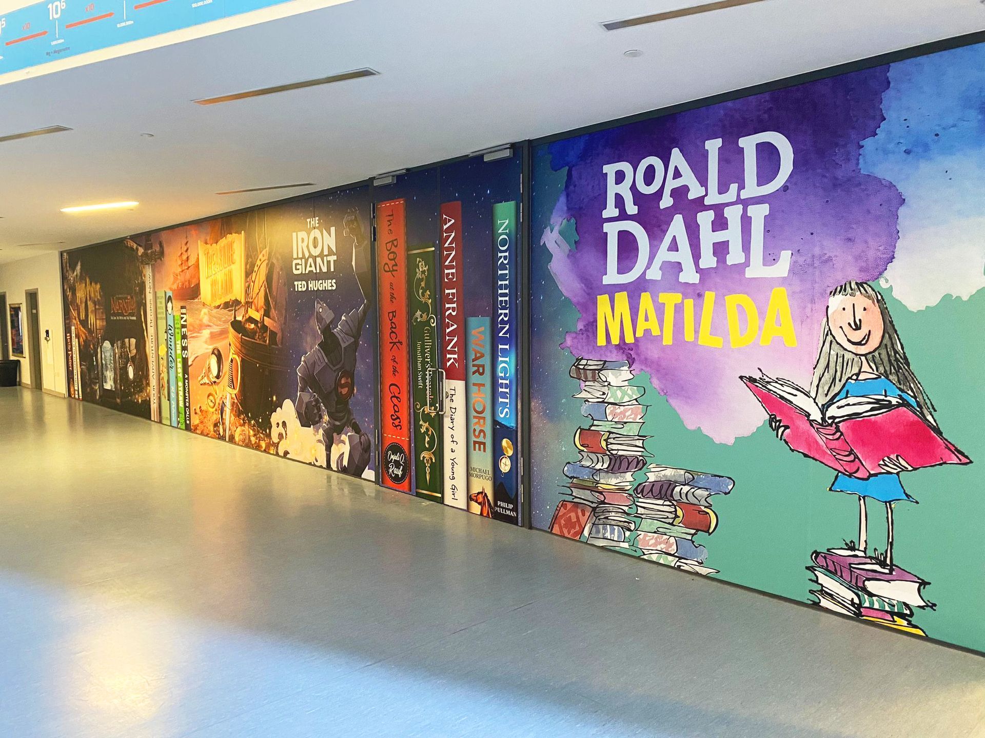
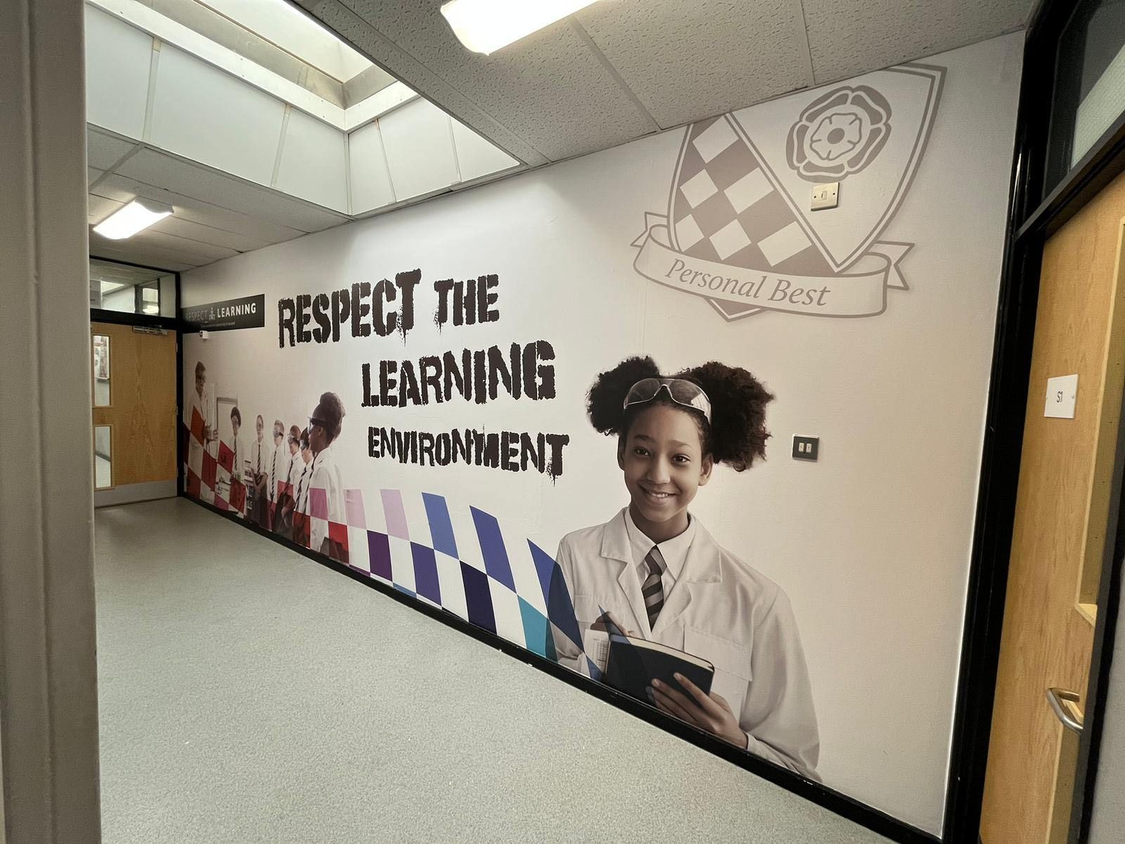
Now, step into a corridor transformed by bespoke wall graphics. The atmosphere shifts instantly. Pupils move with purpose. The space feels cared for.
That shift isn't an accident of interior design. It is the direct result of colour psychology at work.
Every hue on your school walls communicates something to the young minds passing beneath it. It calms anxiety, sparks curiosity, or, if neglected, induces boredom and restlessness. At Cubed Creative, with over 21 years of experience working closely with schools across London and the UK, we’ve seen how intentional colour choices reshape not just physical walls, but student behaviour and school culture.
Let's look at what your corridor colours are really doing to your students and how to get them working for your school.
The Science of Colour in Learning Environments
Environmental psychology confirms what great educators have always known: physical surroundings shape cognitive performance and emotional well-being. When pupils transition between lessons, their brains process a constant stream of visual data.
Colours trigger automatic neurological responses before conscious thought even takes place.
- Cool Tones (Soft Blues and Greens): These hues are neurologically linked to calm, sustained focus, and emotional regulation. They lower heart rates and reduce sensory overload, making them ideal for general circulation routes and zones near SEN or pastoral rooms.
- Warm Tones (Yellows and Soft Oranges): Energetic and stimulating, warm tones invite social engagement and creativity. However, when oversaturated or applied across entire walls, they can trigger agitation and shorten attention spans.
- Neutrals (Soft Creams and Pale Greys): They provide essential visual rest. Without neutral "white space," vibrant graphics lose their impact and hallways become visually exhausting.
What Different Corridors Need: A Practical Guide
Not all school corridors serve the same purpose. Treating every hallway with the exact same coat of standard paint misses a major opportunity to support pupil behaviour.
1. General Teaching Corridors: The Calm Transition
High-traffic transit zones need to prevent bottlenecks and maintain a calm, purposeful mood.
- The Palette: Soft blues, muted greens, and balanced light neutrals.
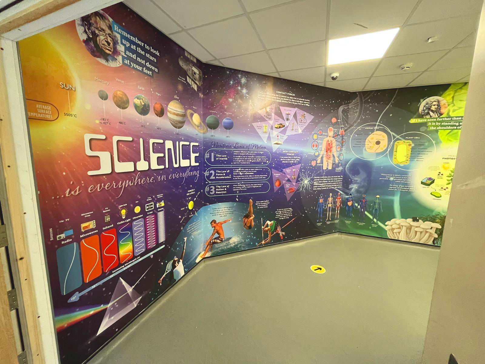
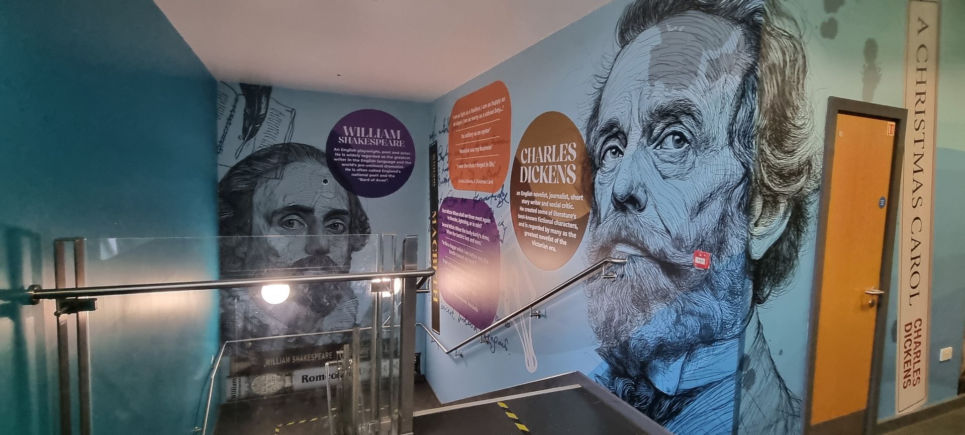
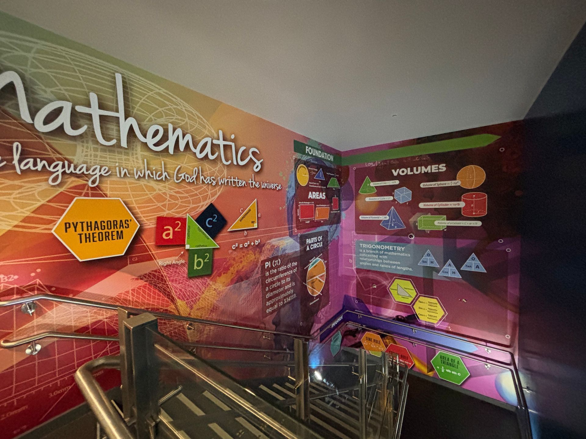
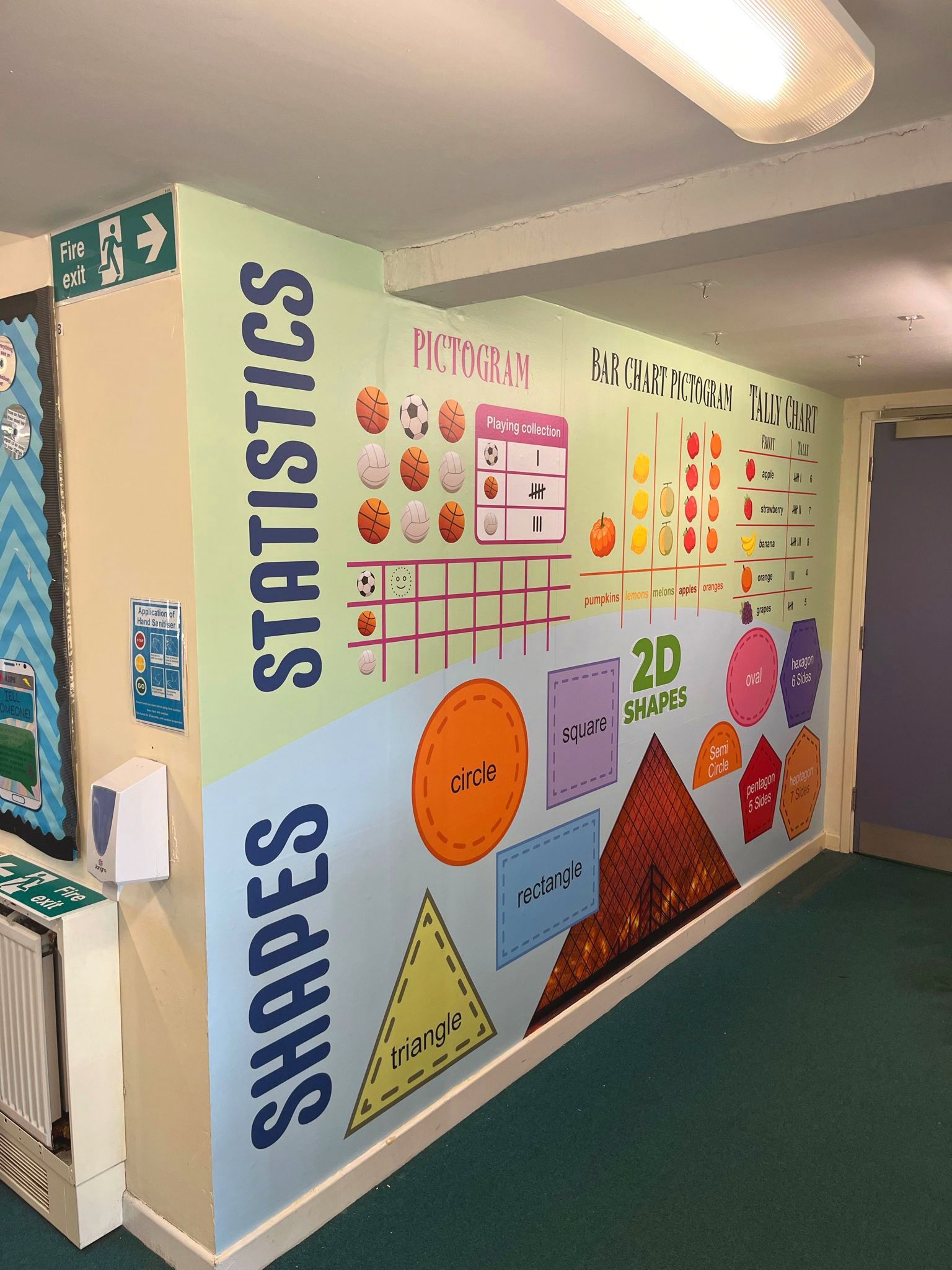
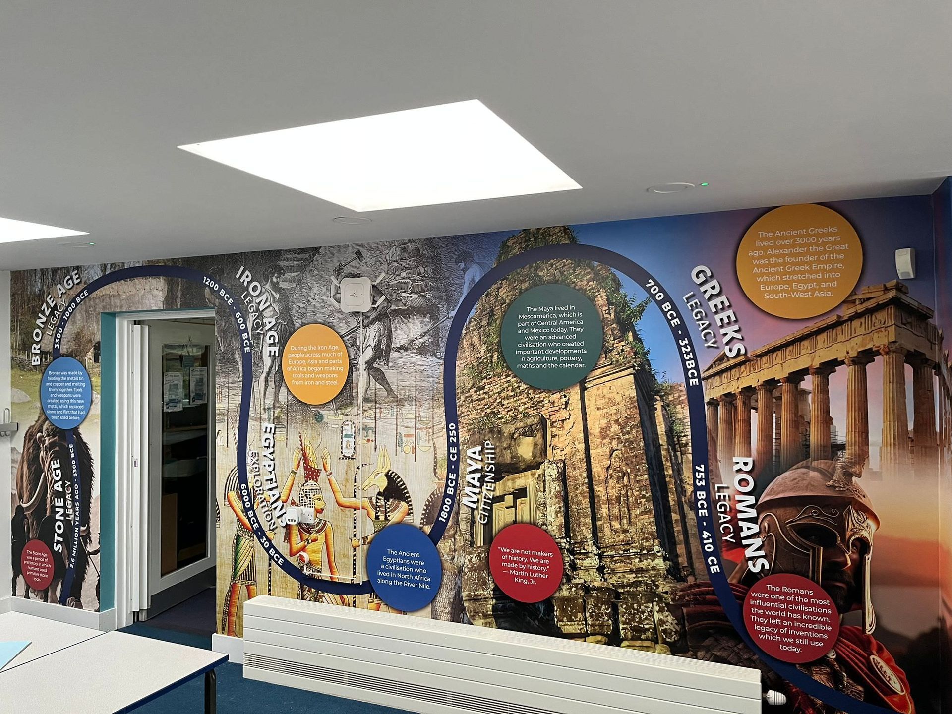
- The Graphic Touch: Introduce subject-themed wall art, like science timelines, literary quotes, or nature graphics, with moderate colour saturation. This keeps corridors engaging without overwhelming students between demanding lessons.
2. Social and Creative Spaces: Controlled Energy
Near art studios, drama departments, or dining halls, you want an atmosphere that fosters creativity and positive social interaction.
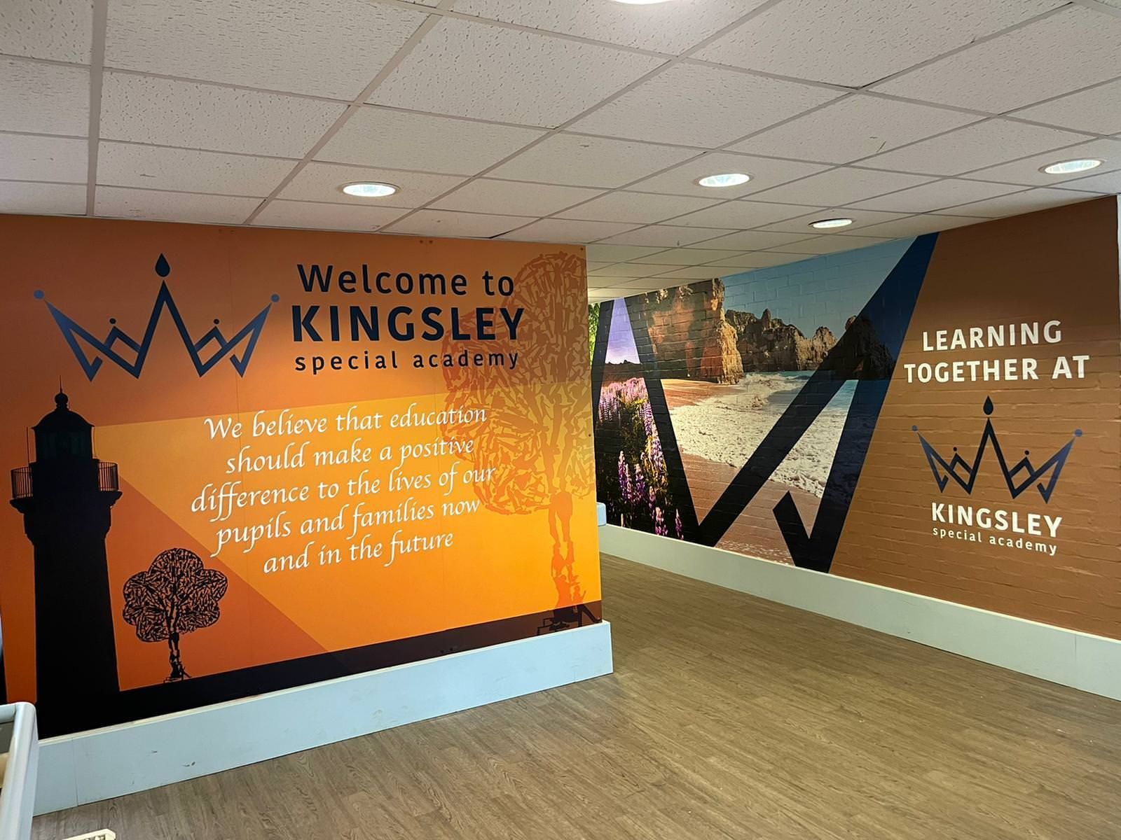
- The Palette: Warm neutrals as a base, paired with controlled accents of soft yellow or terracotta.
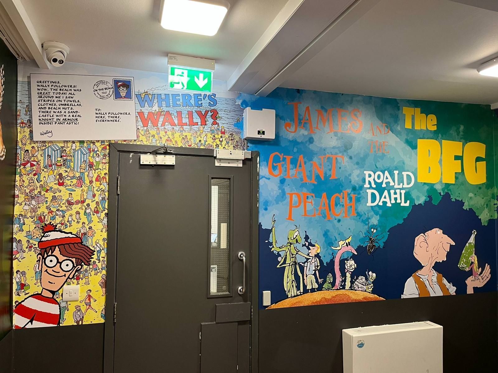
- The Graphic Touch: Showcase student artwork murals, vibrant colour-blocking, or dynamic designs that celebrate school identity and community pride.
3. Stairwells and Main Entrances: Setting the Tone
Stairwells are high-movement areas where safety and spatial orientation are paramount.
- The Palette: Strong, clean contrasting tones that define risers, handrails, and landings clearly.
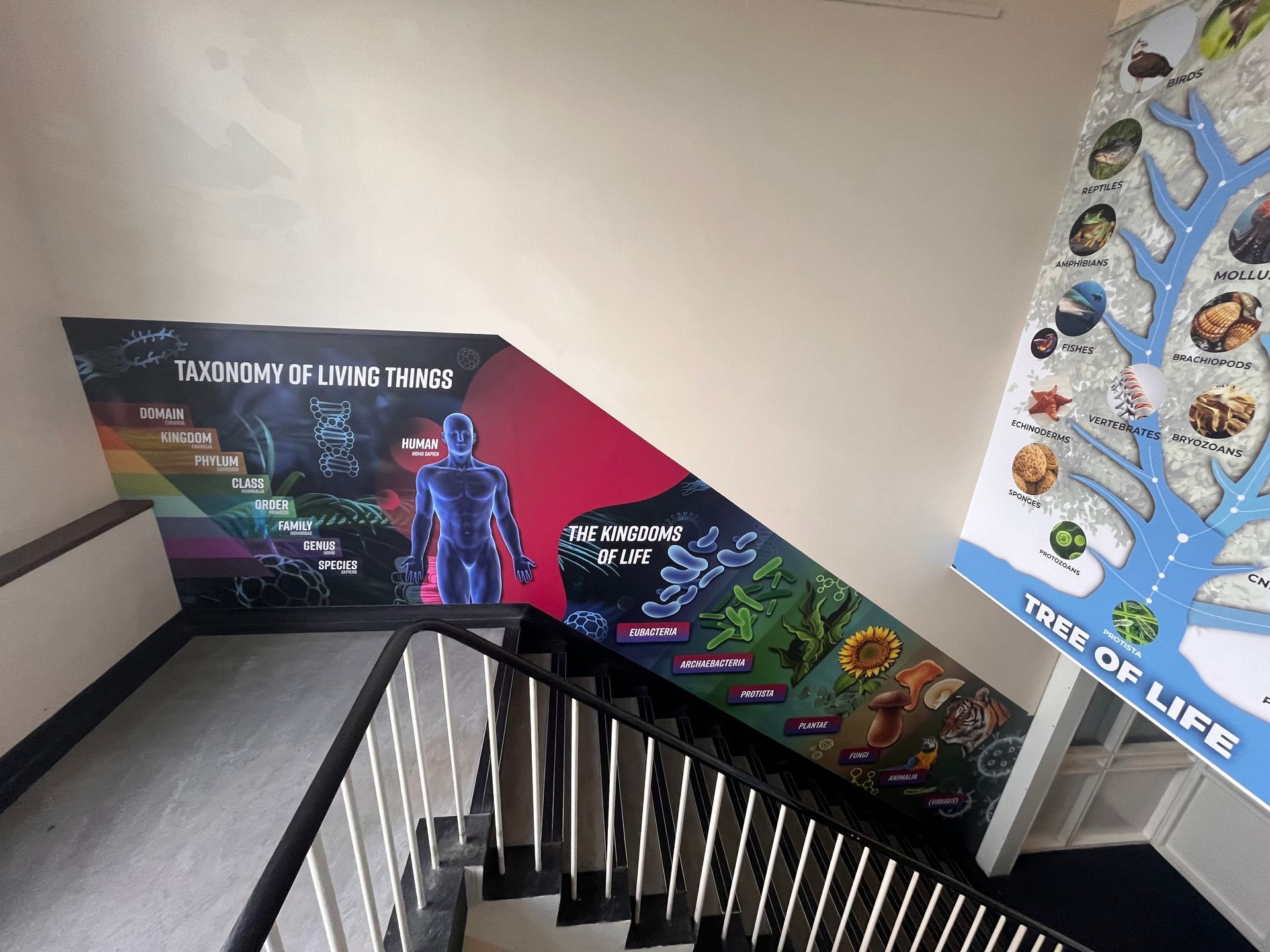
- The Graphic Touch: Use large-scale feature walls to highlight core values, such as resilience, respect, and community, turning a functional stairwell into an inspiring daily reminder of your school's ethos.
Common Colour Pitfalls in Schools
Many school leaders inherit tired colour schemes or rely on quick fixes that inadvertently run counter to their pastoral goals. Here are three common traps to avoid:
- The Endless Grey or All-White Trap: While clean, clinical white or dull grey feels neutral, research shows that featureless, sterile environments increase student boredom and disengagement. Pupils respond to environments that reflect care and character
- Over-Arousing Primaries: Slapping primary red or bright yellow across large wall expanses creates visual noise. It ramps up cortisol levels when what students actually need between lessons is a sense of calm order.
- Ignoring Lighting Interaction: Colour and light are inseparable. A cool blue that looks fresh under daylight fluorescent tubes might look cold and unwelcoming under harsh LED strips. Always test samples on site under your school's actual lighting conditions.
Transforming Spaces Without the Disruption
Updating your school environment doesn't require a disruptive, multi-week architectural refurbishment.
By partnering with an experienced education specialist team, you can completely transform your corridors, libraries, and reception areas in a single school break. At Cubed Creative, our complete design and print service happens entirely under one roof. We handle everything from the initial free site visit and bespoke design concepts to precise manufacturing and professional installation by our expert fitters.
What's more, we plant a tree for every project we complete.
Ready to Transform Your Corridors?
Your walls are talking to your students every single day. Make sure they are telling a story of pride, focus, and inspiration.
If your corridors are ready for a psychology-backed refresh, get in touch with our team today. We'll visit your school, discuss your vision, and show you how simple design changes can change your students' daily experience.
Explore our school wall graphics services to see how we help schools bring their learning environments to life.