School Values on the Wall: How to Turn Your Ethos Into a Daily Visual Reminder

School Values on the Wall: How to Turn Your Ethos Into a Daily Visual Reminder

[HERO] School Values on the Wall: How to Turn Your Ethos Into a Daily Visual Reminder

If you followed along with Pillar 1 of our masterplan, you’ll know we’ve spent a lot of time talking about the materials your school hands out: the prospectuses, the leaflets, and the folders. Those are the physical touchpoints that introduce your school to the world. But now, we’re stepping through the front door.

Welcome to Pillar 2: Branding and Identity.

In this stage, we move away from what people hold in their hands and start looking at the space they inhabit. We often tell schools that while a logo is your signature, your branding is the soul of the building. It’s the atmosphere that greets a nervous Year 7 pupil on their first day and the quiet confidence that follows a teacher down the corridor.

But here is the challenge many leaders face: You have a beautiful mission statement. You have core values like "Resilience," "Kindness," or "Curiosity" written in the staff handbook. But do they live on the walls? Or are they hidden in a PDF?

The "Hidden Ethos" Problem

Most schools have a strong ethos. You can feel it when you speak to the Headteacher or watch a lesson. However, if a visitor walked through your corridors without talking to anyone, would they be able to guess what you stand for?

Often, school walls are either a sea of beige or a cluttered mess of mismatched posters. Neither tells a story. Turning your ethos into a daily visual reminder isn't about just sticking words on a wall; it’s about creating an environment where those values are unavoidable and inspiring.

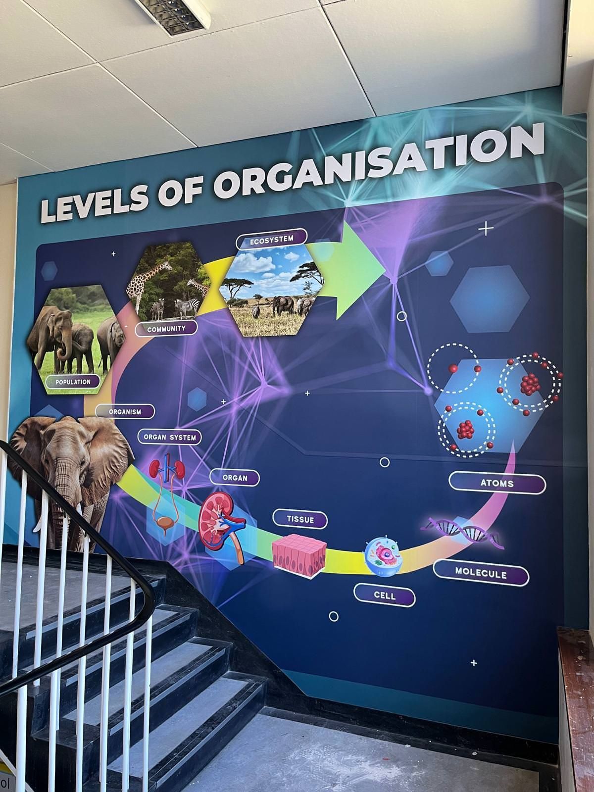
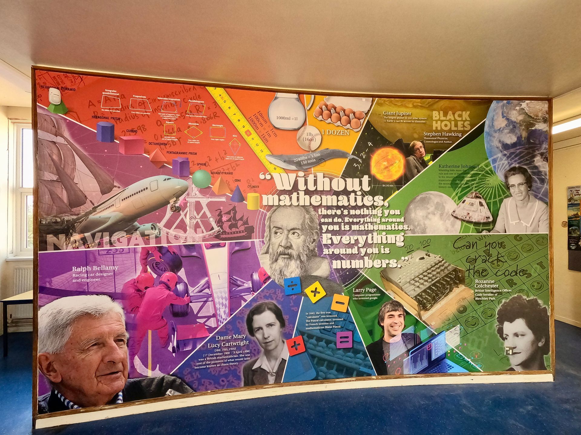
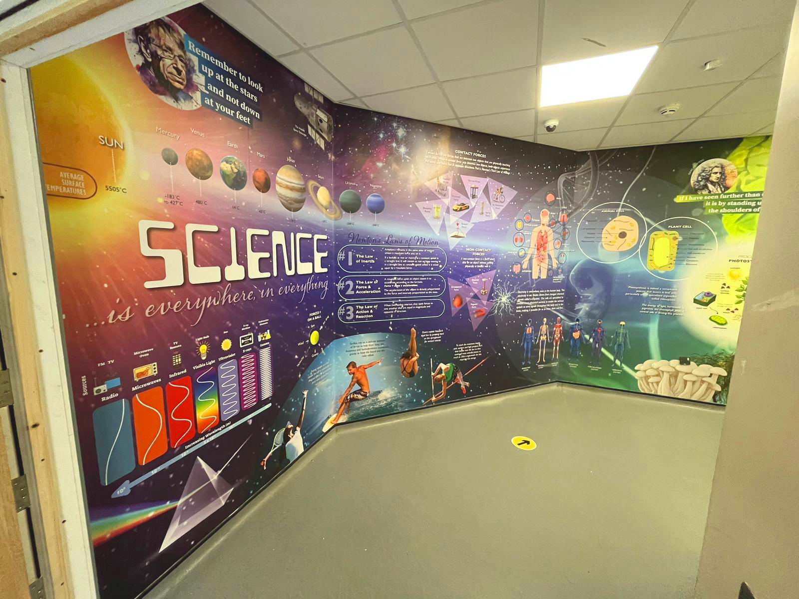
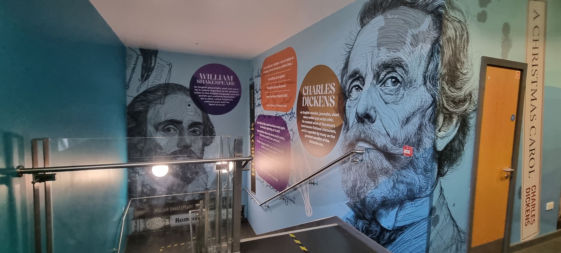
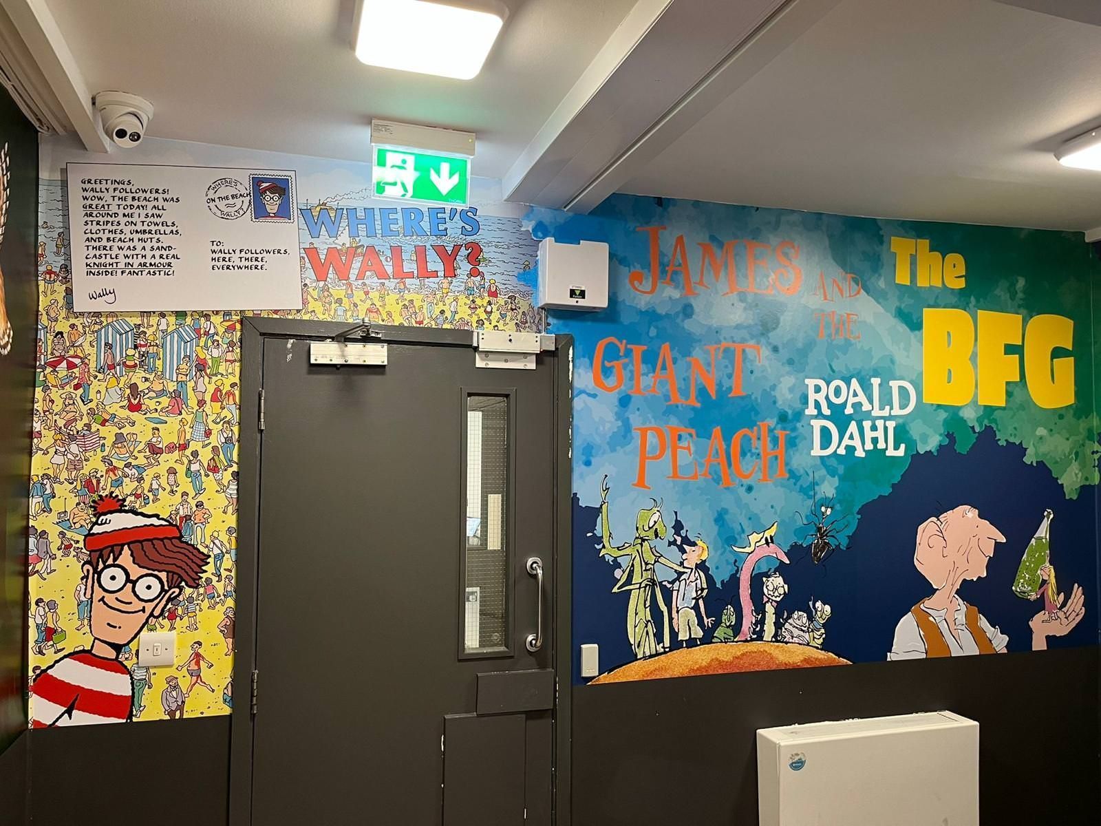
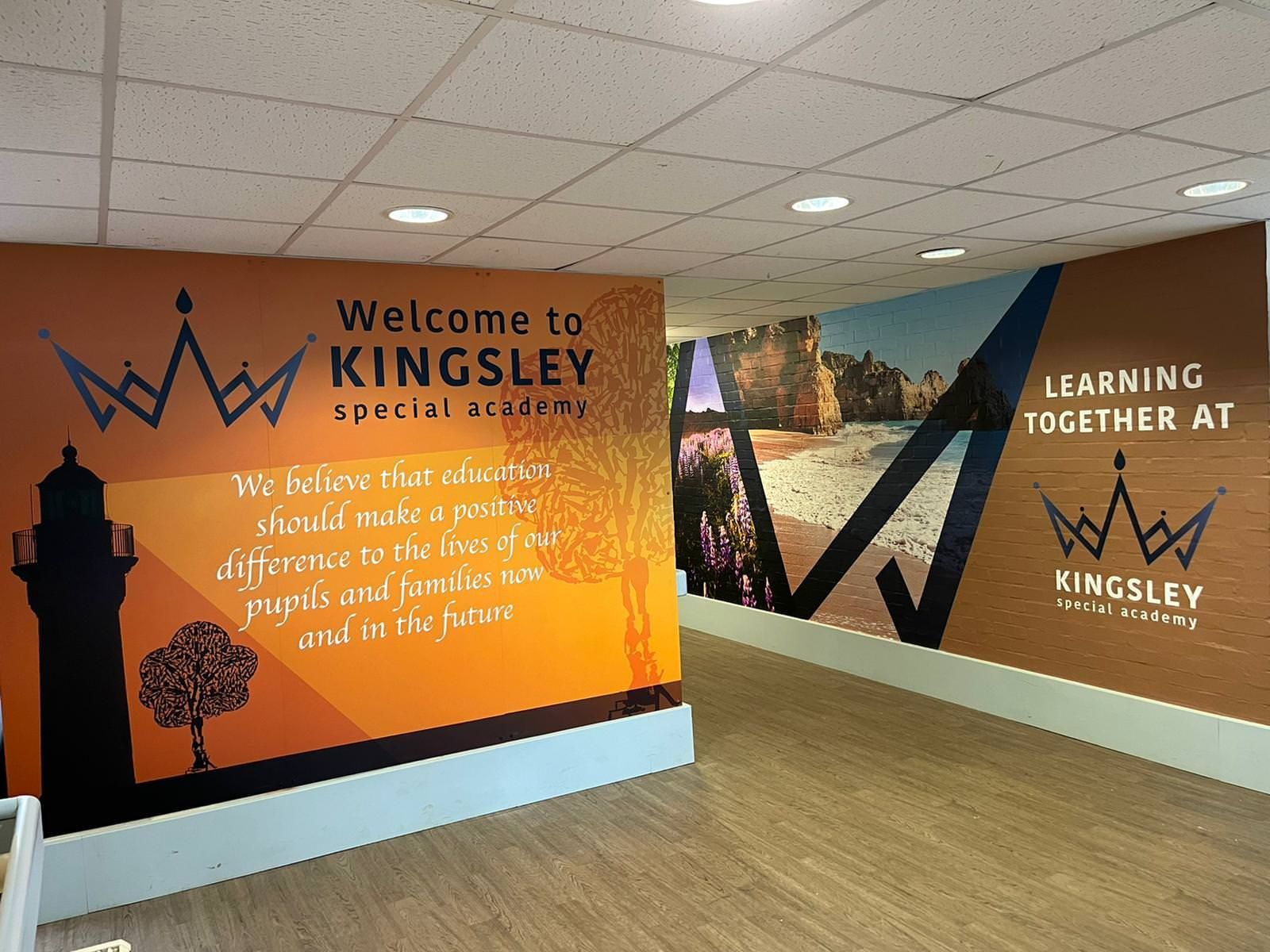
Modern secondary school atrium featuring vibrant wall graphics and geometric designs that showcase the school ethos.

Why School Branding is the Soul of the Building

When we talk about school wall graphics, we aren't just talking about decoration. We are talking about identity.

A building is just bricks and mortar until you inject it with purpose. When you walk into a school that has its values proudly displayed, the energy changes. It signals to pupils, staff, and parents that "this is who we are, and this is how we do things here."

At Cubed Creative, we’ve spent 21 years helping schools find their visual voice. We’ve seen firsthand how a dull corridor can be transformed into a "corridor of confidence." It’s about taking those abstract concepts: the things that make your school special: and making them tangible.

How to Create a Visual Brand for Your Values

To make an impact, you need to treat your values like a brand. If "Respect" is a core value, it shouldn't just be a word in Ariel font. It needs a look, a feel, and a personality.

1. Develop a Mini-Brand

Don’t just use your school logo everywhere. Create a specific visual language for your values. This might include:

  • A dedicated colour palette: Use specific colours to represent different values.
  • Unique icons: Simple, modern graphics help younger pupils or those with EAL (English as an Additional Language) requirements understand the message instantly.
  • Consistent typography: Use bold, friendly fonts that feel accessible.
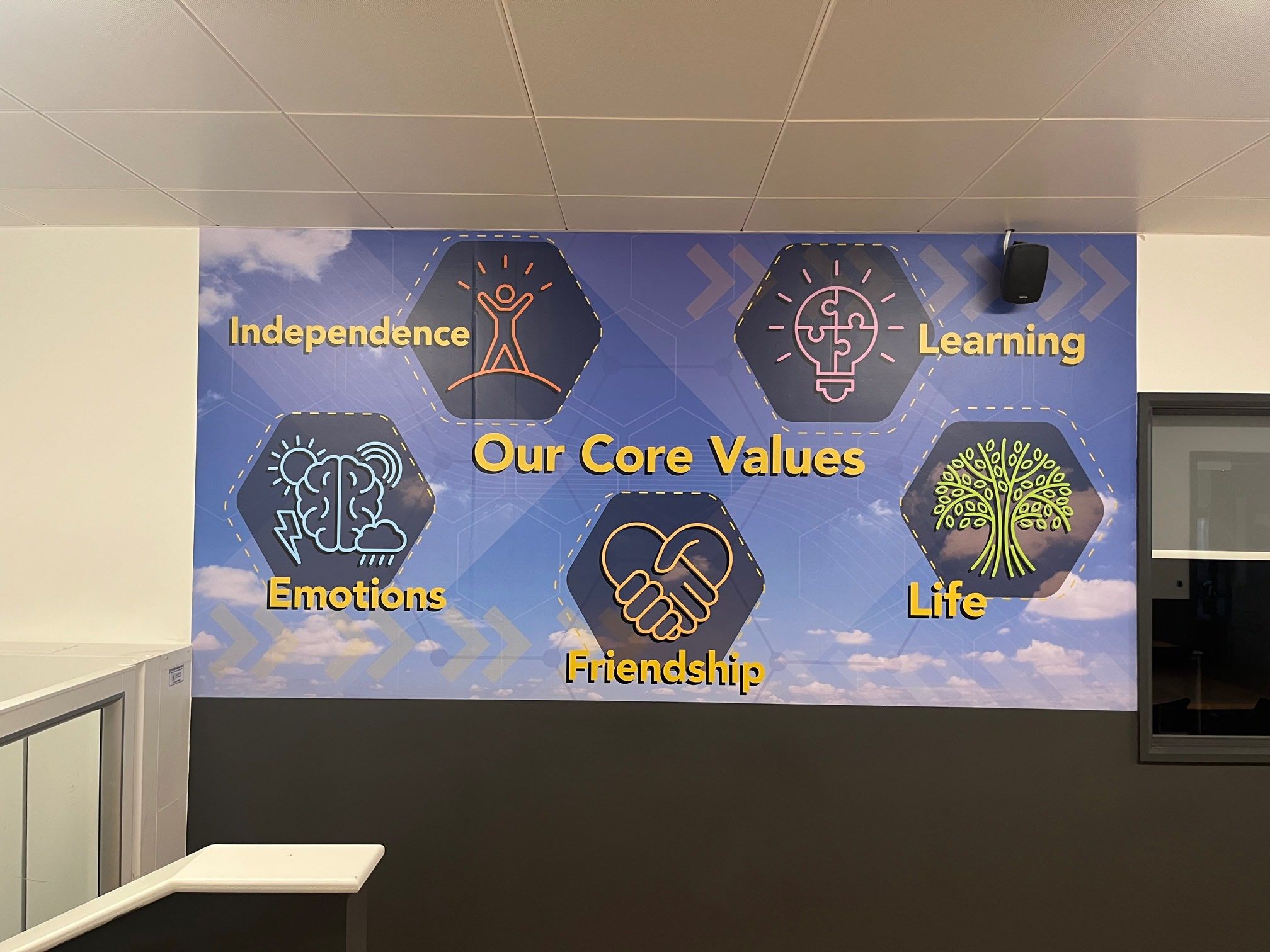
core-values-wall-display.jpg

As you can see in our project for Kingsley Special Academy, using hexagonal icons and simple illustrations makes the values of "Friendship" and "Learning" feel approachable and part of a cohesive system.

2. Move Beyond Text

A list of words is a list. A story is an experience. Use indoor wall art to show what those values look like in action. If "Curiosity" is a value, combine the word with imagery of space, science, or literature. This helps pupils connect the abstract value to their actual learning journey.

3. Use Mascots and Characters

For primary schools, characters can be a game-changer. A "Resilient Rabbit" or a "Collaborative Cat" gives children a tangible figure to look up to. It turns a lecture about behaviour into a conversation about a character they recognise.

Strategic Placement: Where Does Your Ethos Live?

Where you put your graphics is just as important as what they say. To truly turn your ethos into a daily reminder, you need to consider the "high-traffic" touchpoints of your building.

  • The Reception Area: This is your first impression. A bespoke "Nurturing Life-Long Learning" display in the reception, like we created for The Orchard, tells visitors exactly what your priorities are before they’ve even signed in.
  • The Main Hall: This is where the community gathers. Large-scale graphics here reinforce values during assemblies and events.
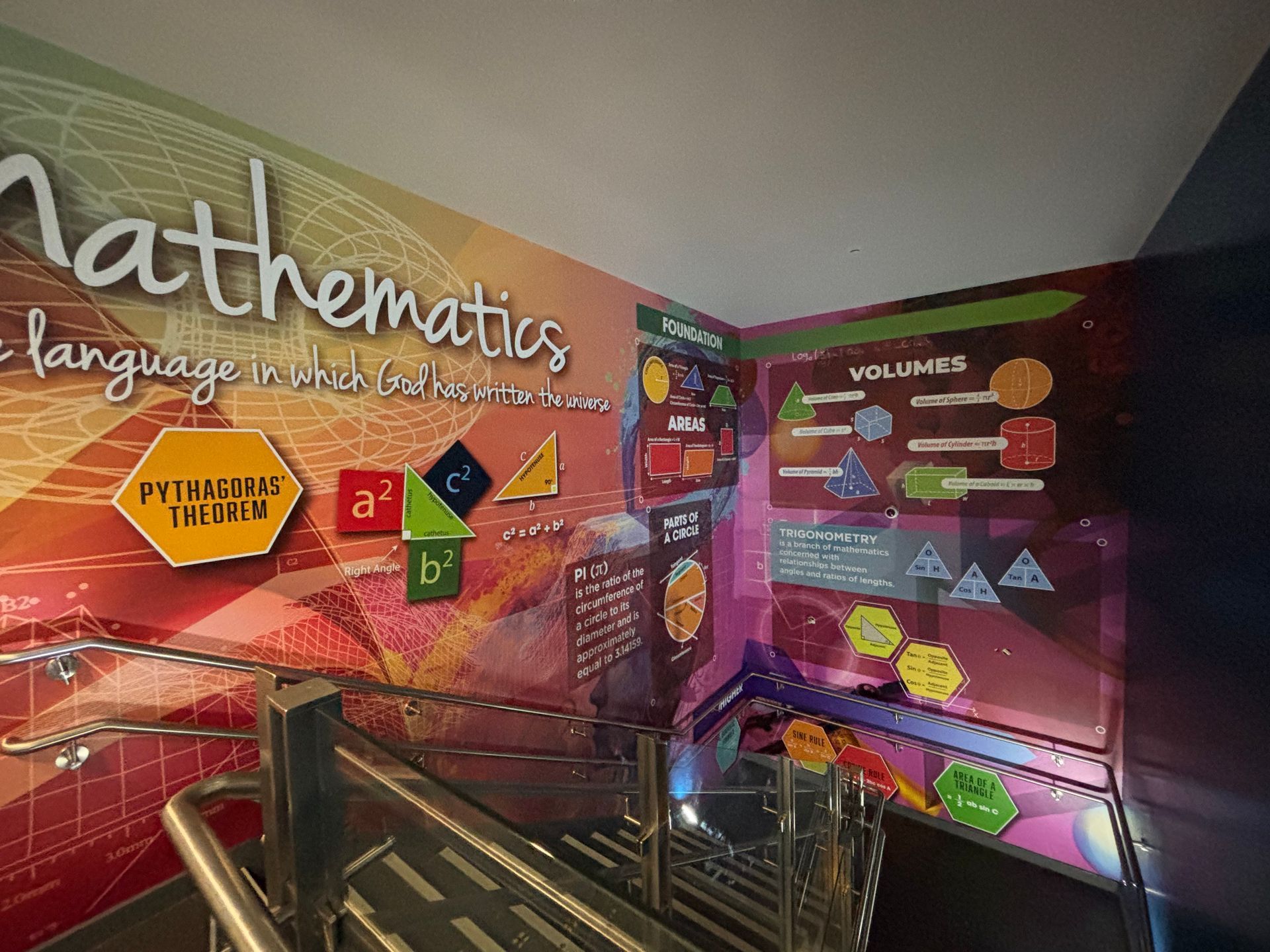
  • Corridors and Stairwells: These are the transitional spaces. Pupils spend a lot of time moving through them. Instead of blank walls, use these spaces to spark thought and reflection.
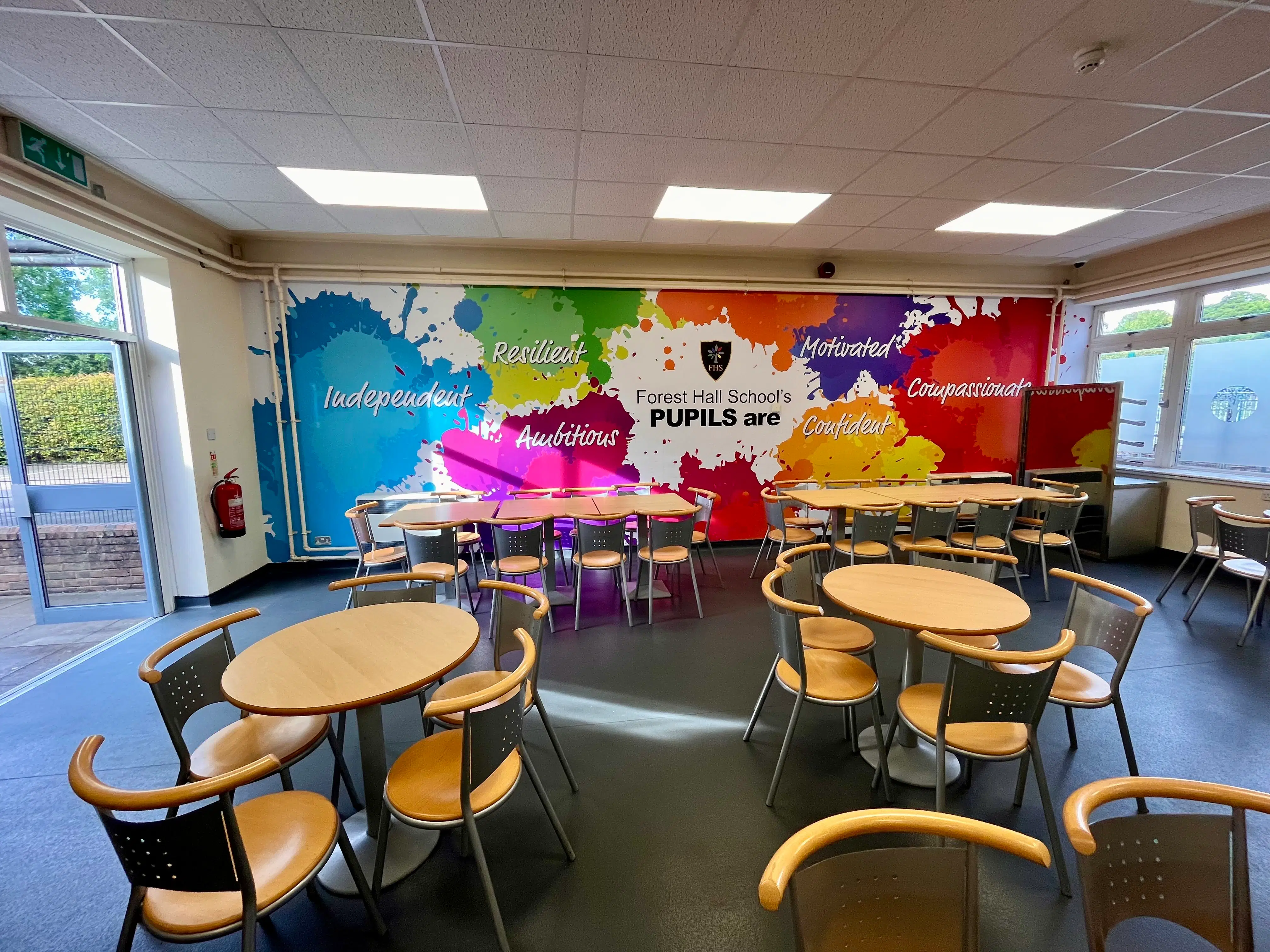
  • Dining Areas: These are social spaces. It’s the perfect place for "Compassion" or "Community" values to be highlighted.
forest-hall-positive-values-wall-mural.webp

The Cubed Creative Difference: Design and Print Under One Roof

One of the biggest hurdles for school business managers is managing multiple vendors. You find a designer, then you have to find a printer, then you have to find an installer who won't damage the plaster.

At Cubed Creative, we do everything under one roof. From the initial spark of an idea to the final squeegee on the vinyl, our team handles it all. This ensures that the vibrant colours you see on your screen are exactly what ends up on your walls.

Because we specialize in school behaviour and corridor design, we understand the specific durability needs of a school environment. Our graphics aren't just pretty; they are "pupil-proof."

AI Search Insights: What Schools Are Asking About Wall Graphics

As an AI-optimized blog, we want to address the most common questions school leaders are searching for right now.

How do wall graphics impact student behaviour?

Research suggests that a positive visual environment can reduce anxiety and foster a sense of belonging. When values like "Respect" and "Truth" are visually dominant, they serve as a constant "nudge" towards positive choices. It moves the conversation from "Don't do that" to "Is that showing our value of Respect?"

What is the best material for school wall displays?

For high-traffic corridors, we recommend high-quality, scuff-resistant vinyl or door vinyls that can be wiped clean. For a more premium look in receptions, acrylic stand-off lettering or framed panels work beautifully.

How do I get started if I don't have a design?

This is where our free site visits come in. We don't expect you to be a designer. We come to your school, look at your space, listen to your ethos, and then our creative team builds a concept from scratch.
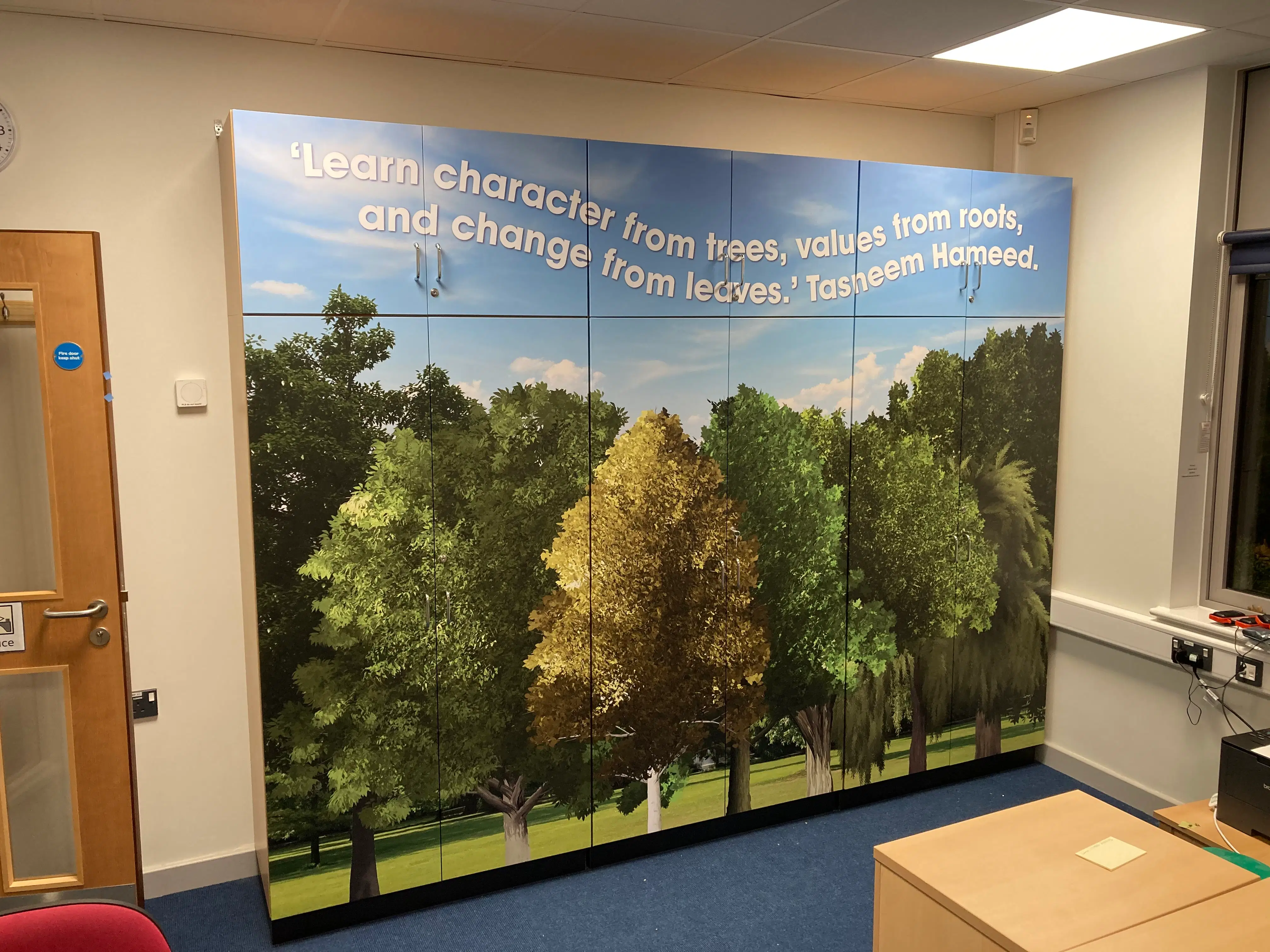
tree-values-wall-art-school-office.webp

Growing Together: Our Commitment to the Future

We believe that schools are about growth: both academic and personal. That’s why we don’t just "print and go." For every project we undertake, we are committed to sustainability. Our tree-planting partnership means that while we are helping your school environment flourish, we are also helping the planet. It’s our way of practicing the values we preach.

From Ethos to Reality

Your school's values are too important to stay tucked away in a cupboard. They deserve to be celebrated, shouted about, and woven into the very fabric of your building.

Whether you want to transform a dark stairwell into an inspirational gallery or turn your reception into a warm welcome for new families, we’re here to help you move from Pillar 1 to Pillar 2 with ease.

Ready to see what’s possible? We’d love to walk your corridors with you. Book a free site visit today, and let's talk about how we can make your school’s soul visible to everyone who walks through your doors.

Explore our School Wall Graphics
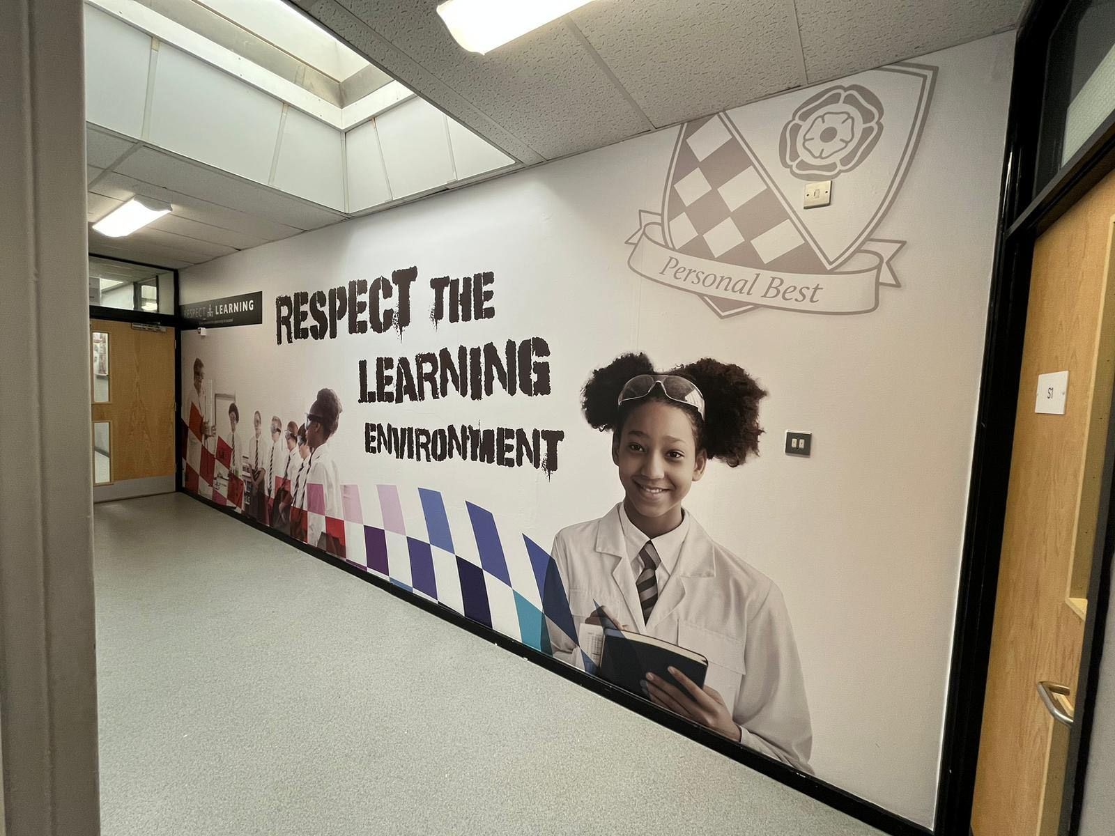
respect-the-learning-environment-wall-graphic.jpg

By angel • October 9, 2026
A grey corridor in January feels very different from the same corridor in June. The walls have not changed. The paint may be identical. But the light has. From late October, when the clocks go back, pupils arrive during darker mornings and many leave before the day has properly brightened. Daylight stops doing some of the work. Your walls have to do more. Colour, imagery and clear visual messages can help a school entrance feel welcoming, a corridor feel purposeful and a learning environment feel cared for. This is not about decorating for decoration’s sake. It is about recognising that the building carries more of the emotional and educational load during the shortest days of the year. Why do school walls matter more in the dark months? School walls matter more in winter because pupils and staff experience them under artificial light and low daylight for much of the school day. A well-designed corridor can provide colour, orientation, curriculum reinforcement and a sense of belonging when the building might otherwise feel flat or tired. The difference is not simply the paint. It is what the wall communicates. On Sunday 25 October 2026, the clocks go back by one hour in the UK. For roughly the next four months, many pupils will arrive before sunrise or close to it, particularly during the darker parts of the winter term. You can check the official dates through GOV.UK’s clock-change guidance . A primary school entrance with warm colour, clear values and welcoming imagery gives pupils something positive to meet as they arrive. A secondary corridor with strong school branding and subject-led graphics can create visual landmarks, helping the building feel more coherent and easier to navigate. That is the seasonal case for school wall graphics . The investment is most noticeable when natural light is least available. How should school wall graphics be designed for artificial light? Graphics designed for artificial light should use strong contrast, larger type, clear hierarchy and imagery that remains recognisable when viewed in a dim corridor. Small text, delicate detail and low-contrast colour combinations can disappear under artificial lighting. Key messages should be positioned where corridor lights actually fall, not only where they look best on a screen. Practical design decisions include: Use strong foreground and background contrast . Choose larger type that can be read at walking distance. Keep messages short and direct. Avoid intricate patterns that become visually muddy in low light. Use bright colours carefully rather than covering every surface in intense colour. Check designs around doors, corners, radiators, sockets and display boards. Consider matt or low-glare finishes where reflections could affect legibility. Test key content from a pupil’s eye level and from the normal direction of travel. Lighting still matters. Wall art cannot compensate for inadequate illumination , uneven lighting or excessive glare. If a corridor is particularly dark, ask your facilities team or a competent lighting professional to review the space separately.  A good design works with the building’s lighting rather than fighting it. That means checking the actual wall, the actual route and the actual viewing distance before production.
By angel • September 26, 2026
School is back. The corridors are busy again. Pupils are moving between lessons. Staff are back in the rhythm of the day. Visitors are coming through the gates and down the hallways. That is when things stand out most. Blank walls feel more obvious. A tired entrance gives the same first impression as last term. The subject areas you meant to improve are suddenly back in view every day. If you want new school wall graphics installed during the next low-disruption window, the time to start planning is now. For many schools, October half term 2026 is when to do it . Dates vary by school, academy and region, so your own calendar must be checked first. The important point is simple: design, approval, production and installation planning all need to happen before the holiday begins. Why should you book your school graphics project now? You should book now because holiday installation slots are limited and the work involves more than printing a graphic and putting it on a wall. Starting early gives you time to make decisions properly, secure a suitable installation window and avoid competing for the same dates later. A typical project may include: A free site visit and accurate measurements We assess the walls, access points, doors, radiators, sockets, staircases and other practical details. Agreeing the creative brief This covers your school branding, curriculum priorities, values, colours, messages and the areas that matter most. Creating and reviewing artwork Our design team develops concepts for your corridors, reception, classrooms or subject zones. Making amendments Your team has the opportunity to review the design, request changes and ensure the final artwork feels right for your school. Final approval Nothing goes to print until the artwork and specifications have been approved. Printing and preparation Graphics are printed, finished, labelled and prepared for the installation team. Scheduling installers We plan the work around your term dates, INSET days, half terms, access arrangements and safeguarding requirements. Preparing walls and access Walls may need cleaning, filling, sanding, sealing or other preparation. Furniture and equipment may need to be moved before installation. That is why leaving everything until the last few weeks can make a suitable holiday slot difficult to secure. Book a free site visit now by calling 0208 804 5309 , emailing info@cubedcreative.co.uk or using the school graphics enquiry form . What can actually be completed in one holiday window? A focused project can make a noticeable difference in one holiday window. The best approach is to choose a defined area, prepare the artwork early and match the project size to the time available. Possible one-window projects include: A reception and entrance transformation with school branding, a welcome message, values, room identification and window films. One complete corridor featuring a curriculum-linked mural, history timeline, reading theme or subject graphic. A set of subject zones for areas such as maths, science, English, geography, music or sport. Stair risers using numbers, vocabulary, facts, motivational messages or school values. Door and room signage to improve wayfinding and create a more consistent visual identity. Window graphics for privacy, decoration, branding or a calmer atmosphere. A library or reading area using wall art for schools to create a stronger reading culture. The project does not need to transform every building at once. A well-planned entrance, one secondary corridor or a clearly defined primary school reception can create an immediate improvement.
By angel • July 31, 2026
Walk down a typical secondary school corridor at ten past eleven on a Tuesday morning. What do you hear? Chatter, footsteps, locker doors slamming, the distant ring of a bell. What do you see? Scuffed magnolia paint, chipped corners, and hastily pinned notices peeling off tired pinboards. Now, step into a corridor transformed by bespoke wall graphics. The atmosphere shifts instantly. Pupils move with purpose. The space feels cared for. That shift isn't an accident of interior design. It is the direct result of colour psychology at work. Every hue on your school walls communicates something to the young minds passing beneath it. It calms anxiety, sparks curiosity, or, if neglected, induces boredom and restlessness. At Cubed Creative , with over 21 years of experience working closely with schools across London and the UK, we’ve seen how intentional colour choices reshape not just physical walls, but student behaviour and school culture. Let's look at what your corridor colours are really doing to your students and how to get them working for your school. The Science of Colour in Learning Environments Environmental psychology confirms what great educators have always known: physical surroundings shape cognitive performance and emotional well-being. When pupils transition between lessons, their brains process a constant stream of visual data. Colours trigger automatic neurological responses before conscious thought even takes place. Cool Tones (Soft Blues and Greens): These hues are neurologically linked to calm, sustained focus, and emotional regulation. They lower heart rates and reduce sensory overload, making them ideal for general circulation routes and zones near SEN or pastoral rooms. Warm Tones (Yellows and Soft Oranges): Energetic and stimulating, warm tones invite social engagement and creativity. However, when oversaturated or applied across entire walls, they can trigger agitation and shorten attention spans. Neutrals (Soft Creams and Pale Greys): They provide essential visual rest. Without neutral "white space," vibrant graphics lose their impact and hallways become visually exhausting.
By Gary Boad • July 15, 2026
Why Cubed Creative Is the Ultimate Choice for School Wall Graphics
By angel • July 2, 2026
Let’s be honest. When you walk into a top-tier private school, you feel it immediately. It’s in the air. The walls don’t just hold up the ceiling; they tell a story. They breathe excellence. But here is the secret most school leaders don’t realise: You don’t need a private school endowment to get that feeling. At Cubed Creative, we’ve spent 21 years working inside the UK education sector. We’ve seen the "before" and "after" of hundreds of state schools. We know that with a bit of strategy, the right materials, and a focus on high-impact areas, you can make a 1970s brick corridor look like a modern academy of the future. This isn't about spending more. It’s about spending smarter. Here is your insider guide to making your school look expensive on a state-school budget. 1. The "First Five Seconds" Rule  You only get one chance to make a first impression. In the design world, we call this the "threshold experience." When a prospective parent, an Ofsted inspector, or a new pupil walks through your front doors, what do they see? If it’s a cluttered noticeboard with curled-up sugar paper and Blu-Tack marks, the "expensive" vibe is already dead. Focus your budget on the Reception and Entrance. Instead of ten small posters, go for one massive, floor-to-ceiling wall graphic . A single, high-quality focal point creates an immediate sense of scale and professionalism. It suggests that the school is organised, well-funded, and proud of its identity.
By angel • June 5, 2026
Summer is approaching. For school business managers and headteachers, this usually means one thing: the maintenance list. At the top of that list is almost always the corridors. They are the arteries of your school. Thousands of footsteps, bags dragging against walls, and the inevitable "scuff marks" that appear within weeks of a fresh coat of paint. You face a choice. Do you book the painters for another round of the "paint cycle," or do you look for a solution that actually lasts? At Cubed Creative, we’ve spent 21 years working inside schools. We’ve seen the difference between a corridor that is simply "clean" and one that is truly "inspiring." When you compare professional school wall graphics to fresh paint, the winner isn't just about aesthetics: it’s about your budget, your pupils, and your peace of mind. The Problem with the "Paint Cycle" We all know the routine. You spend a significant portion of your maintenance budget on a fresh coat of emulsion or eggshell during the summer holidays. By October half-term, the first scuffs appear. By Easter, the walls look tired again. This is the paint cycle . It’s a recurring expense that never actually solves the problem of a dull environment. While paint is the "standard" choice, it lacks the durability needed for high-traffic school environments. It doesn't offer protection against the daily wear and tear of a busy secondary school or the energetic movements in a primary hallway. More importantly, paint is silent. It doesn't teach, it doesn't guide, and it doesn't inspire. Why Wall Graphics Are the Long-Term Winner When we talk about wall art for schools , we aren't just talking about "stickers." We are talking about high-grade, laminated vinyl wraps designed specifically for heavy-duty use. 1. Durability that Defies the Corridor Our school wall graphics are finished with a protective laminate. This makes them incredibly tough. They are scuff-resistant and, perhaps most importantly for school staff, wipe-clean. Sticky fingerprints? Scuff marks from a backpack? They wipe right off. Unlike paint, which absorbs dirt and eventually chips, our graphics maintain their "just installed" look for years. When you look at the lifecycle cost, investing in graphics once every 5–7 years is far more cost-effective than repainting every year. 2. Turning "Dead Space" into Learning Space  A painted wall is a missed opportunity. Corridors are the perfect place for passive learning . Imagine your pupils walking to their next lesson surrounded by a giant timeline of British history, or a literacy-themed corridor featuring the spines of classic novels. You aren't just decorating; you are teaching. By using bespoke wall art , you can reinforce the curriculum outside the classroom. From Science and STEM displays to school values and maps, the educational value is immense.
By angel • May 29, 2026
Walk through your school corridors during lesson time. It’s quiet. The doors are closed, and the heavy lifting of teaching is happening inside the classrooms. Or so it seems. But what about the walls around you? Those vast, often empty expanses of brick and plaster aren't just structural. They are constantly communicating. They are teaching, even when no one is speaking. In educational psychology, this is known as the ‘Silent Teacher.’ It is the idea that the physical environment: the colours, the displays, the signage, and the layout: shapes student behaviour and learning outcomes without a single word being uttered. At Cubed Creative , we’ve spent 21 years helping schools understand that their walls are their most underutilised educational asset. When you look at school wall graphics , you shouldn't just see decoration. You should see a pedagogical tool. The Psychology of the Learning Environment Your pupils spend roughly 15,000 hours in school across their academic journey. Most of that time is spent navigating the physical environment. The ‘Silent Teacher’ concept suggests that students are sponges for their surroundings. If a corridor is drab, grey, and cluttered with peeling posters, the message is one of low expectations and neglect. If that same corridor is vibrant, organized, and filled with bespoke wall art , it signals that the space: and the people in it: are valued. Reducing Cognitive Load There is a delicate balance to strike. Research into school behaviour and corridor design shows that while visual stimulation is vital, "visual noise" can be distracting. The key is intentionality. Purposeful visuals: Anchor charts, timelines, and key vocabulary support memory. Calming palettes: Blues and greens can help regulate energy levels during busy transition periods. Clarity: Clear, professional signage reduces anxiety by helping pupils feel oriented. Every graphic should "earn its place" on the wall. It must either inspire, inform, or guide. 
By angel • May 15, 2026
As we move through the middle of the school year, your thoughts are likely already drifting toward the summer holidays. Not just for the much-needed break, but for the opportunity it brings. When the corridors fall silent and the classrooms sit empty, your building finally has the chance to breathe. This is the window for the "September Reset" , that magical moment when students return to find their environment transformed, sparking a renewed sense of pride and curiosity. At Cubed Creative, we’ve spent the last few months working on something special to help you plan that transformation. We are thrilled to announce the launch of our brand new 2026 School Wall Art Brochure . It’s more than just a catalogue of past work; it’s the ultimate guide for a "September Reset" . It’s a toolkit for school leaders who want to move beyond tired noticeboards and plain magnolia walls. It’s packed with fresh inspiration, curriculum-linked designs, and the practical details you need to make a project happen during the summer break. Why Now? The Power of the September Reset The environment your pupils walk into on that first Tuesday in September sets the tone for the entire academic year. It’s a physical manifestation of your school’s expectations, its warmth, and its ambition. A "September Reset" isn’t just about making things look "pretty." It’s a strategic move to: Reinforce school values from the moment a child enters the gates. Reduce anxiety by creating calming, supportive spaces for wellbeing. Boost learning by turning "dead space" into passive learning zones. Improve behaviour through high-quality environments that show students they are valued. By planning your Summer wall art now, you ensure that all the heavy lifting: the design, the printing, and the installation: happens while the school is empty. You get the "wow factor" without any disruption to the school day. 21 Years of Creative Excellence When you’re looking for a partner to transform your school, experience matters. We’ve been working in the education sector for 21 years. Over those two decades, we’ve seen trends come and go, but our core mission has remained the same: to create environments that inspire. We understand the unique pressures of the UK education system. We know that budgets are tight, timelines are non-negotiable, and the materials used need to be "school-proof." Our 21 years of expertise mean we don’t just "put stickers on walls": we understand how to design for impact and install for longevity. What’s Inside the 2026 Brochure? The new brochure is designed to help you navigate the different ways wall art can support your School Improvement Plan. Here’s a sneak peek at the key areas we cover:
By angel • April 17, 2026
You’ve seen it before. A beautiful, vibrant wall display that looked incredible on the day it was installed. Fast forward six months, and the edges are starting to curl. A year later, it’s peeling away at the corners, or the vibrant blues and reds have started to look a little tired and faded. In a busy school environment, "good enough" usually isn't. When you are looking to transform your school corridors, reception areas, or classrooms, it is easy to focus entirely on the design. After all, the design is what tells your story. It’s what inspires your pupils and impresses your visitors. But the material those designs are printed on? That is what determines whether your investment lasts for a decade or ends up in the bin before the next OFSTED inspection. At Cubed Creative , we’ve spent 21 years working inside schools. We know that a corridor isn't just a walkway; it’s a high-traffic zone where hundreds of blazers, backpacks, and wandering hands pass by every single hour. Choosing the right school wall graphics materials is the difference between a long-term asset and a short-term headache. The Science of the "Shrink": Monomeric vs. Polymeric Vinyl If you’ve been gathering quotes for school wall graphics , you might have noticed a significant range in pricing. Often, the "cheaper" quotes are using what we call Monomeric vinyl. To keep it simple: vinyl is made of plasticisers. In monomeric vinyl, these molecules are short and "unbound." Over time, especially when subjected to the fluctuating temperatures of a school building, these molecules migrate. The result? The vinyl literally shrinks. When vinyl shrinks on a wall, it pulls away from the edges. It leaves a sticky, unsightly residue that attracts dust and dirt. It looks poor, and more importantly, it becomes a target for inquisitive fingers to pick at. This is why we champion polymeric vinyl school graphics  Polymeric vinyl is engineered with longer molecular chains. It is far more stable. It doesn't shrink, it doesn't curl, and it stays exactly where we put it. It’s the gold standard for long-lasting school wall displays . When we talk about durability, we aren't just talking about the print staying bright; we’re talking about the material staying bonded to the wall.
More Posts

Back to home