We’ve all been there. It’s 4:00 PM on a Tuesday, you’re armed with a staple gun that’s seen better days, and you’re staring at a vast expanse of blue sugar paper that refuses to stay flat. You want your classroom to be an inspiring hub of learning, but by the time the final border is pinned, it looks more like a chaotic explosion in a stationery shop.
At Cubed Creative, we’ve spent the last 21 years helping schools transform their environments. We’ve seen the good, the bad, and the "why is that poster from 1994 still there?"
The truth is, your walls are more than just partitions between rooms. They are silent teachers. When used correctly, school wall graphics can boost engagement and reinforce key concepts. When used poorly, they become a distracting mess that hinders focus.
Here are the seven most common mistakes schools make with classroom wall displays, and, more importantly, how you can fix them.
1. The "Everything but the Kitchen Sink" Approach
There is a common misconception that a "good" classroom is a covered classroom. We feel the urge to fill every square inch of brickwork with posters, bunting, and student work.
The Mistake: Visual overload. Research suggests that heavily decorated classrooms can actually decrease student performance. When every wall is screaming for attention, the brain struggles to filter out the noise. This leads to cognitive overload, particularly for pupils with SEND or sensory processing sensitivities.
The Fix:
Aim for the 20% rule. Keep at least 20% of your wall space clear. This "white space" gives the eyes a place to rest and allows the important displays to actually stand out. Think quality, not quantity.
2. Form Over Function (The Pinterest Trap)
We love a beautiful classroom. However, a display that looks stunning on a social media feed isn't necessarily helping your pupils pass their SATs or GCSEs.
The Mistake: Using displays that are purely decorative rather than functional. If a poster has been up for six months and you’ve never once pointed to it during a lesson, it’s just wallpaper.
The Fix: Prioritise functional displays. Focus on "anchor charts" that capture current learning, word walls that build vocabulary, or literacy wall graphics that encourage a reading culture. If it doesn't serve a pedagogical purpose, ask yourself if it really needs to be there.
3. Choosing the Wrong Materials (Monomeric vs Polymeric)
This is the technical bit where many school business managers get caught out. When you’re looking at school wall art, the material matters just as much as the design.
The Mistake: Opting for cheap monomeric vinyl. It looks fine on day one, but monomeric vinyl has a "memory." It wants to shrink back to its original size. After a term of central heating and sunlight, you’ll see the edges curling, adhesive failing, and unsightly gaps appearing.
The Fix: Insist on polymeric vinyl. It’s more stable, more durable, and designed to stay exactly where you put it for years. At Cubed Creative, we use high-grade materials that survive the "scuff test" of a busy corridor or classroom. It costs a little more upfront, but it saves you a fortune in replacements. You can check our school project terms for more on how we ensure quality.
4. The "Adult Eye Level" Oversight
Take a second and literally get down on your knees in the middle of your classroom. What can you see?
The Mistake: Mounting displays at the eye level of a 5’10” teacher. If your pupils are in Year 2, they are likely spending the entire day looking at the bottom third of your walls. If the most important information is near the ceiling, they simply won't engage with it.
The Fix: Design from the floor up. Ensure that key reference materials and student work are positioned where the children can actually see and interact with them. Reserve the higher spaces for branding or
school wall graphics that are meant for visual impact rather than daily reference.
5. Static Displays That Become "Invisible"
There’s a myth that if a display stays up too long, pupils stop learning from it. In reality, repetition is one of the simplest ways the brain stores information. Seeing the same thing again and again helps it get “logged” over time.
The Mistake: Swapping things out too often. If your key vocabulary, number facts, or routines are constantly changing, pupils don’t get enough repeat exposure for it to really sink in. It can also turn your walls into a never-ending job list for staff.
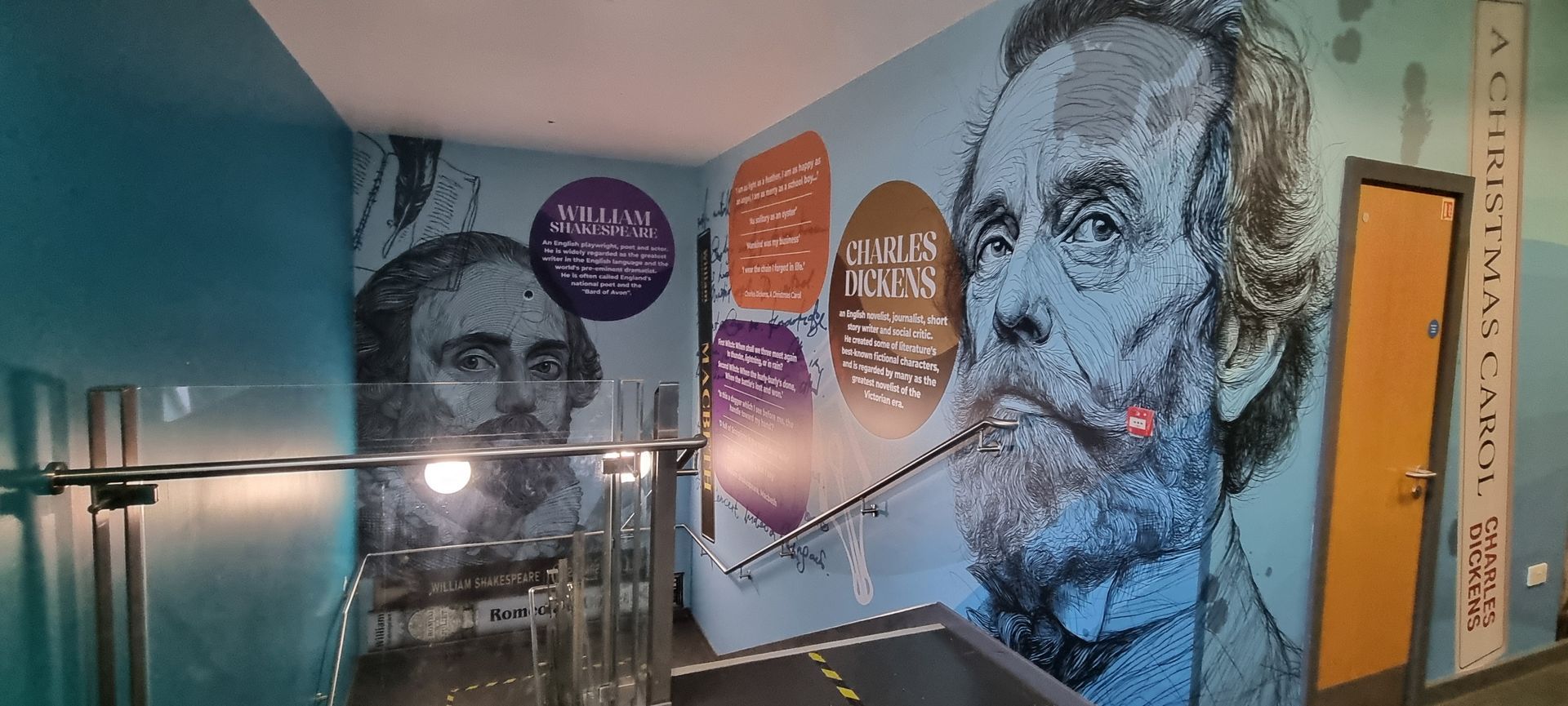
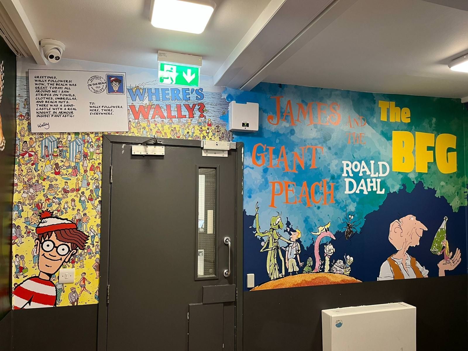
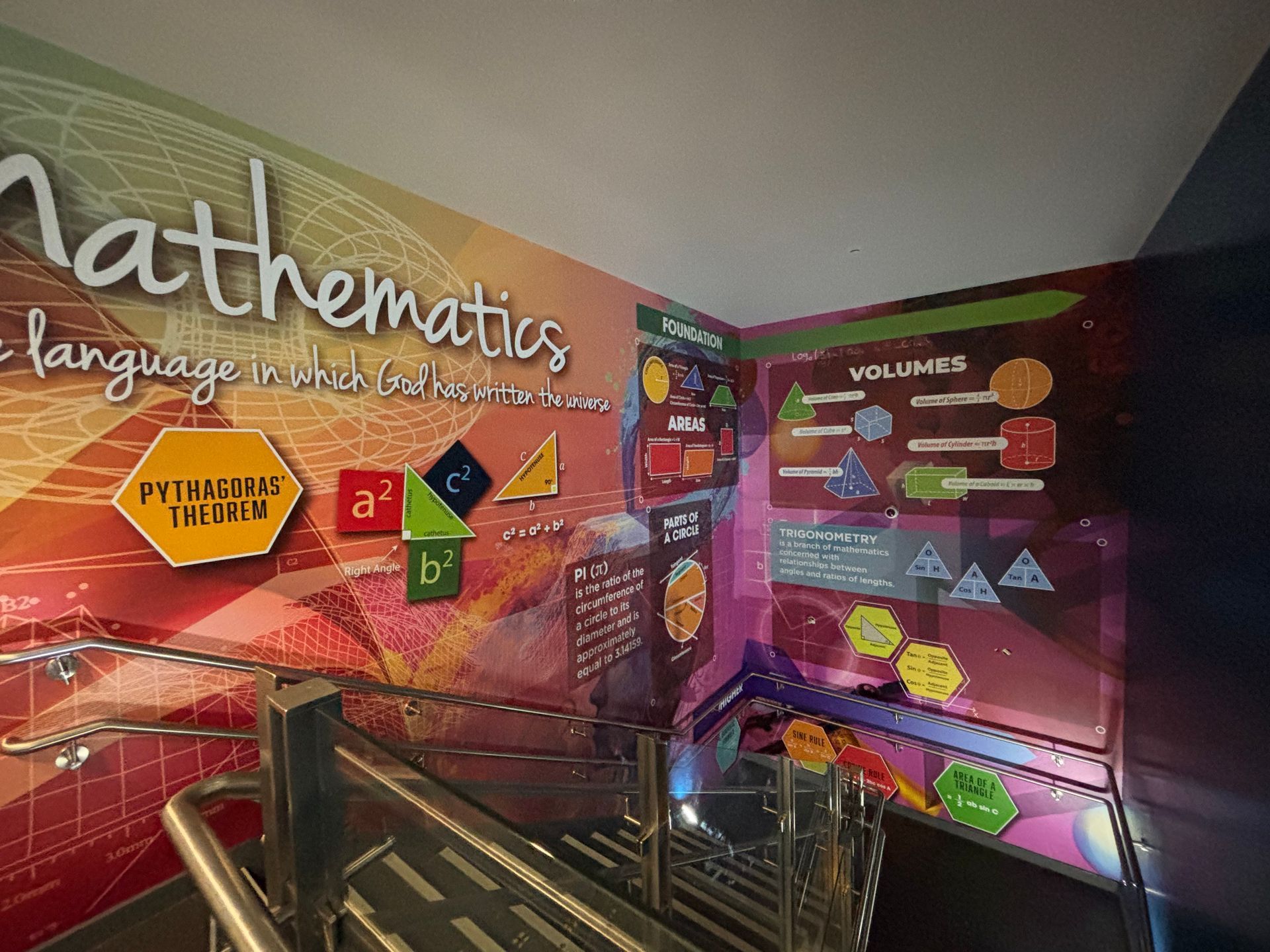
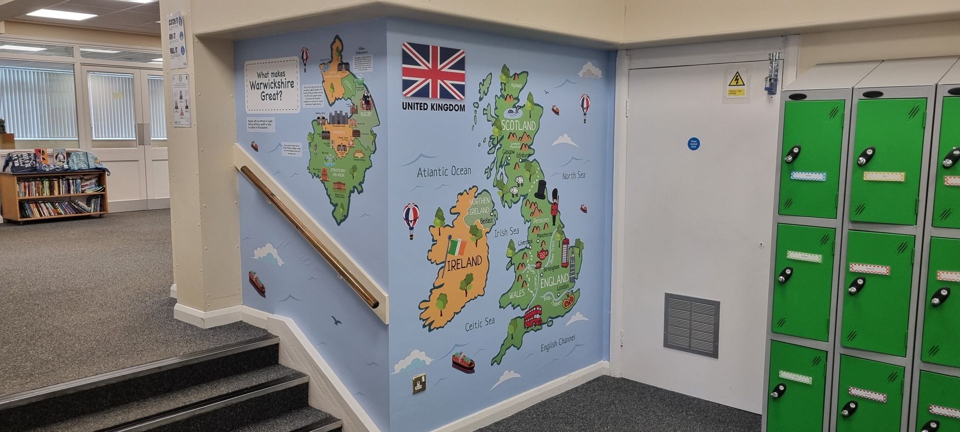
The Fix: Keep the important stuff up for the long haul, and make sure it’s worth looking at. High-quality, well-designed graphics give pupils consistent cues every day, without curling edges or fading colours. This is where long-term installs like stair riser graphics or full wall wraps really earn their keep: they sit in the background, quietly reinforcing the same messages, until pupils know them without even trying.
6. The "Generic" Look
Walk into enough schools and you start to spot the same posters on repeat. Same clipart. Same “motivational” quotes. Same laminated corners curling up by half term.
The Mistake: Relying on off-the-shelf, mass-produced displays that could belong to any school, anywhere. They’re not bad, exactly. They’re just… a bit anonymous. And when your walls feel anonymous, it’s harder for pupils (and staff) to feel that sense of “this is our place”.
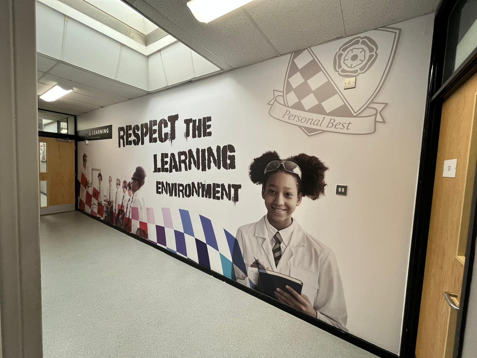
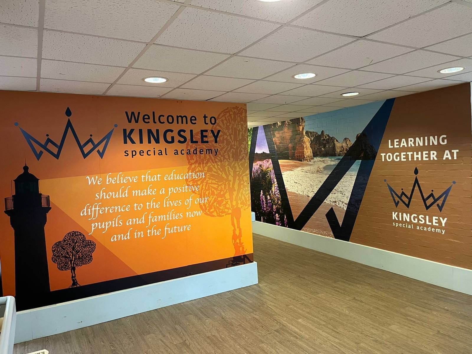
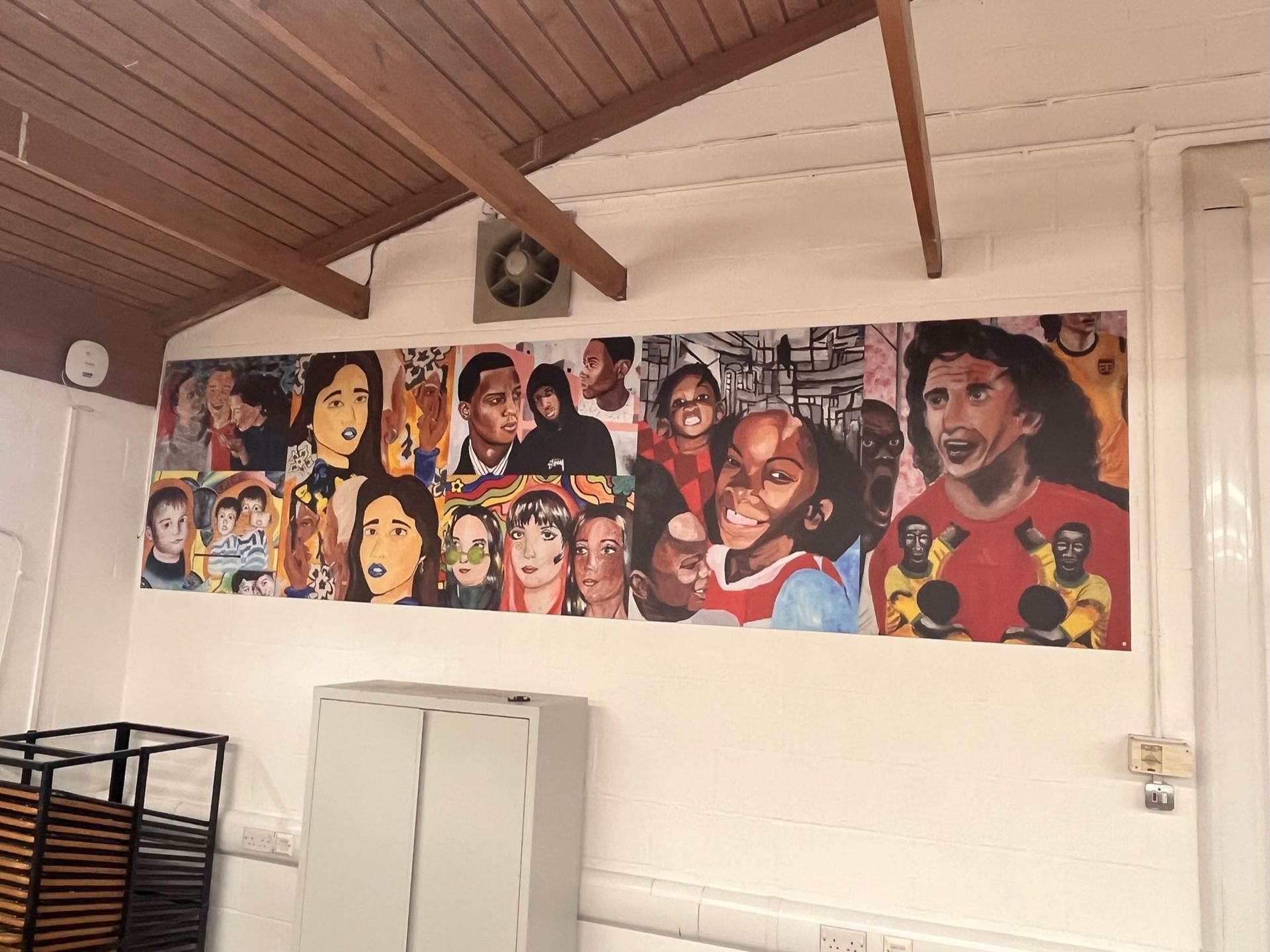
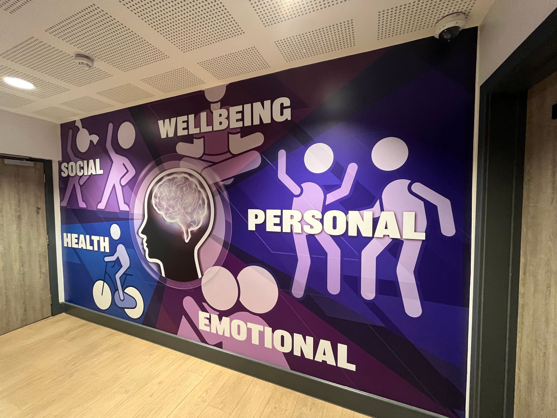
The Fix: Make your visuals yours. Bespoke, custom-designed graphics can reflect your community, your values, your colours, and the way your school actually works day to day. It’s one of the simplest ways to build pride and reinforce your ethos without saying a word. And because it’s designed for your spaces, it tends to look cleaner, last longer, and feel like it genuinely belongs. For ideas on shaping behaviour and culture through the environment, our post on
school behaviour and corridor design offers some great insights.
7. Clashing Colours and Sensory Chaos
The psychology of colour is a powerful tool in education, but it’s easy to get it wrong.
The Mistake: A mish-mash of bright primary colours, neon borders, and mismatched fonts. This creates a high-arousal environment that can make it difficult for pupils to remain calm and focused.
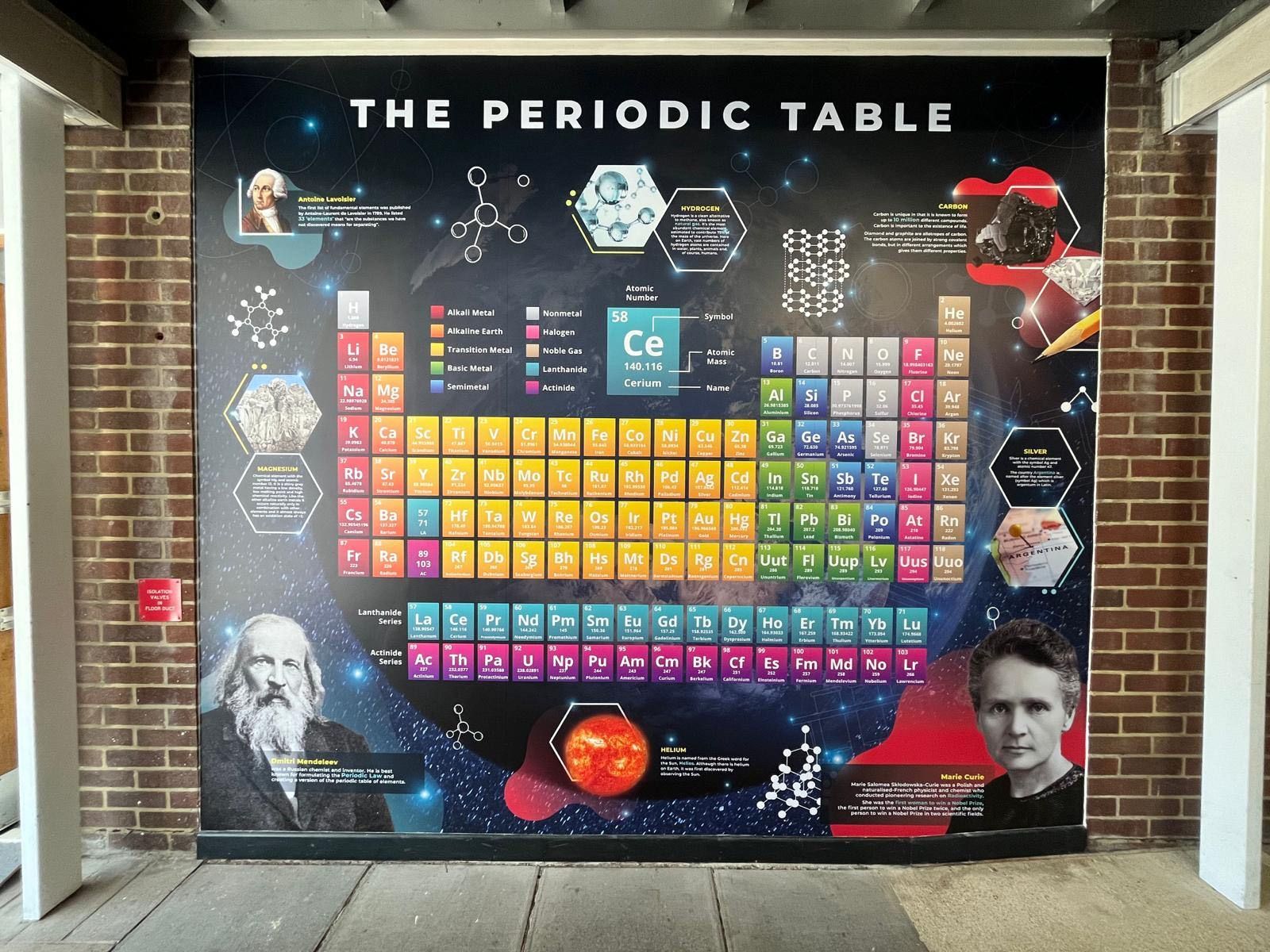
The Fix: Choose a cohesive colour palette. Think about the "vibe" of the room. A science lab might benefit from clean, modern STEM wall graphics, while a quiet reading corner should use softer, more muted tones. Consistency in your school branding across the site also helps create a sense of order and professional pride.
Why Quality Displays Matter
Your school environment tells a story about what you value. When a display is peeling, cluttered, or outdated, it sends a subconscious message that the environment, and perhaps the learning, isn't a priority.
When you invest in high-quality, professionally designed wall graphics, you’re doing more than just decorating. You’re creating a space that inspires pupils, impresses parents during open evenings, and makes teachers feel proud of their workplace.
At Cubed Creative, we don't just "print and go." We offer an end-to-end service, from initial design concepts to professional installation. We understand the unique pressures of the school environment: budgets are tight, and timelines are even tighter. If you're curious about how we work, you can read more about what end-to-end school wall graphics actually means for you.
A Greener Way to Transform Your School
We believe good design should make a positive impact on your pupils and the planet. That’s why we’ve partnered with One Tree Planted.
Here’s how it works: we plant one tree for every single wall we complete. One wall, one tree. Two walls, two trees. The more spaces you transform with us, the more trees get planted.
It’s a simple way to make your school look brilliant while doing something positive beyond the school gates, too.
Ready to Fix Your Walls?
If you’re tired of the staple gun struggle and want to create a learning environment that truly works, we’re here to help. Whether you’re looking for window films to add privacy, hanging banners for the hall, or a full corridor transformation, our team has the expertise to make it happen.
Why not take a look at our brochure for some inspiration? Or, if you have questions about materials, durability, or design, check out our school FAQ.
Let’s stop making those common mistakes and start creating spaces where students and teachers can truly thrive. Give us a shout at Cubed Creative, and let's get to work!