💫 The Magic of Reading: Turning School Corridors into Story Worlds

School corridors become story-rich areas that stimulate students' imagination and reading enthusiasm at all educational levels. Schools can achieve their literacy targets and foster creative thinking through wall graphics that create emotional connections between students and literature.

The following section presents essential design elements, along with placement suggestions, to establish reading corridors that unite educational content with artistic elements and atmospheric effects during the Halloween season.


Building Story Worlds


Literary Icons and Imagery


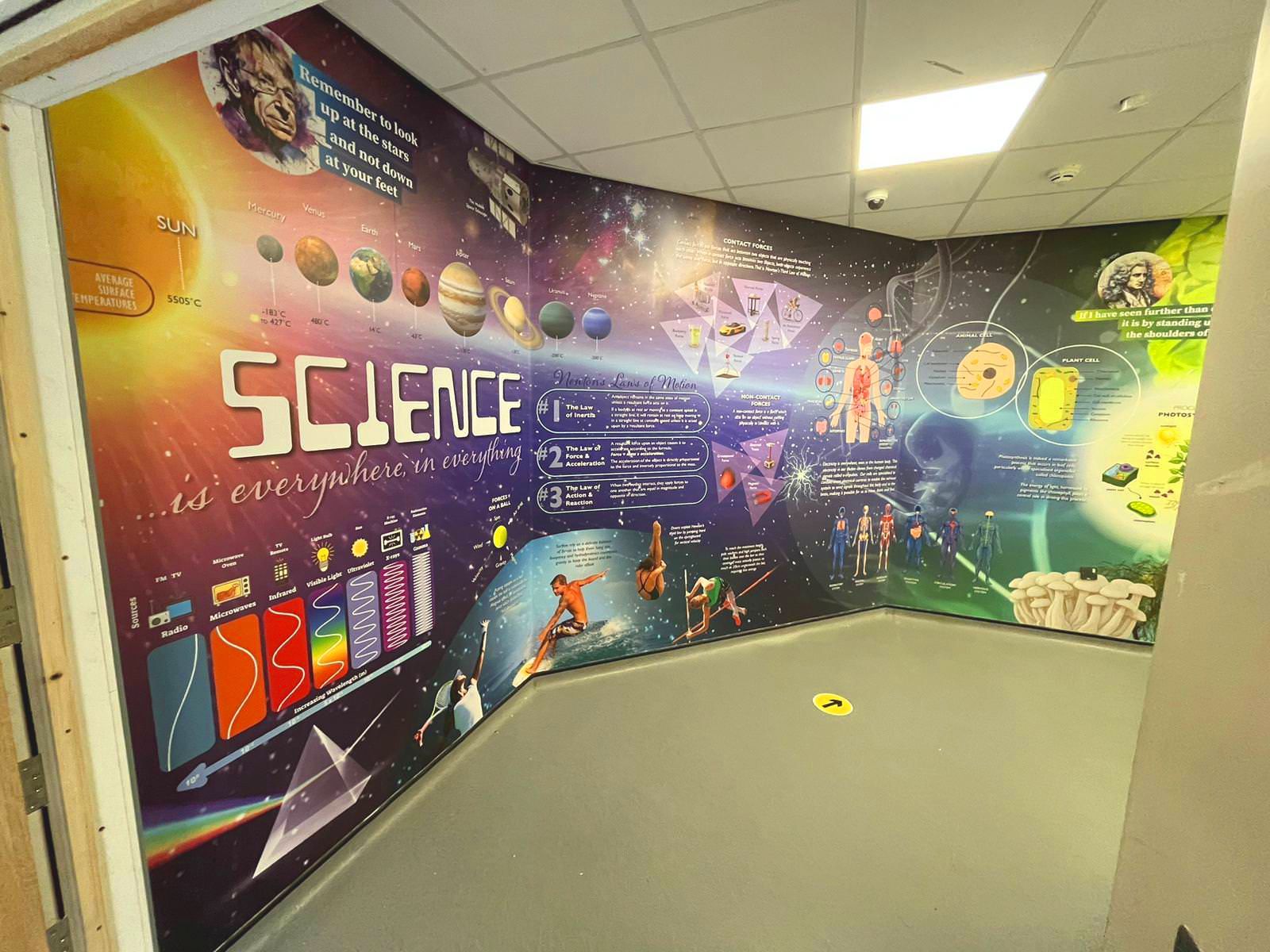
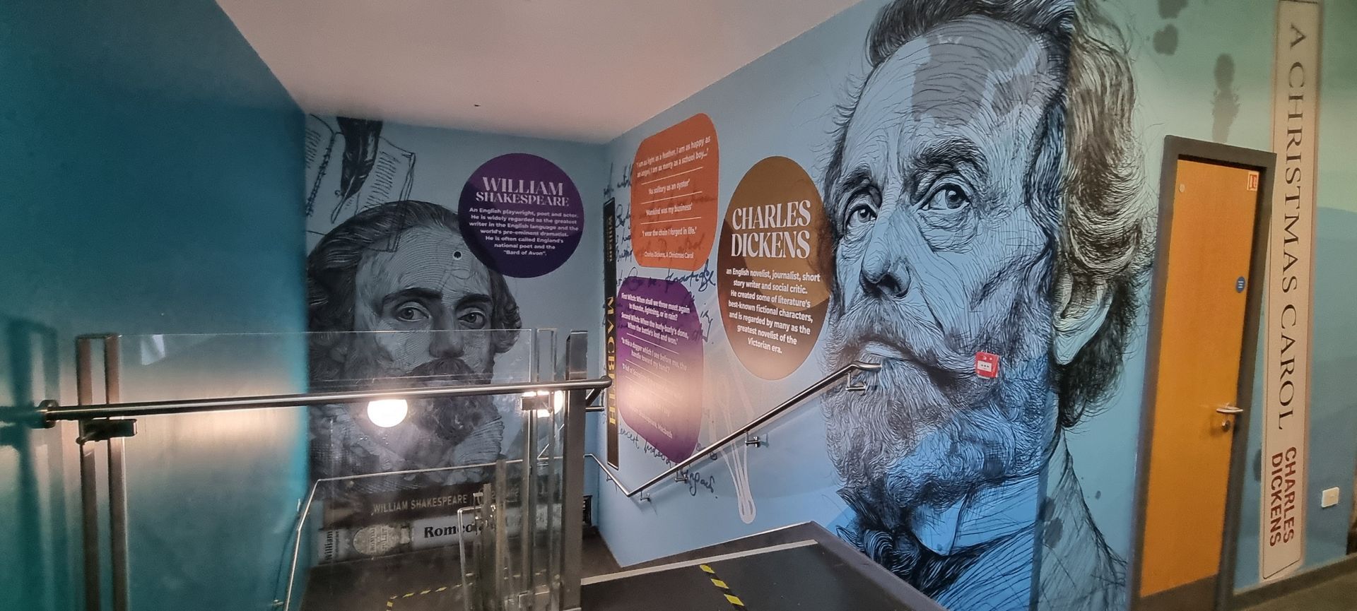
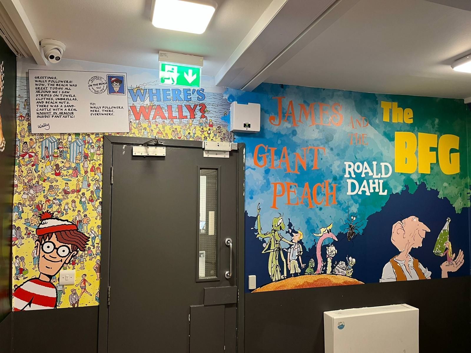
  • The wall graphics should display recognisable characters and creative scenes which will spark pupils' curiosity and sense of wonder. The use of recognisable visual elements in wall graphics helps students develop interest while making reading experiences more realistic.
  • The use of subtle symbols — keys, doors, and paths — allows students to connect the visual elements to storytelling concepts of exploration and discovery.


Visual Narratives


  • The wall art should present a narrative sequence through visual elements that follow a story progression from forest environments to castle entrances, mirroring the children's book's exploration.
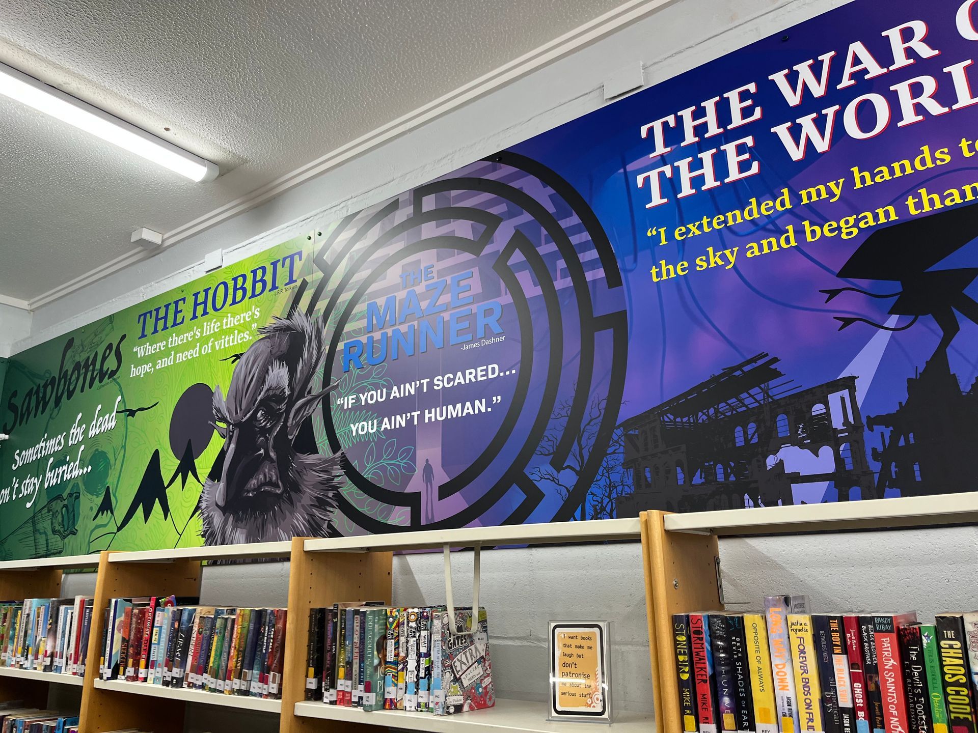
  • The addition of brief literary quotes and essential story lines enables students to create their own writing while starting classroom discussions about the text.


Sensory and Emotional Impact


  • The atmosphere of a space depends on its colour scheme. The combination of comfortable, warm colours with deep shades creates an atmosphere that leads to either relaxation or exciting adventures. The characters in the artwork enable students to understand emotional states and develop empathy and comprehension skills.


Placement for Maximum Impact


Corridors and Common Areas


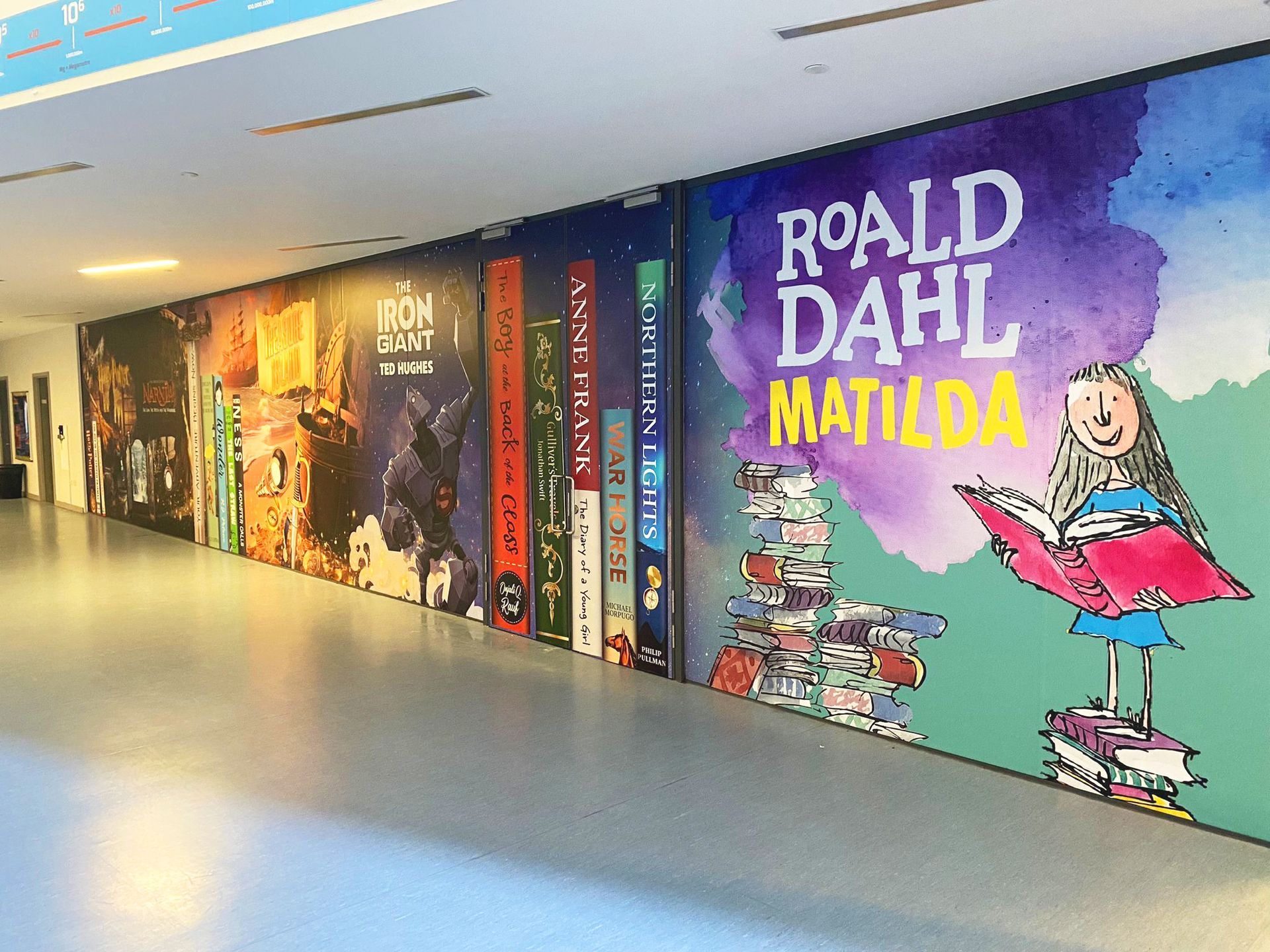
  • The school should transform its regular hallways into educational paths which lead students through reading experiences. Displaying familiar book covers at student eye level in corridors encourages students to develop their reading skills and feel proud of their literacy achievements.


Libraries and Literacy Zones


  • The walls should serve as visual bookshelves, showcasing different books to motivate students to read for pleasure.
  • The addition of QR codes and writable panels enables students to access digital resources and classroom activities through the visual content.


Seasonal Themes


  • The Halloween and forest scenes featuring magical creatures create an exciting, memorable reading environment. The same design elements will support the season, providing an opportunity to highlight the power of storytelling. The combination of fantasy and mystery elements in the Castle Future teaches about narrative structures and literary genres.

Design and Implementation


Collaboration


  • Teachers and students should work together to select reading materials and quotes that align with school values. At the same time, experienced designers should create visuals that support curriculum learning and maintain student safety.
  • The selection of materials for wall graphics should focus on environmentally friendly options that are safe for students and easy to maintain.
  • The designs should be placed at heights that students can access to ensure complete accessibility.


Maintenance


  • The school should schedule regular maintenance to preserve the appearance of wall graphics. The school should update book titles each term to align with reading assignments and World Book Day celebrations.


Examples of Reading Corridor Designs


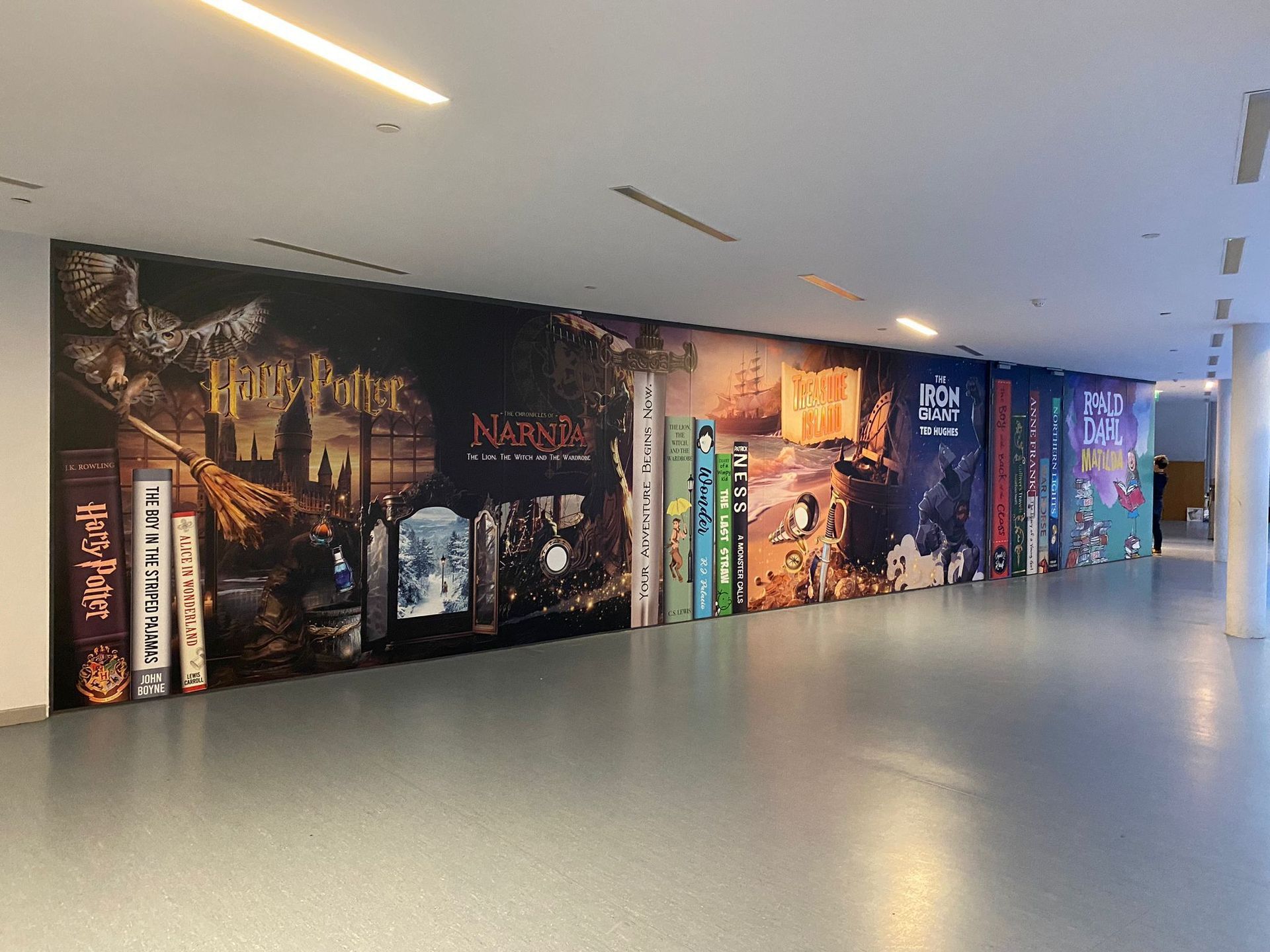
The Literary Spine Wall


  • The design features enlarged book covers that honour the books students read in class.
  • The design helps students become familiar with their reading materials while building their confidence in reading activities.


The Adventure Mural


  • The design presents a single story that shows pupils how to move between different imaginary worlds.
  • The design element creates an interest in reading while helping students understand story elements and narrative structures.


The Halloween Reading Trail


  • The display features temporary book displays that showcase "Guess the Book" challenges and frightening story excerpts.
  • The combination of Halloween spirit with reading activities transforms the holiday into a literacy-focused celebration.


Conclusion

Wall graphics that immerse students create more than visual appeal because they share stories, foster creativity, and make reading activities visible throughout the entire school. Schools that unite educational content with creative design elements will develop learning spaces which motivate students to explore new knowledge every school day.


Call to Action:

Cubed Creative enables you to transform your beloved stories into magical reading spaces, including enchanting corridors and libraries that inspire imagination.

By angel June 5, 2026
Summer is approaching. For school business managers and headteachers, this usually means one thing: the maintenance list. At the top of that list is almost always the corridors. They are the arteries of your school. Thousands of footsteps, bags dragging against walls, and the inevitable "scuff marks" that appear within weeks of a fresh coat of paint. You face a choice. Do you book the painters for another round of the "paint cycle," or do you look for a solution that actually lasts? At Cubed Creative, we’ve spent 21 years working inside schools. We’ve seen the difference between a corridor that is simply "clean" and one that is truly "inspiring." When you compare professional school wall graphics to fresh paint, the winner isn't just about aesthetics: it’s about your budget, your pupils, and your peace of mind. The Problem with the "Paint Cycle" We all know the routine. You spend a significant portion of your maintenance budget on a fresh coat of emulsion or eggshell during the summer holidays. By October half-term, the first scuffs appear. By Easter, the walls look tired again. This is the paint cycle . It’s a recurring expense that never actually solves the problem of a dull environment. While paint is the "standard" choice, it lacks the durability needed for high-traffic school environments. It doesn't offer protection against the daily wear and tear of a busy secondary school or the energetic movements in a primary hallway. More importantly, paint is silent. It doesn't teach, it doesn't guide, and it doesn't inspire. Why Wall Graphics Are the Long-Term Winner When we talk about wall art for schools , we aren't just talking about "stickers." We are talking about high-grade, laminated vinyl wraps designed specifically for heavy-duty use. 1. Durability that Defies the Corridor Our school wall graphics are finished with a protective laminate. This makes them incredibly tough. They are scuff-resistant and, perhaps most importantly for school staff, wipe-clean. Sticky fingerprints? Scuff marks from a backpack? They wipe right off. Unlike paint, which absorbs dirt and eventually chips, our graphics maintain their "just installed" look for years. When you look at the lifecycle cost, investing in graphics once every 5–7 years is far more cost-effective than repainting every year. 2. Turning "Dead Space" into Learning Space  A painted wall is a missed opportunity. Corridors are the perfect place for passive learning . Imagine your pupils walking to their next lesson surrounded by a giant timeline of British history, or a literacy-themed corridor featuring the spines of classic novels. You aren't just decorating; you are teaching. By using bespoke wall art , you can reinforce the curriculum outside the classroom. From Science and STEM displays to school values and maps, the educational value is immense.
By angel May 29, 2026
Walk through your school corridors during lesson time. It’s quiet. The doors are closed, and the heavy lifting of teaching is happening inside the classrooms. Or so it seems. But what about the walls around you? Those vast, often empty expanses of brick and plaster aren't just structural. They are constantly communicating. They are teaching, even when no one is speaking. In educational psychology, this is known as the ‘Silent Teacher.’ It is the idea that the physical environment: the colours, the displays, the signage, and the layout: shapes student behaviour and learning outcomes without a single word being uttered. At Cubed Creative , we’ve spent 21 years helping schools understand that their walls are their most underutilised educational asset. When you look at school wall graphics , you shouldn't just see decoration. You should see a pedagogical tool. The Psychology of the Learning Environment Your pupils spend roughly 15,000 hours in school across their academic journey. Most of that time is spent navigating the physical environment. The ‘Silent Teacher’ concept suggests that students are sponges for their surroundings. If a corridor is drab, grey, and cluttered with peeling posters, the message is one of low expectations and neglect. If that same corridor is vibrant, organized, and filled with bespoke wall art , it signals that the space: and the people in it: are valued. Reducing Cognitive Load There is a delicate balance to strike. Research into school behaviour and corridor design shows that while visual stimulation is vital, "visual noise" can be distracting. The key is intentionality. Purposeful visuals: Anchor charts, timelines, and key vocabulary support memory. Calming palettes: Blues and greens can help regulate energy levels during busy transition periods. Clarity: Clear, professional signage reduces anxiety by helping pupils feel oriented. Every graphic should "earn its place" on the wall. It must either inspire, inform, or guide. 
By angel May 15, 2026
As we move through the middle of the school year, your thoughts are likely already drifting toward the summer holidays. Not just for the much-needed break, but for the opportunity it brings. When the corridors fall silent and the classrooms sit empty, your building finally has the chance to breathe. This is the window for the "September Reset" , that magical moment when students return to find their environment transformed, sparking a renewed sense of pride and curiosity. At Cubed Creative, we’ve spent the last few months working on something special to help you plan that transformation. We are thrilled to announce the launch of our brand new 2026 School Wall Art Brochure . It’s more than just a catalogue of past work; it’s the ultimate guide for a "September Reset" . It’s a toolkit for school leaders who want to move beyond tired noticeboards and plain magnolia walls. It’s packed with fresh inspiration, curriculum-linked designs, and the practical details you need to make a project happen during the summer break. Why Now? The Power of the September Reset The environment your pupils walk into on that first Tuesday in September sets the tone for the entire academic year. It’s a physical manifestation of your school’s expectations, its warmth, and its ambition. A "September Reset" isn’t just about making things look "pretty." It’s a strategic move to: Reinforce school values from the moment a child enters the gates. Reduce anxiety by creating calming, supportive spaces for wellbeing. Boost learning by turning "dead space" into passive learning zones. Improve behaviour through high-quality environments that show students they are valued. By planning your Summer wall art now, you ensure that all the heavy lifting: the design, the printing, and the installation: happens while the school is empty. You get the "wow factor" without any disruption to the school day. 21 Years of Creative Excellence When you’re looking for a partner to transform your school, experience matters. We’ve been working in the education sector for 21 years. Over those two decades, we’ve seen trends come and go, but our core mission has remained the same: to create environments that inspire. We understand the unique pressures of the UK education system. We know that budgets are tight, timelines are non-negotiable, and the materials used need to be "school-proof." Our 21 years of expertise mean we don’t just "put stickers on walls": we understand how to design for impact and install for longevity. What’s Inside the 2026 Brochure? The new brochure is designed to help you navigate the different ways wall art can support your School Improvement Plan. Here’s a sneak peek at the key areas we cover:
By angel April 17, 2026
You’ve seen it before. A beautiful, vibrant wall display that looked incredible on the day it was installed. Fast forward six months, and the edges are starting to curl. A year later, it’s peeling away at the corners, or the vibrant blues and reds have started to look a little tired and faded. In a busy school environment, "good enough" usually isn't. When you are looking to transform your school corridors, reception areas, or classrooms, it is easy to focus entirely on the design. After all, the design is what tells your story. It’s what inspires your pupils and impresses your visitors. But the material those designs are printed on? That is what determines whether your investment lasts for a decade or ends up in the bin before the next OFSTED inspection. At Cubed Creative , we’ve spent 21 years working inside schools. We know that a corridor isn't just a walkway; it’s a high-traffic zone where hundreds of blazers, backpacks, and wandering hands pass by every single hour. Choosing the right school wall graphics materials is the difference between a long-term asset and a short-term headache. The Science of the "Shrink": Monomeric vs. Polymeric Vinyl If you’ve been gathering quotes for school wall graphics , you might have noticed a significant range in pricing. Often, the "cheaper" quotes are using what we call Monomeric vinyl. To keep it simple: vinyl is made of plasticisers. In monomeric vinyl, these molecules are short and "unbound." Over time, especially when subjected to the fluctuating temperatures of a school building, these molecules migrate. The result? The vinyl literally shrinks. When vinyl shrinks on a wall, it pulls away from the edges. It leaves a sticky, unsightly residue that attracts dust and dirt. It looks poor, and more importantly, it becomes a target for inquisitive fingers to pick at. This is why we champion polymeric vinyl school graphics  Polymeric vinyl is engineered with longer molecular chains. It is far more stable. It doesn't shrink, it doesn't curl, and it stays exactly where we put it. It’s the gold standard for long-lasting school wall displays . When we talk about durability, we aren't just talking about the print staying bright; we’re talking about the material staying bonded to the wall.
By Gary Boad April 6, 2026
The morning rush. You know the one. It is a whirlwind of lost shoes, half-eaten toast, and the ticking clock. Then comes the final hurdle: the school gate.
By angel March 20, 2026
We’ve all been there. It’s 4:00 PM on a Tuesday, you’re armed with a staple gun that’s seen better days, and you’re staring at a vast expanse of blue sugar paper that refuses to stay flat. You want your classroom to be an inspiring hub of learning, but by the time the final border is pinned, it looks more like a chaotic explosion in a stationery shop. At Cubed Creative, we’ve spent the last 21 years helping schools transform their environments. We’ve seen the good, the bad, and the "why is that poster from 1994 still there?" The truth is, your walls are more than just partitions between rooms. They are silent teachers. When used correctly, school wall graphics can boost engagement and reinforce key concepts. When used poorly, they become a distracting mess that hinders focus. Here are the seven most common mistakes schools make with classroom wall displays, and, more importantly, how you can fix them. 1. The "Everything but the Kitchen Sink" Approach There is a common misconception that a "good" classroom is a covered classroom. We feel the urge to fill every square inch of brickwork with posters, bunting, and student work.  The Mistake: Visual overload. Research suggests that heavily decorated classrooms can actually decrease student performance. When every wall is screaming for attention, the brain struggles to filter out the noise. This leads to cognitive overload, particularly for pupils with SEND or sensory processing sensitivities. The Fix: Aim for the 20% rule. Keep at least 20% of your wall space clear. This "white space" gives the eyes a place to rest and allows the important displays to actually stand out. Think quality, not quantity.
By angel March 2, 2026
An Open Evening is not just an event on the calendar. It is a defining moment. Before the results are discussed. Before the curriculum is explained. Before questions are asked. Families are already forming an opinion. And your environment is leading that conversation. The Challenge: You Only Get One First Impression When parents walk through your doors, they are looking for reassurance. Is this school calm? Is it ambitious? Does it feel purposeful? Will my child belong here? A blank wall is a mystery. An inconsistent board confuses. A wall that has not changed for months or years is an indicator that communication with the wall is not important. But clear, intentional design builds confidence immediately. Your space either reinforces your message — or distracts from it.
By Gary Boad February 21, 2026
Step into any hallway at school. Something sits there before any text shows up at all. Quiet. A spark of drive. Heat in your steps. Yet at times, everything feels too heavy to carry A flash of colour stirs something deep, almost right away. Inside classrooms, that instinctual reaction holds weight - greater than many allow themselves to see. What keeps people okay isn't only rules or school counsellors. It shows up in each part of the daily world that kids navigate.
More Posts

Back to home